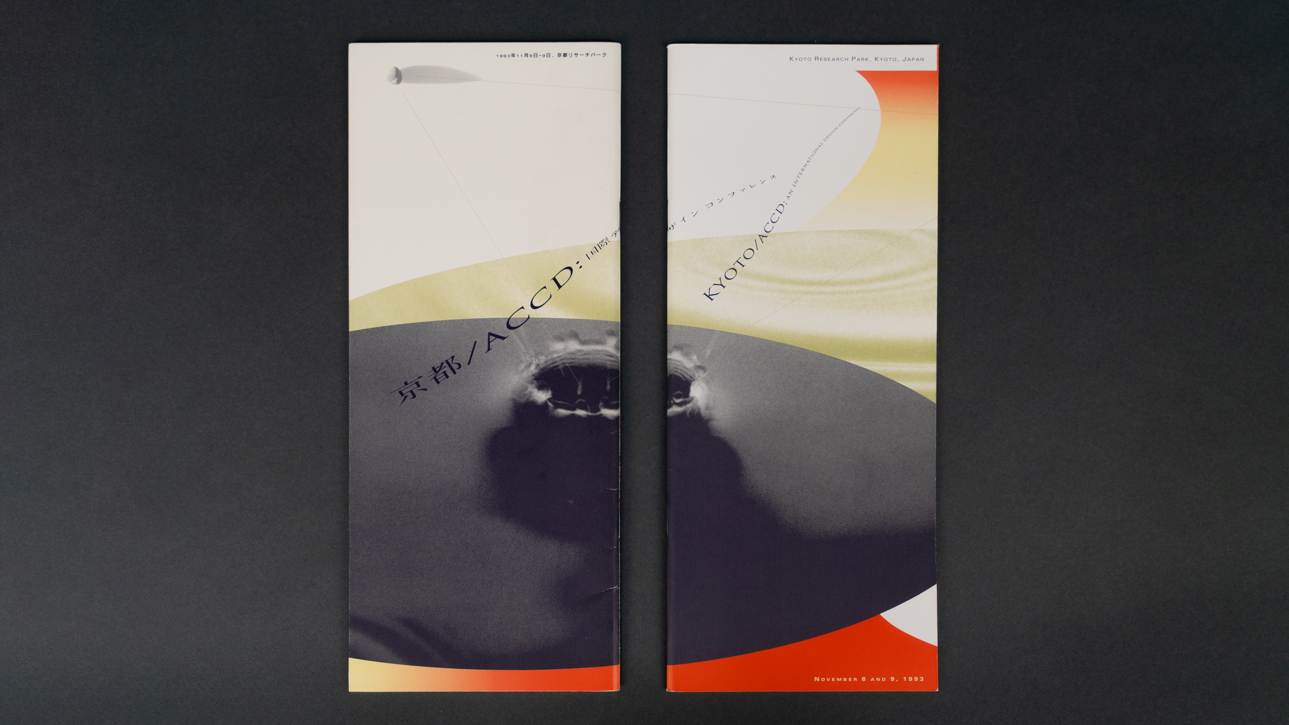
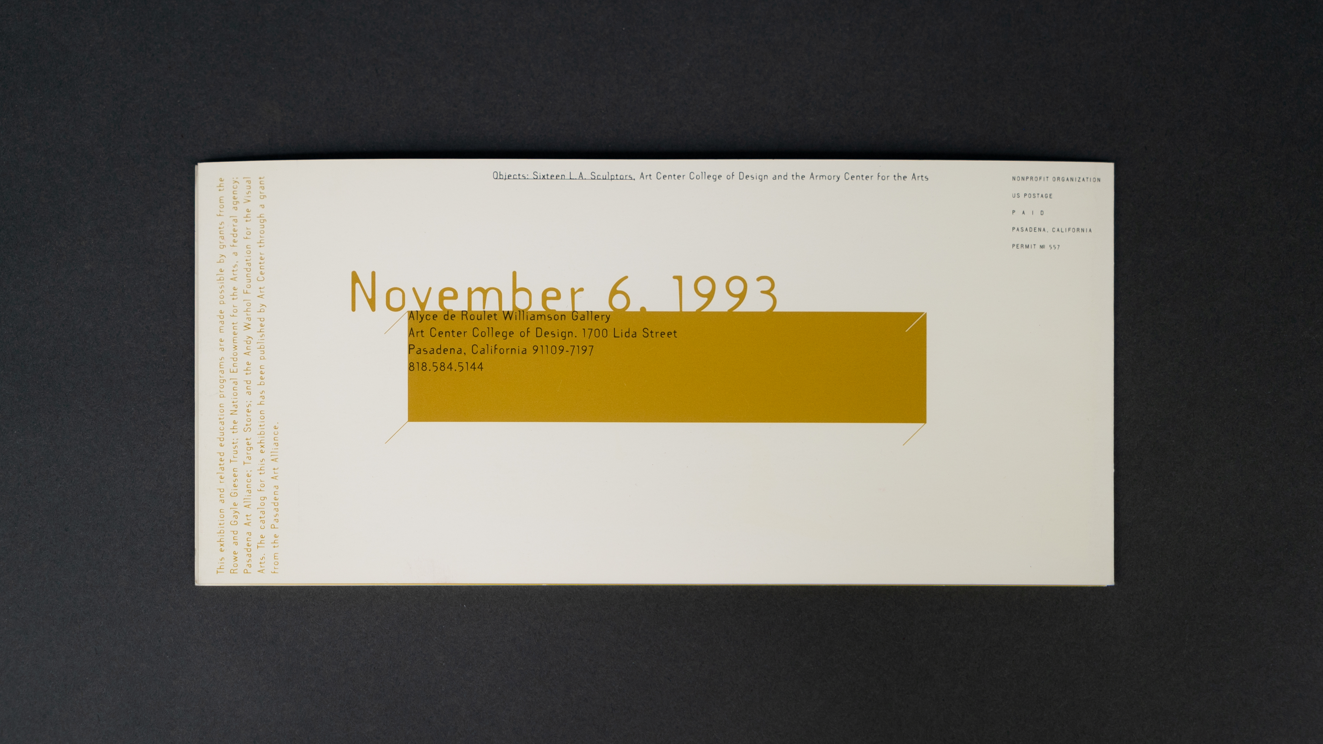
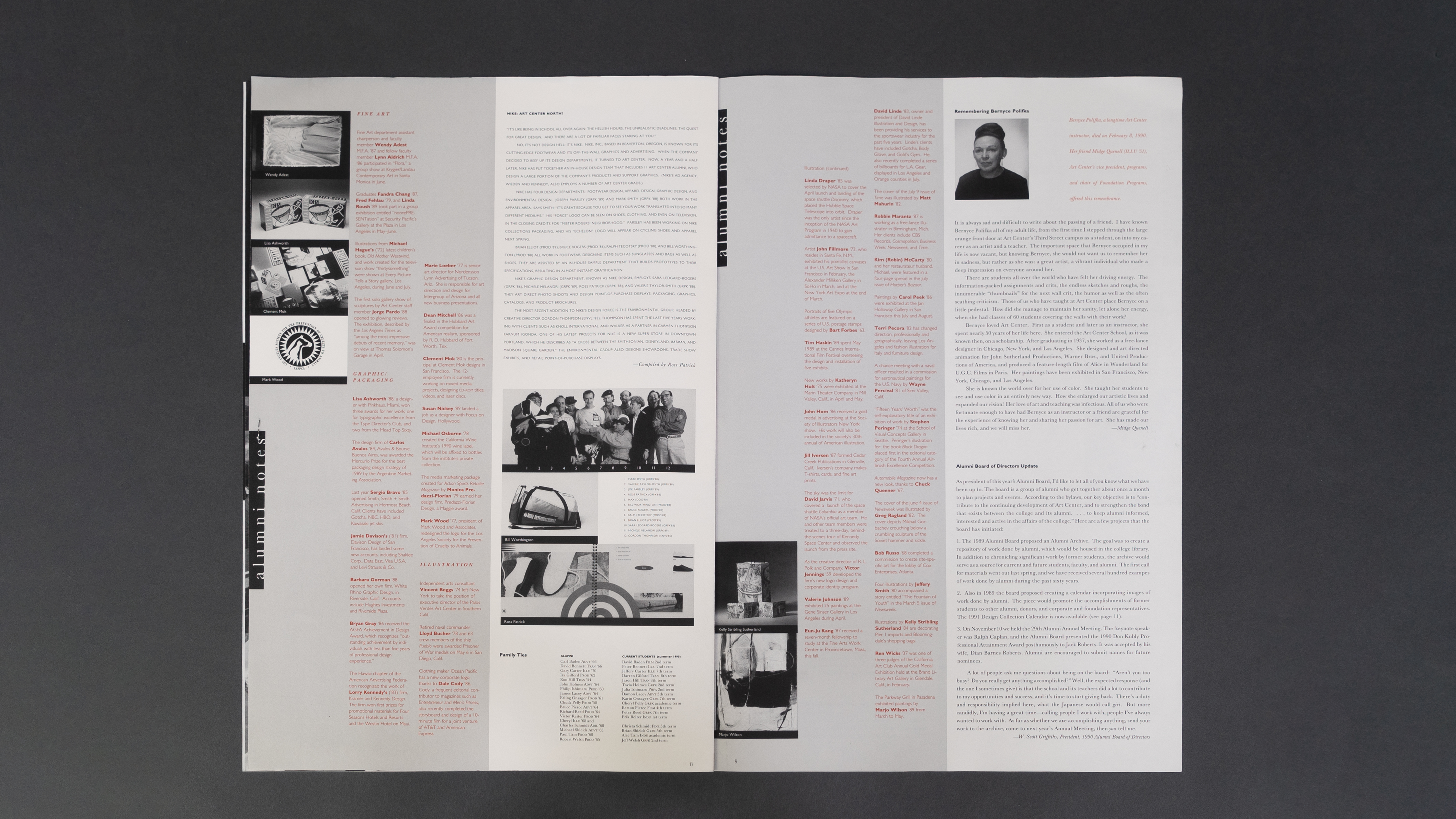
ART CENTER COLLEGE OF DESIGN
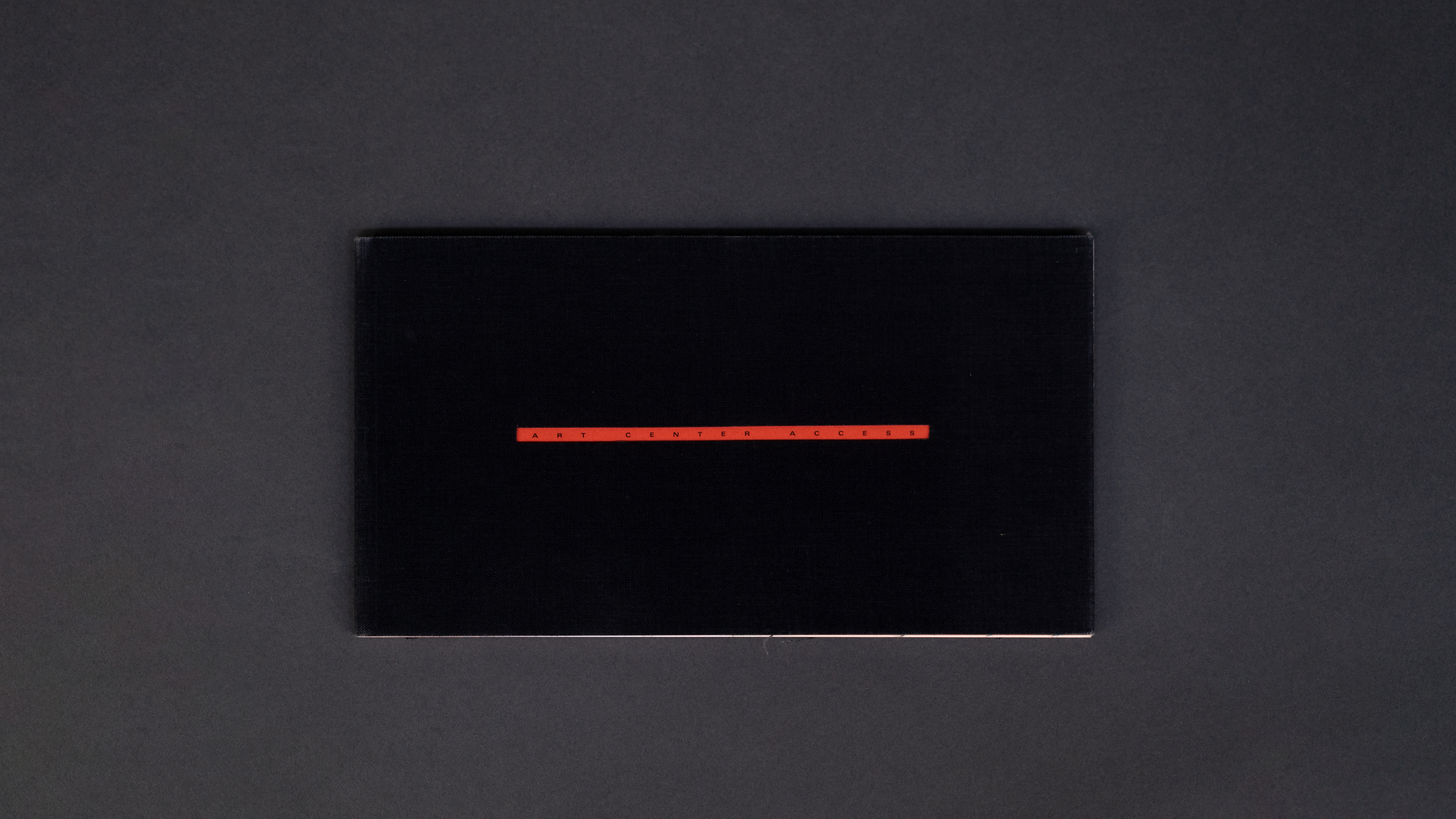
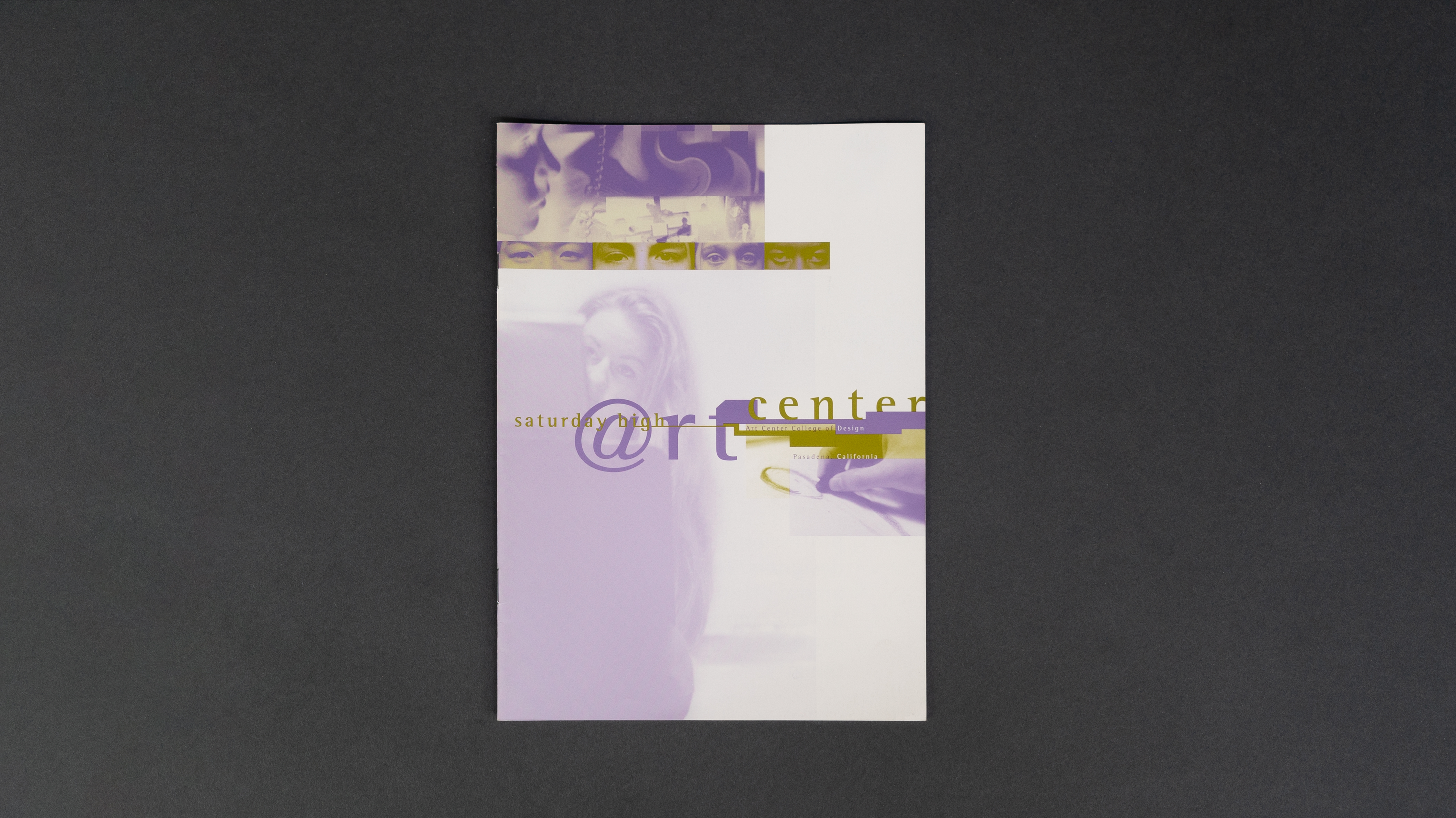
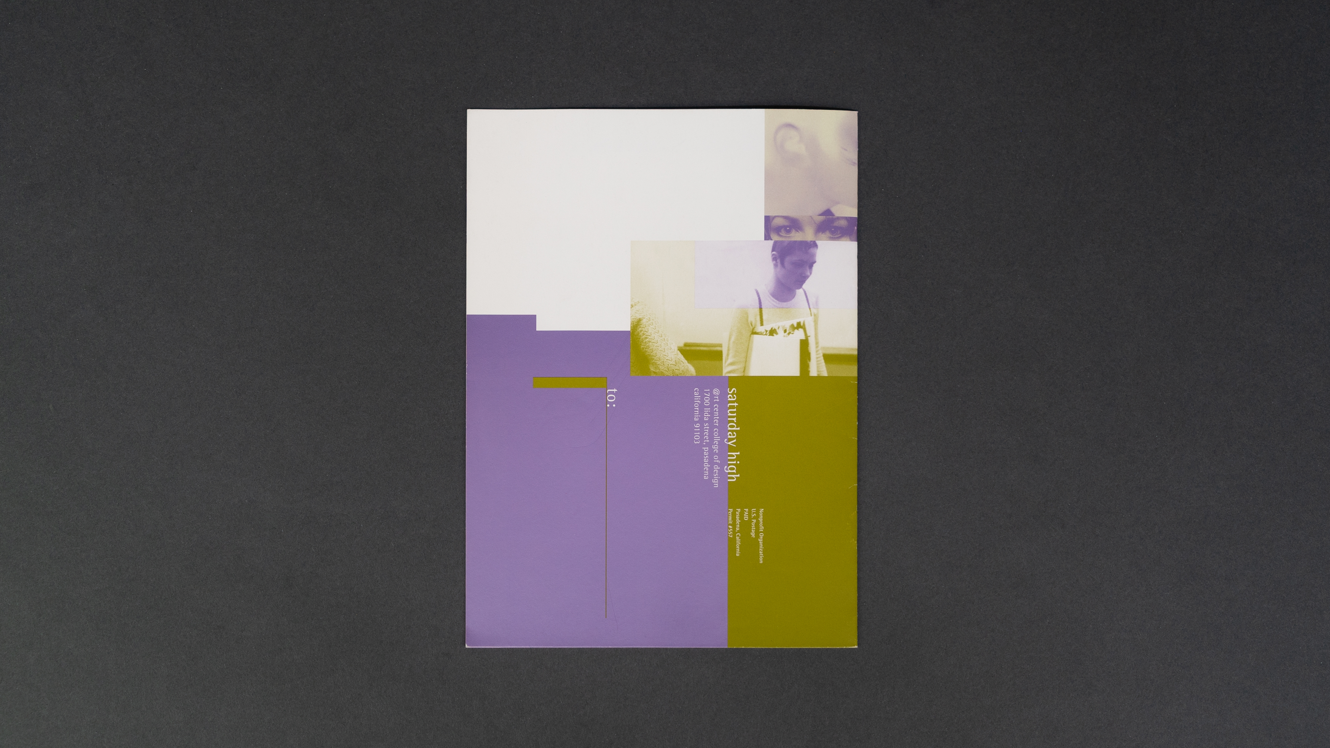
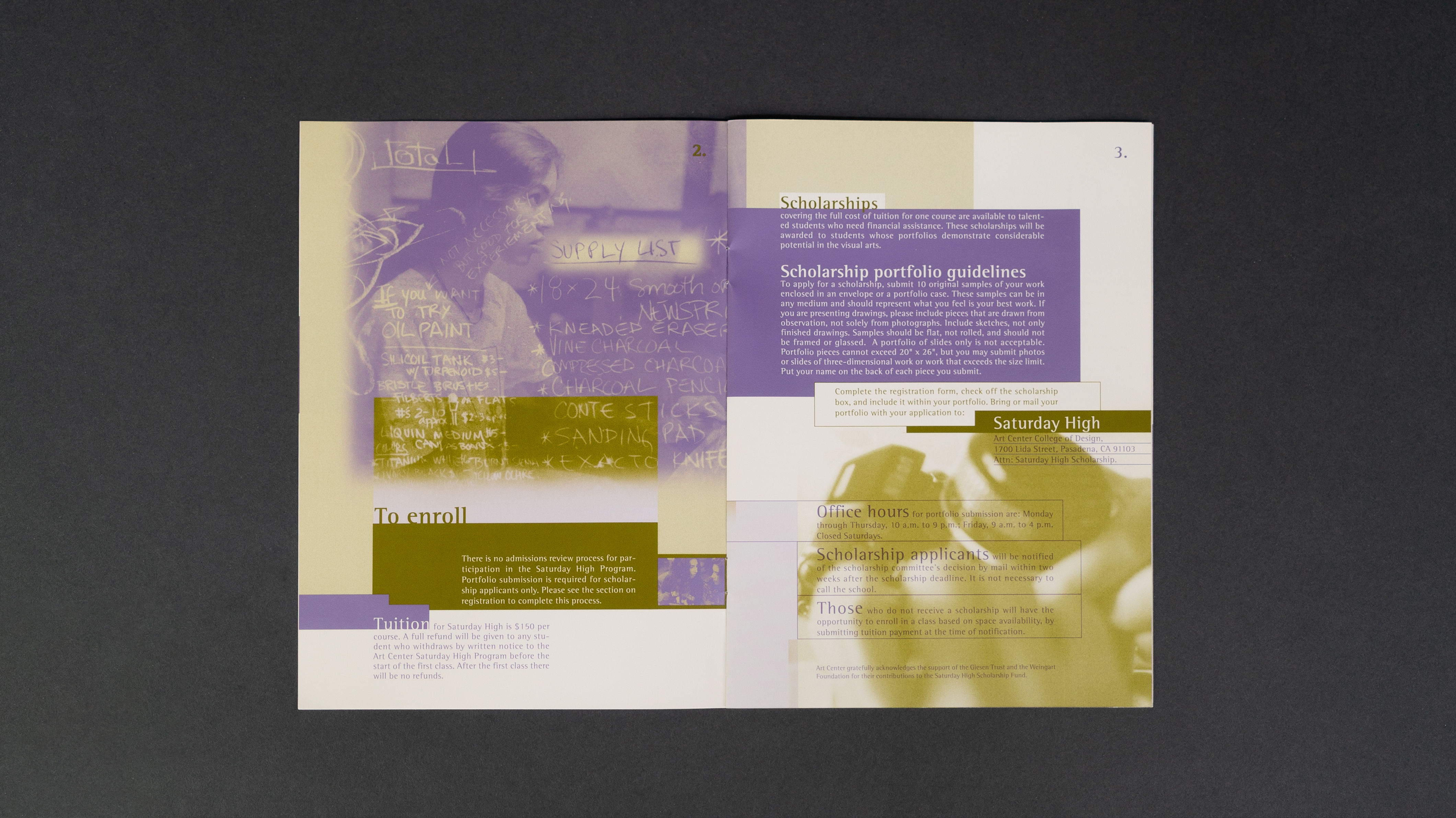
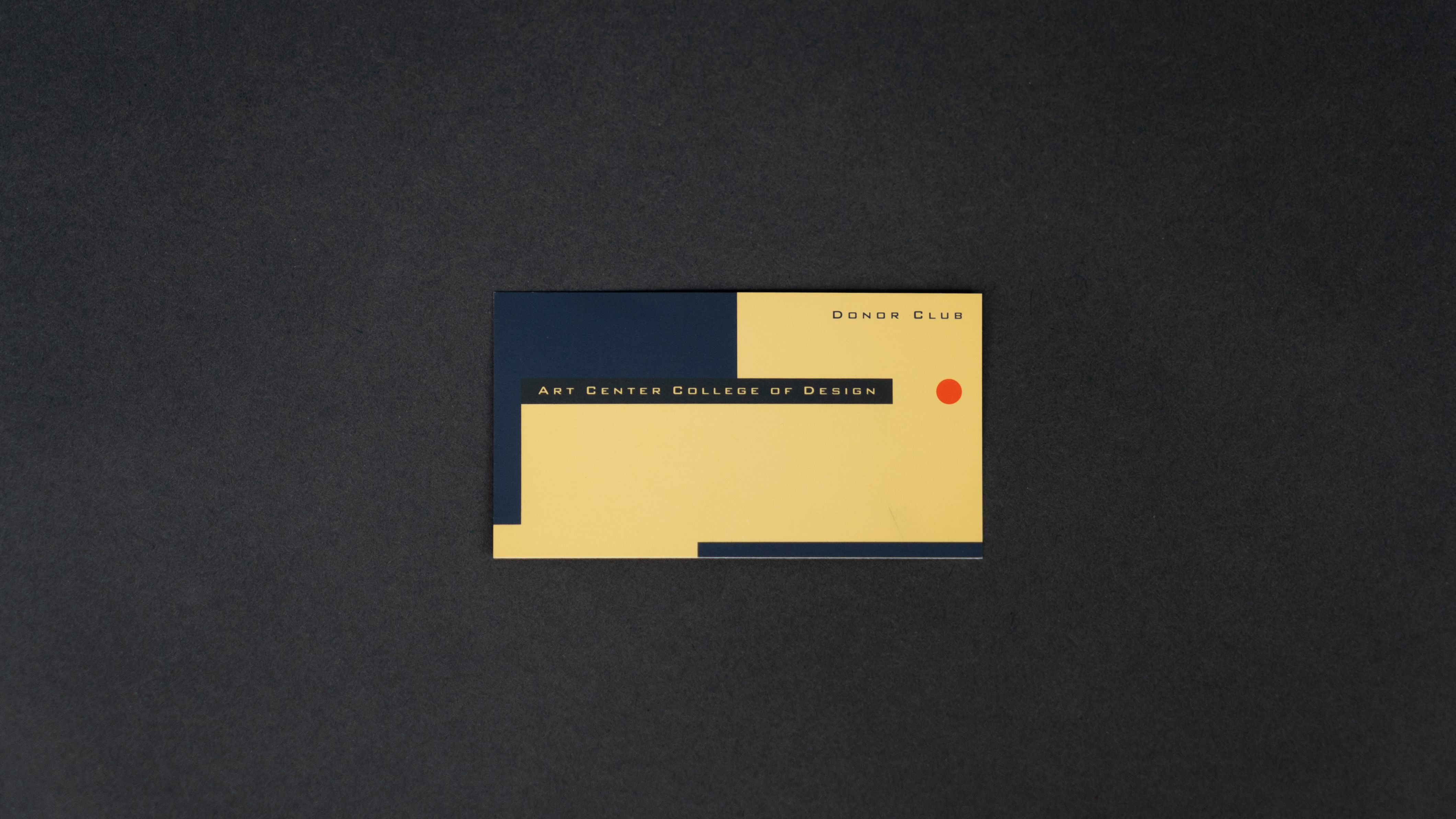
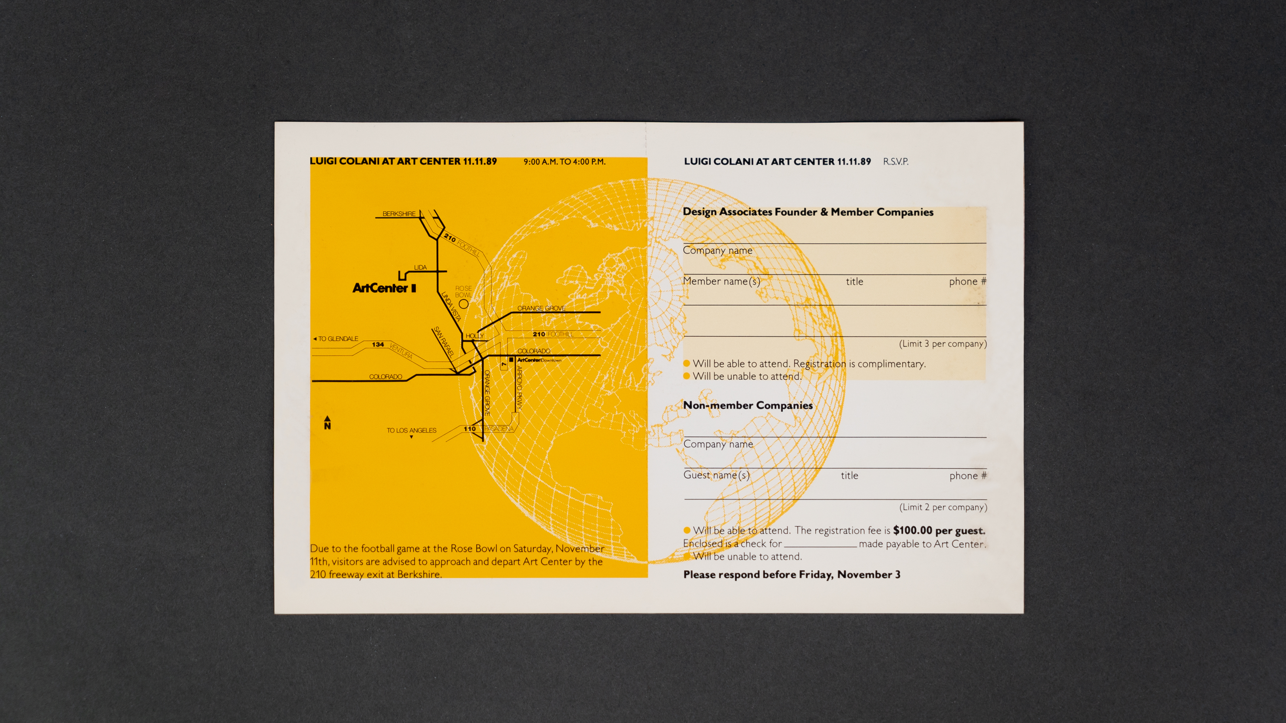
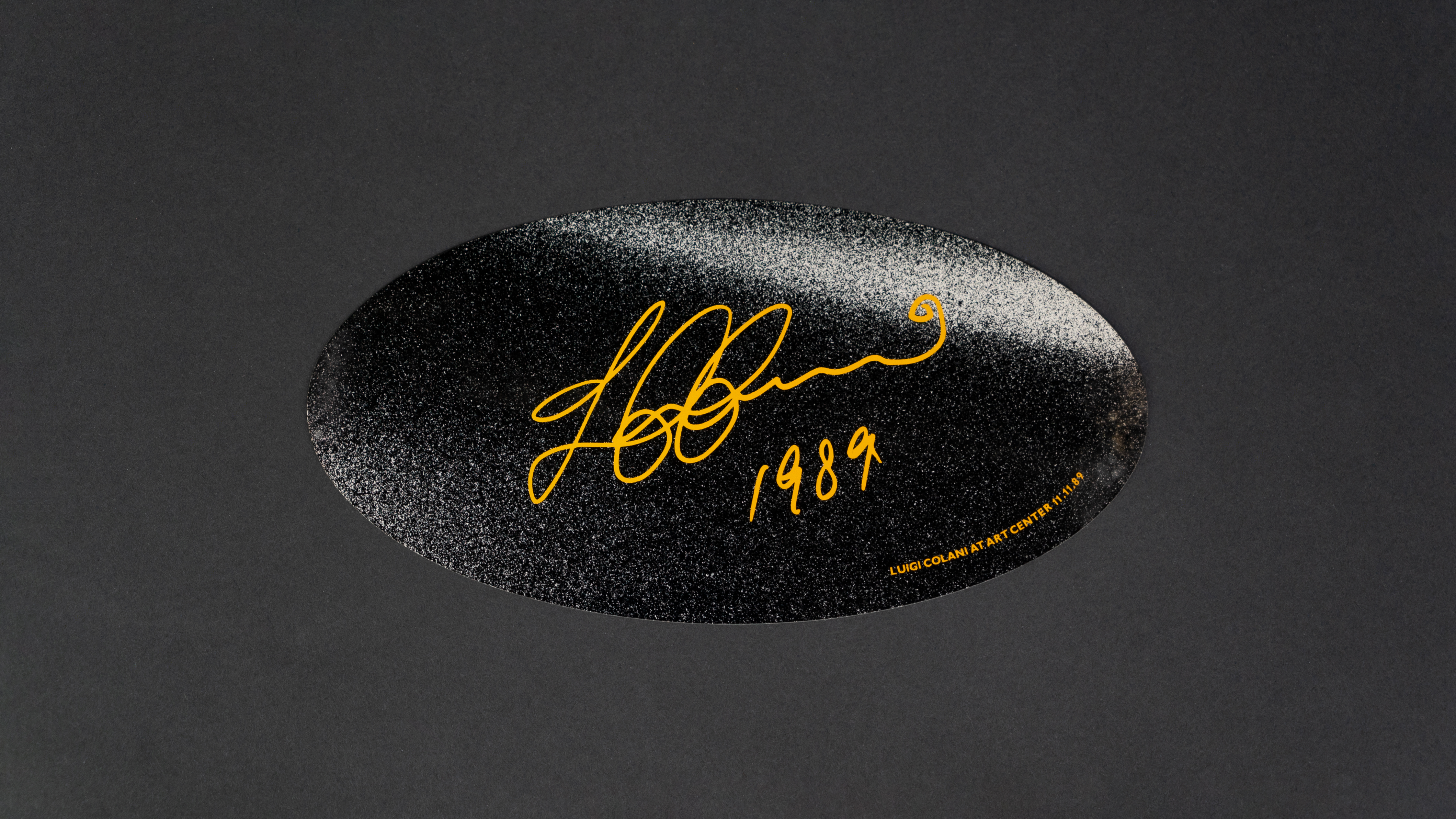
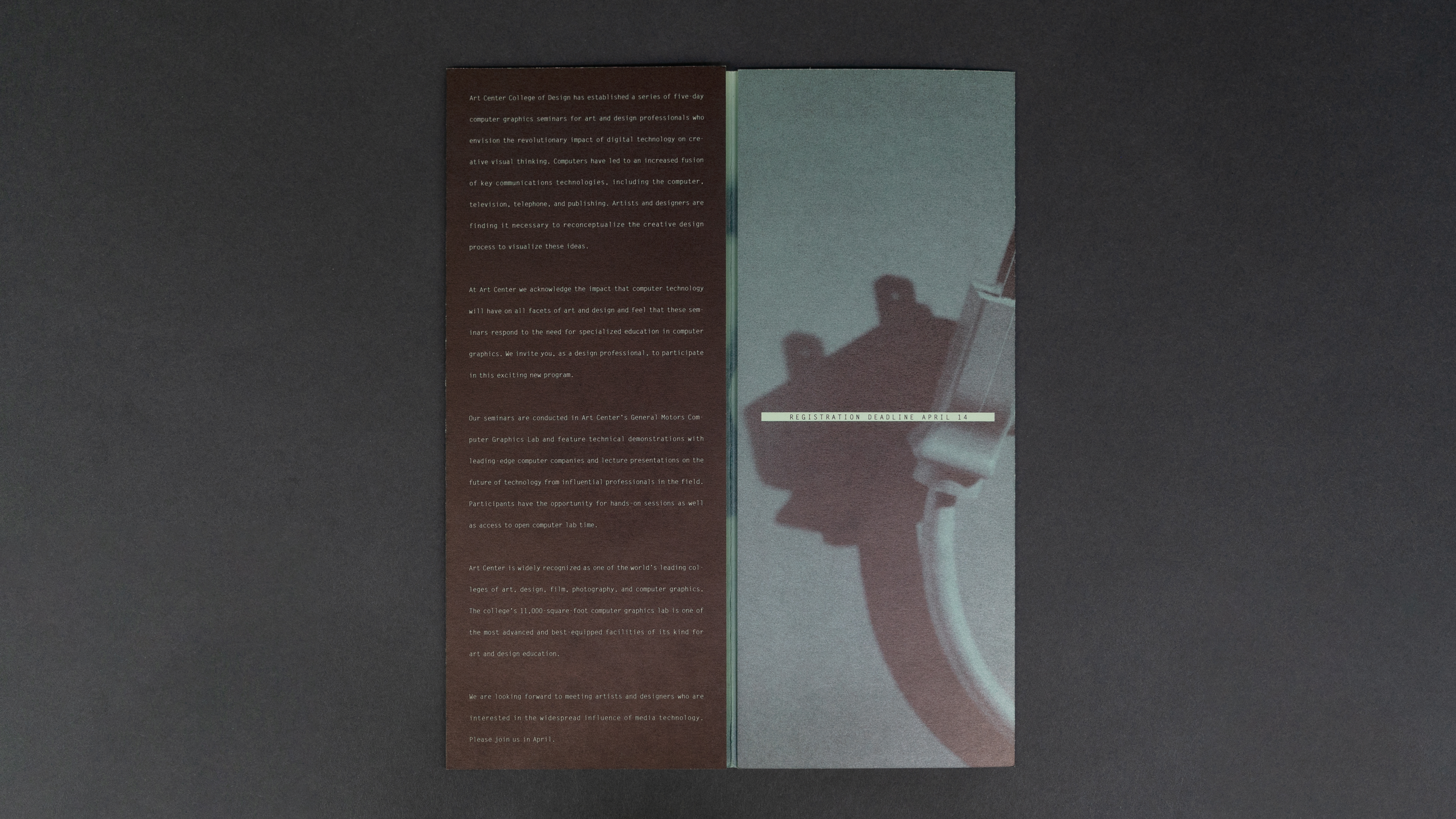
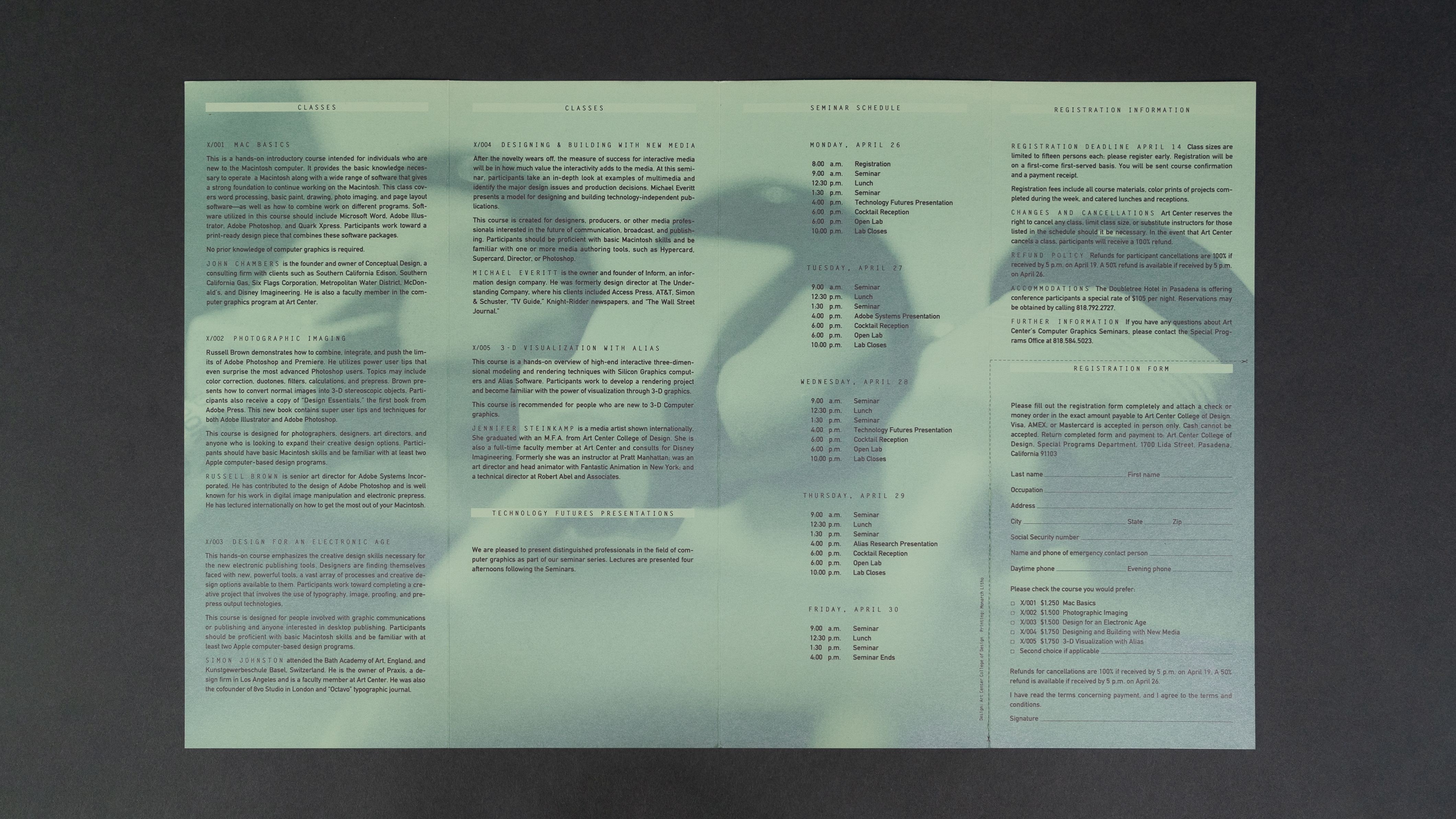
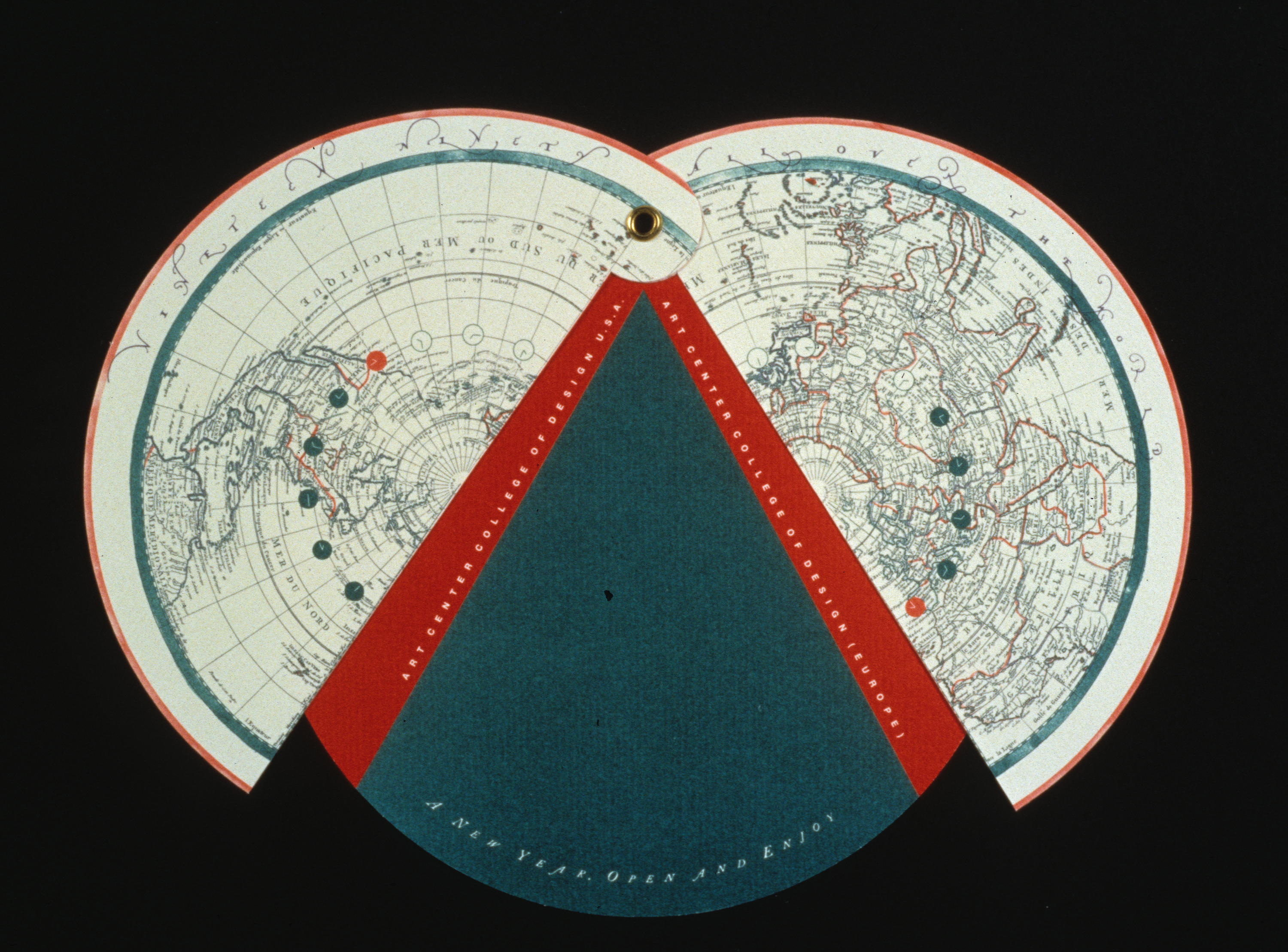
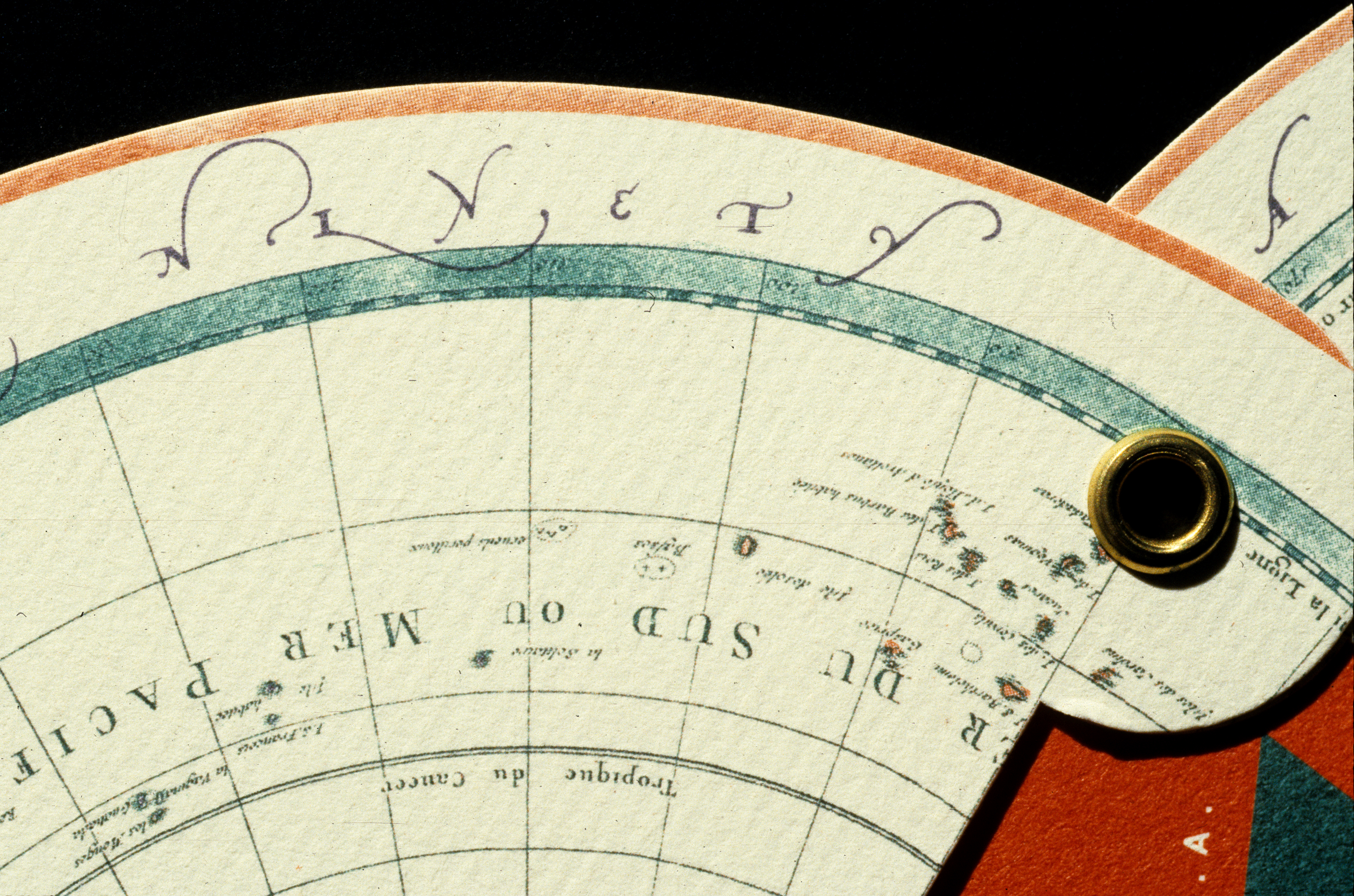
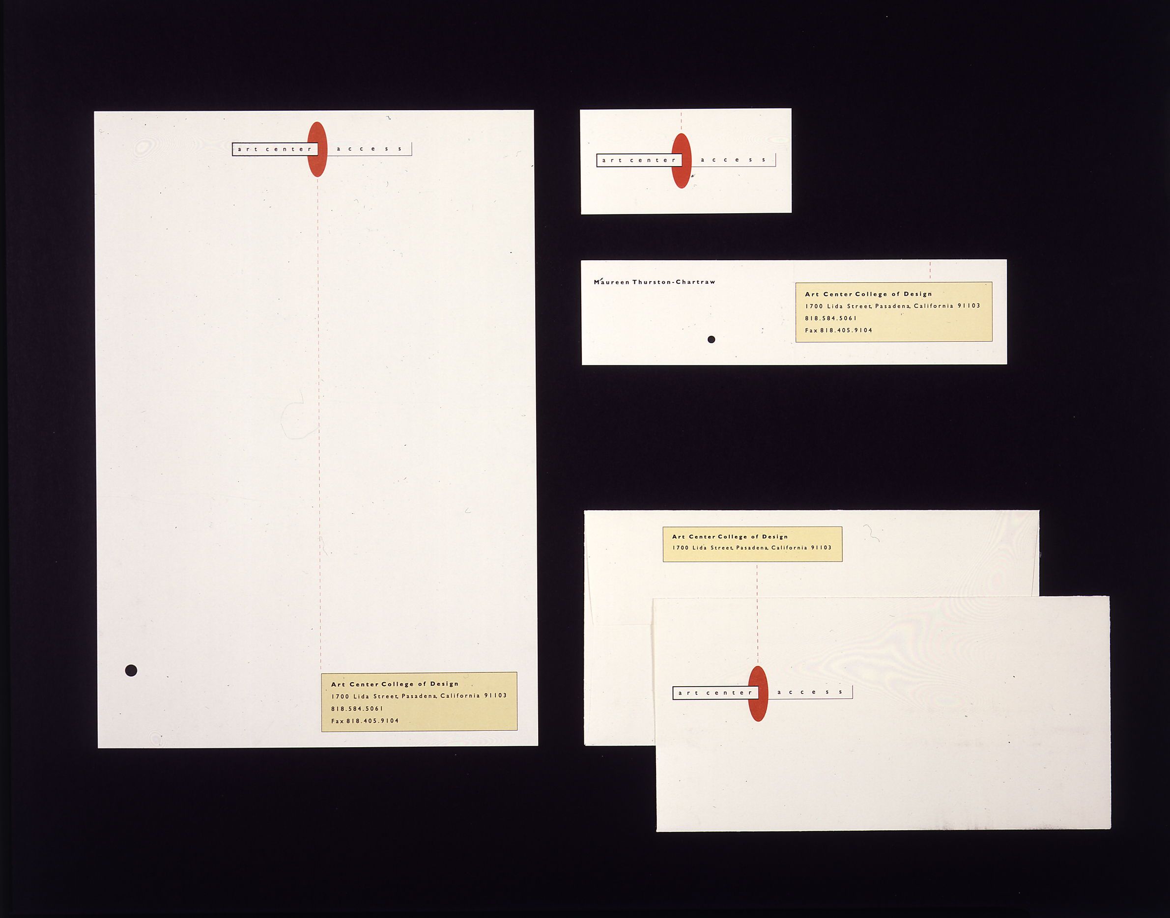
From 1989 to 1996 Rebeca Méndez was design director of the design office at Art Center College of Design in Pasadena. When she arrived at the design office, Stuart Frolick, then creative director of the ‘d.o.’ handed her a rapidograph and a t-square. She laughed out loud, but he was serious. Since 1985 Méndez’s studio ran on Macintosh systems. Her task from then on, was to create a contemporary design studio for Art Center and to institute a student internship program to aid with the design of the publications.
Veronique Vienne
Text from ‘Designing from skin to screen, Graphis Magazine, Issue #306
Heir apparent to the likes of April Greiman and Laurie Haycock Makela, Rebeca Méndez was born and raised in Mexico City, and educated at the Art Center College of Design in Pasadena, California. She is known for her critical role in the redesign and reassessment of her alma mater’s corporate and cultural identity. Hired to teach in 1989 by James Miho, chairman of the department of graphic and packaging design, she held the position of design director between 1991 and 1996. Her weightless graphic compositions, elegantly poised on the page, have become synonymous with the college’s unexpectedly stylish persona. Once stodgy, the 66-year old institution is now perceived as being on the cutting edge of graphic design.
The transformation has been so dramatic that most people still wonder how someone like Rebeca Méndez, someone with her quiet demeanor and silent determination, was able to bring about such a colossal turnaround. But what else would you expect from a former gymnastics champion? Years of strenuous floor exercises and difficult routiness on the beam have taught Rebeca Méndez a thing or two about multiple rotations. She still looks like she can make an aerial front-double somersault and land on her feet. “The times I was best in gymnastics is when I felt weightless,” she says. “It is through dissolving my body in space that I find continuity.
I guess I am still trying to recapture this ethereal feeling in my graphic work and in my relationship with technology. For me, design is always a case of virtuality in the process of being actualized: It has more to do with duration—that is, the flow of time—than with space.”
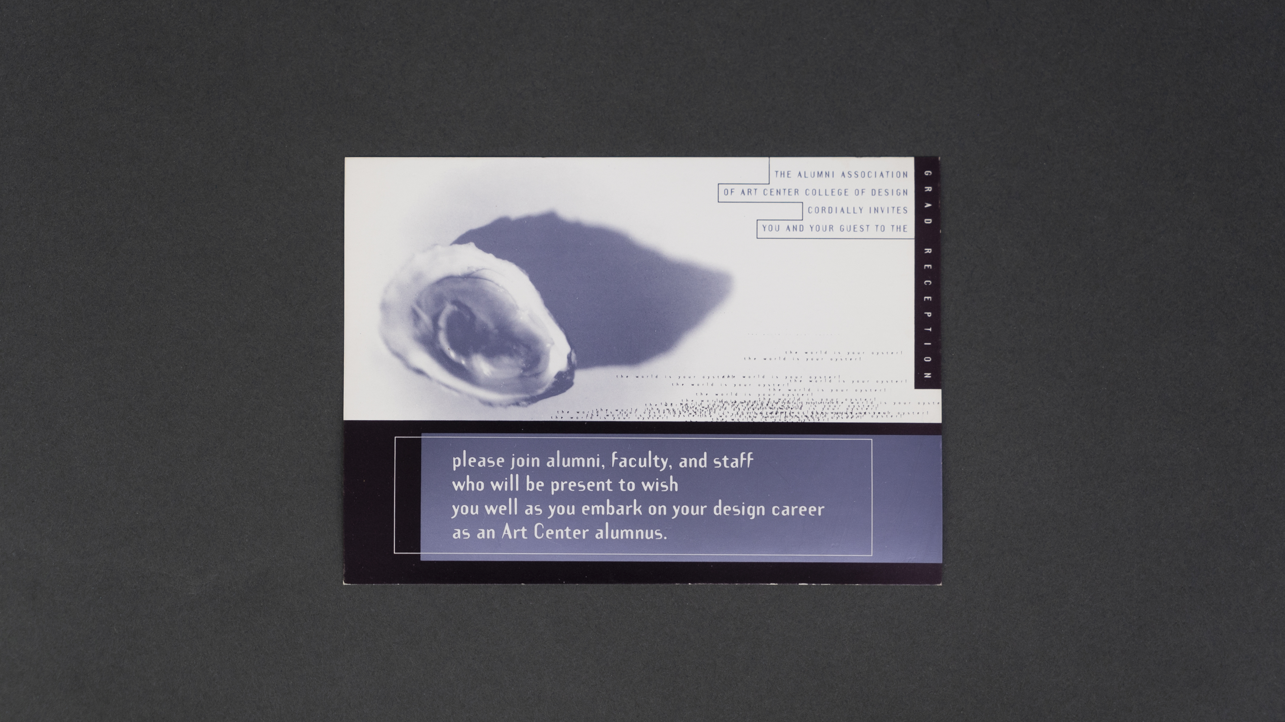
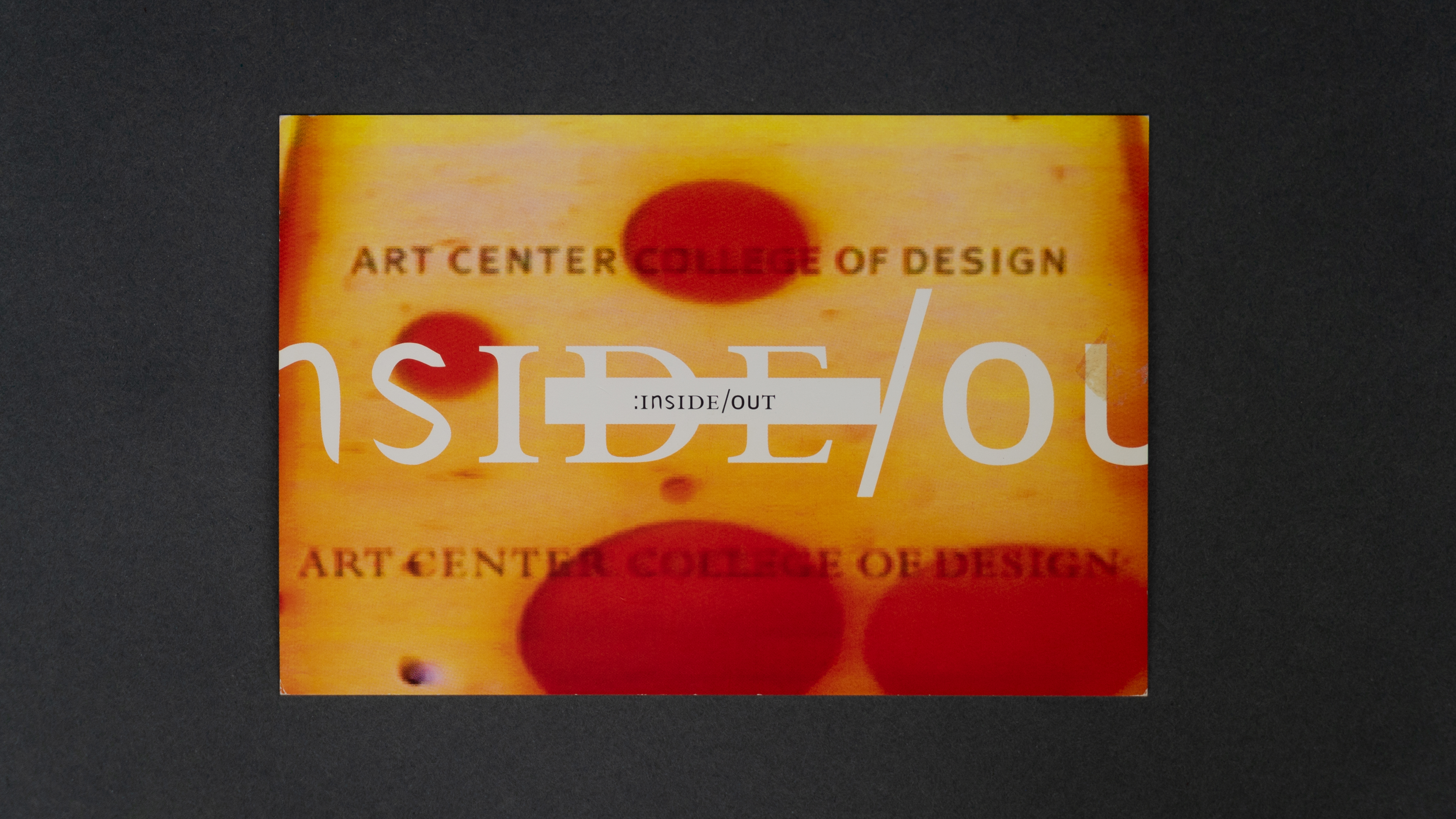
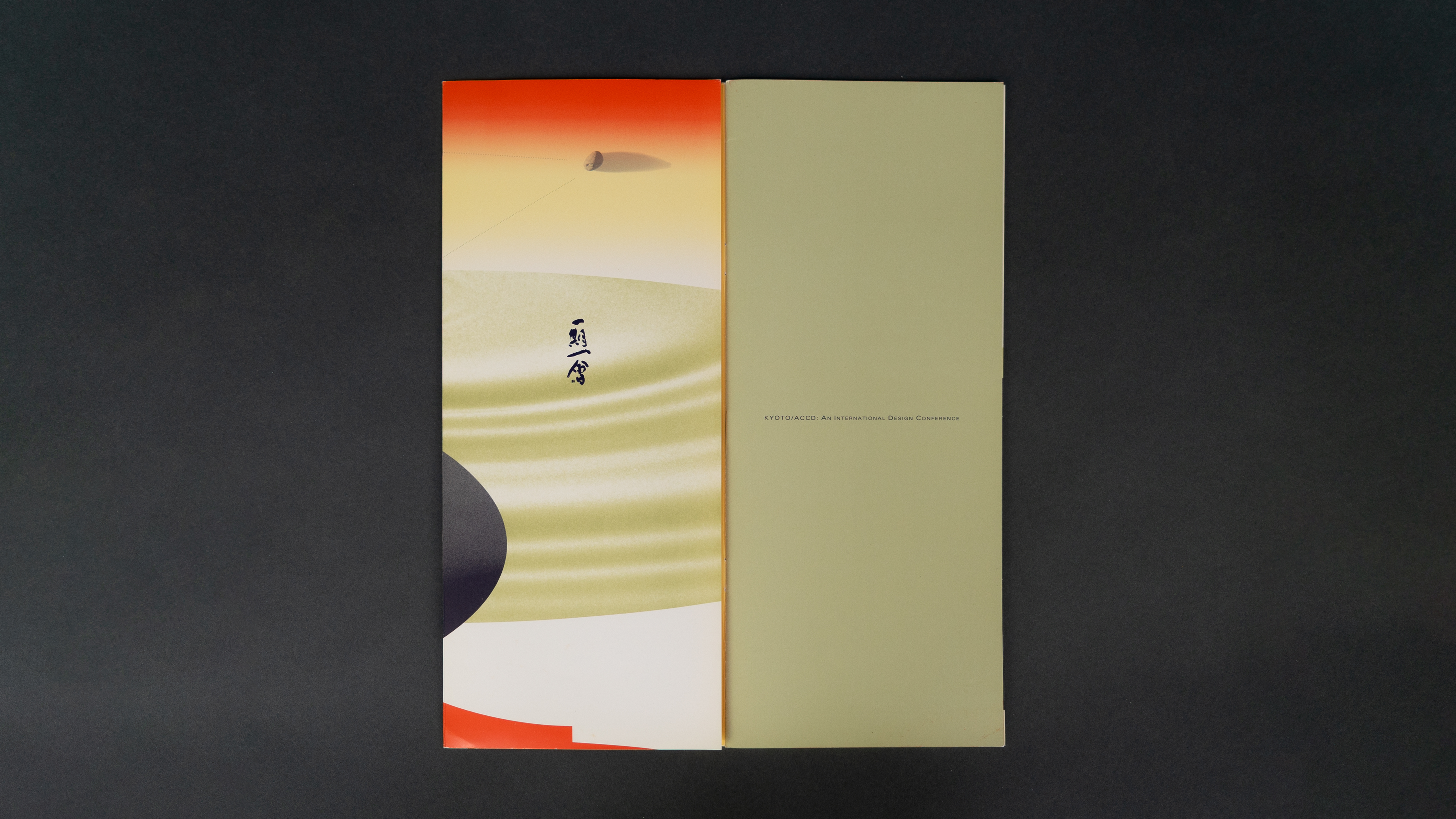
Inspired by French philosopher Henri Bergson, who she discovered through the writings of Gilles Deleuze, Méndez wants her work to be about two directions of representations: that of perception which puts us at once with matter (located in space), and that of memory which puts us at once into mind (in duration). Her layouts are always in the state of becoming, displaying what she describes an an initial dissociation of this mixture of space and time, giving back to each its natural purity, and of their coexistence in the creation of change. But it is with a vengeance that she blurs the boundaries between time and space. There is something almost feral about the way she tears and scatters visual elements on a page. Reflecting the fact that Art Center, its student body and design in general were in a state of transition, she established for the school a fractured, hybrid and deliberately non-linear visual language. “Out of this world of abstraction and virtuality, I created an identity for Art Center, and in turn, this identity created me,” she says. “It was both incestuous and frightening.”
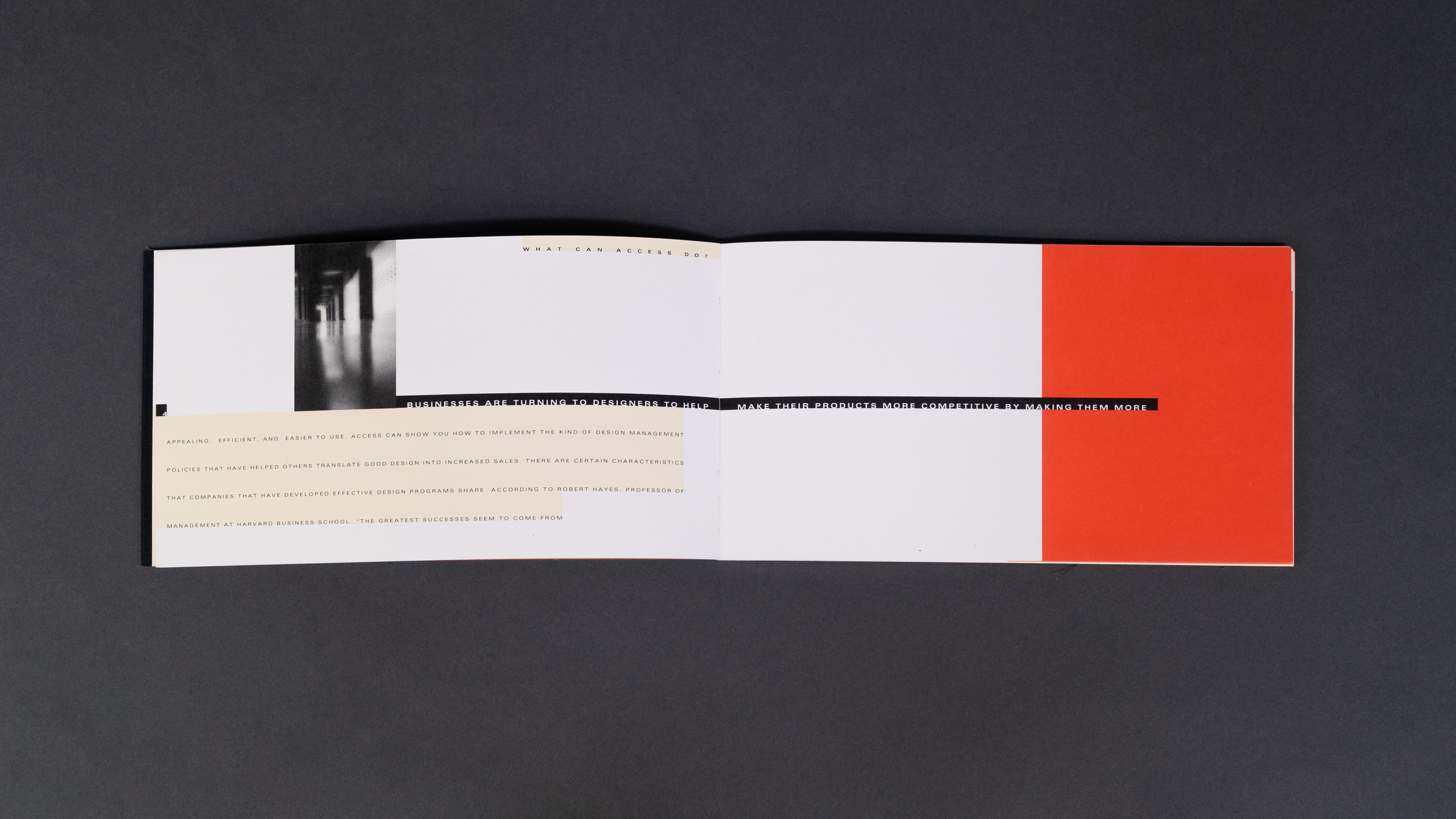
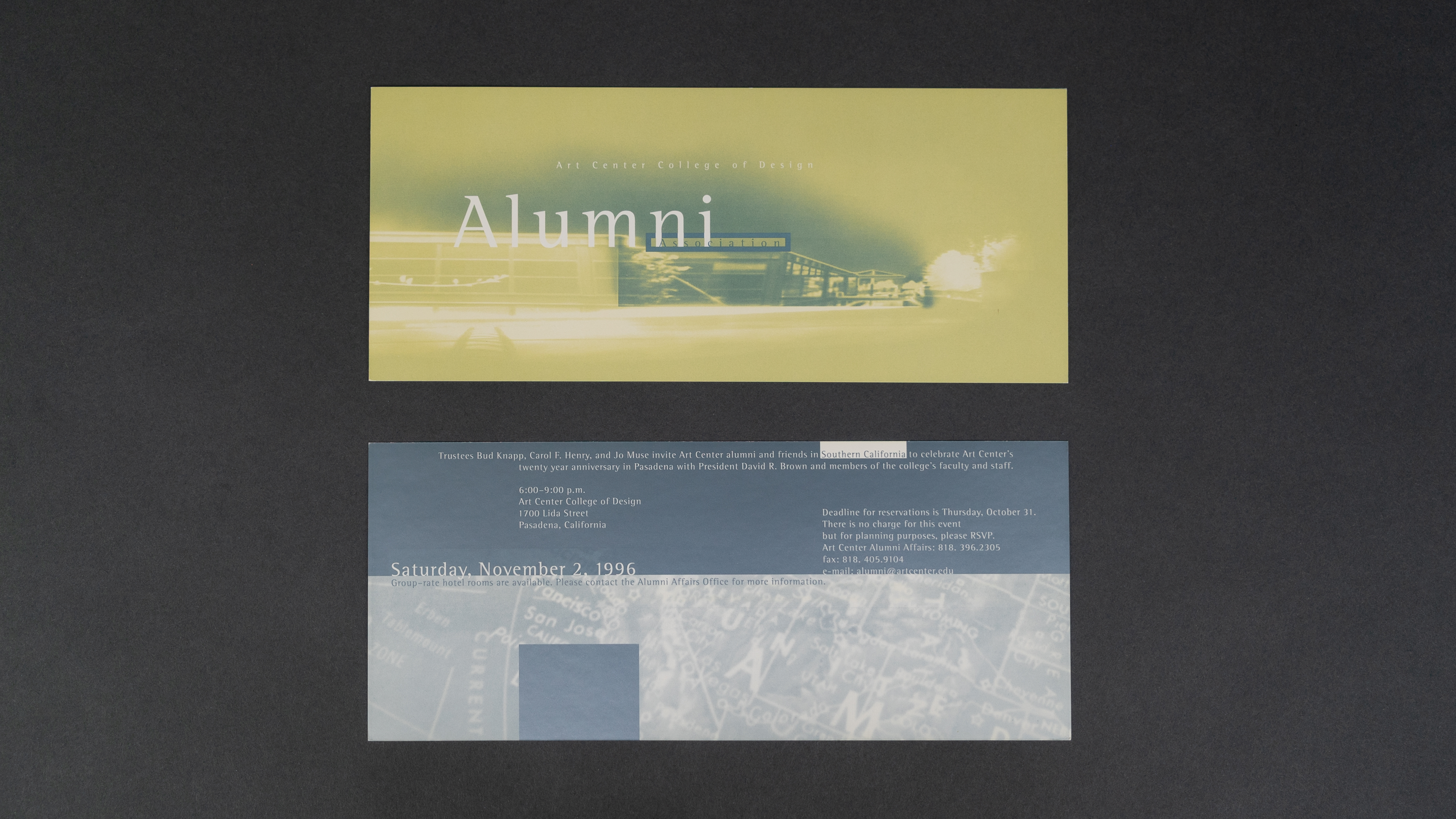
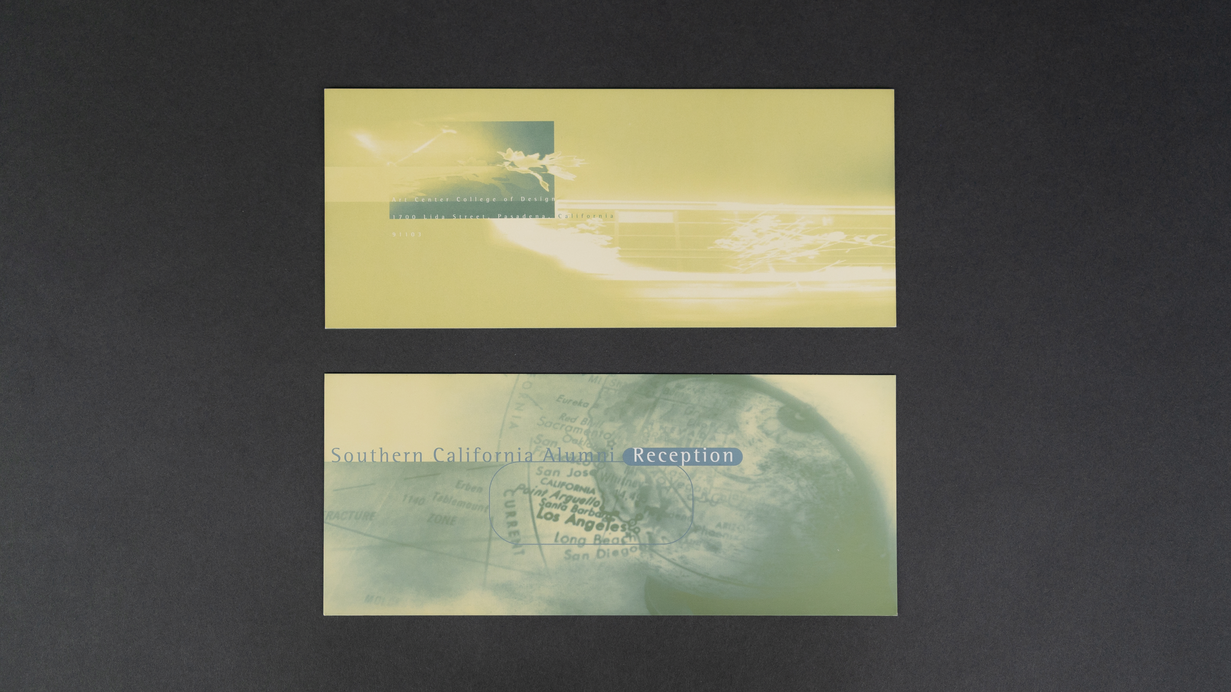
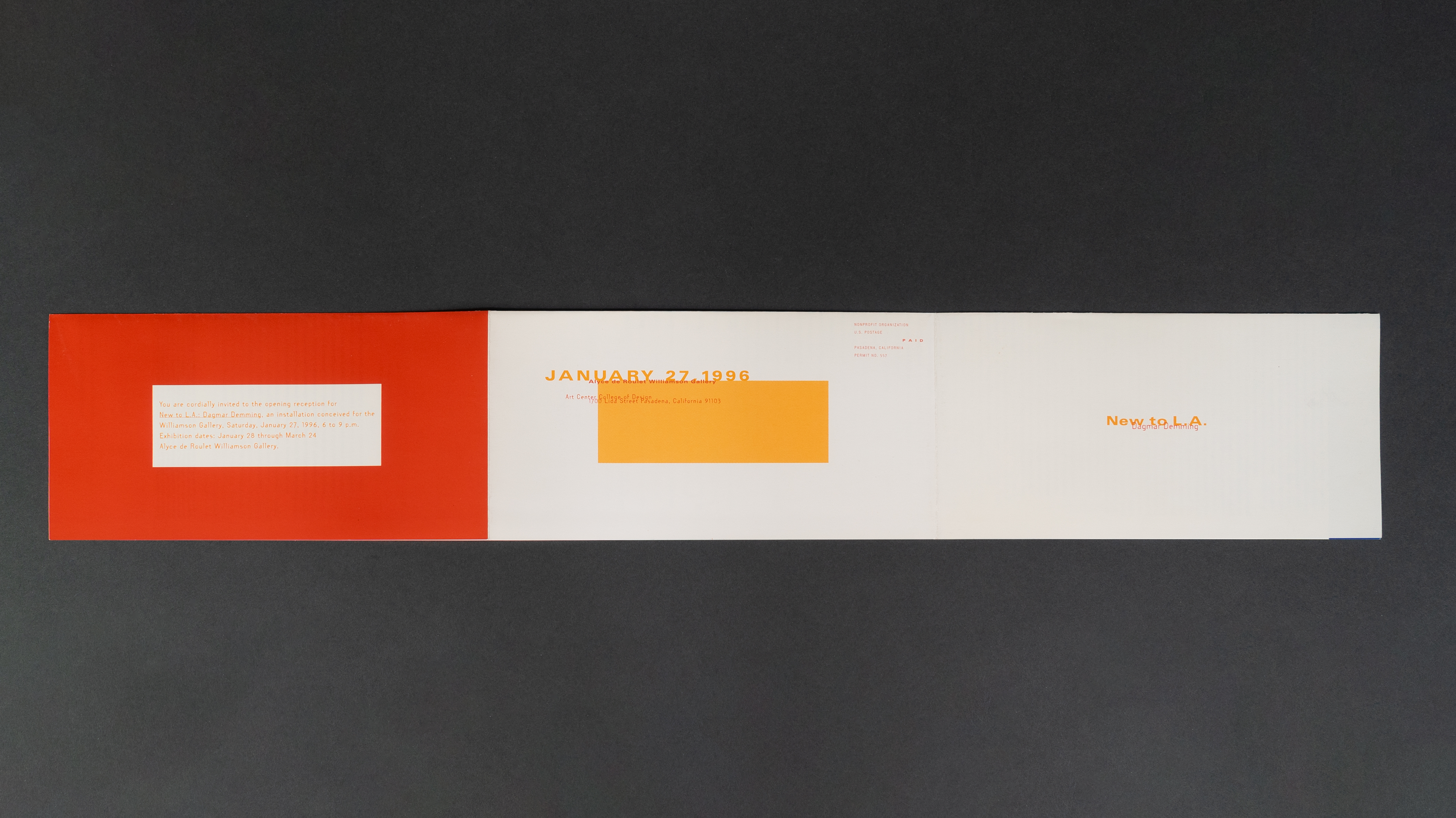
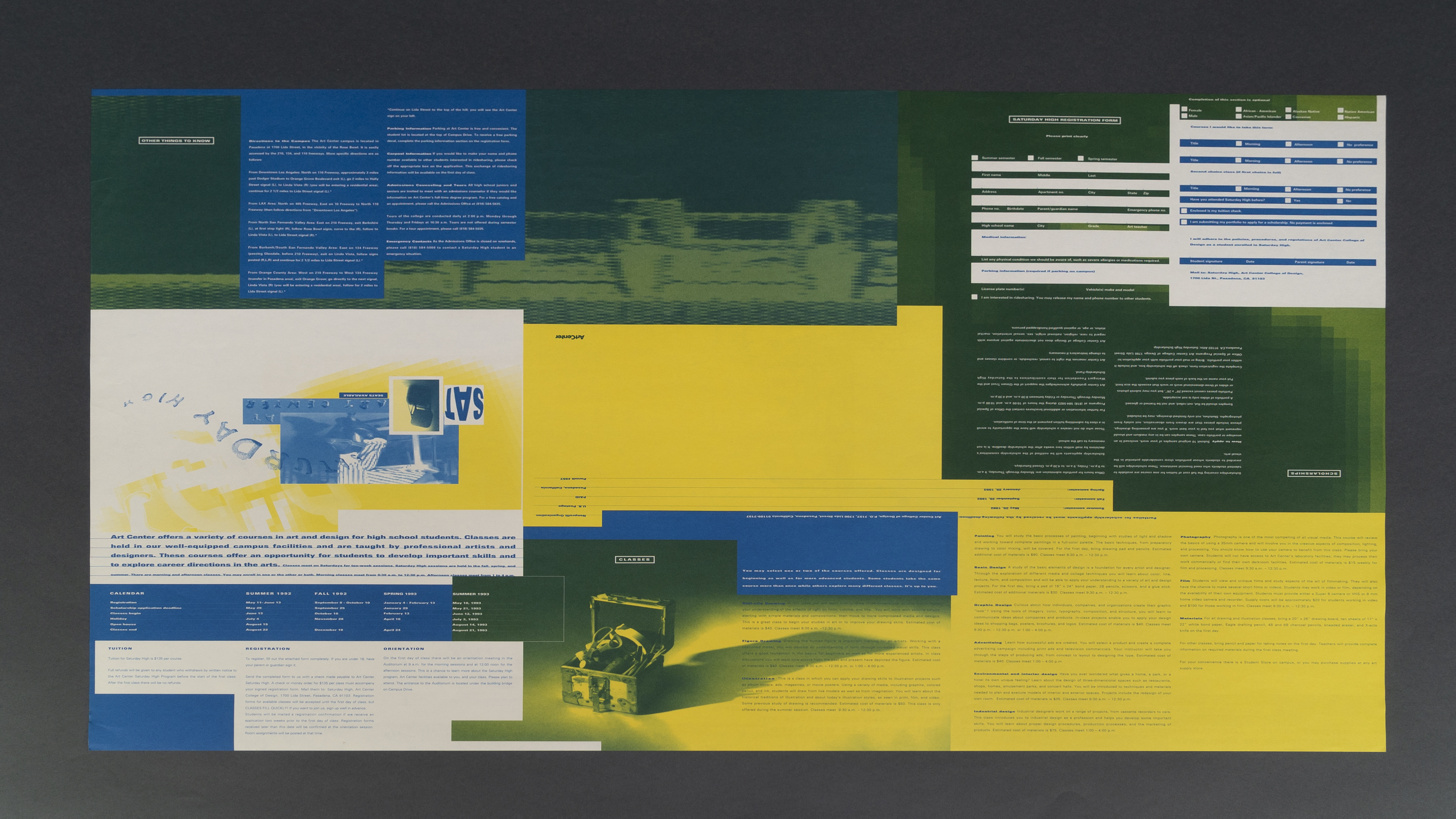
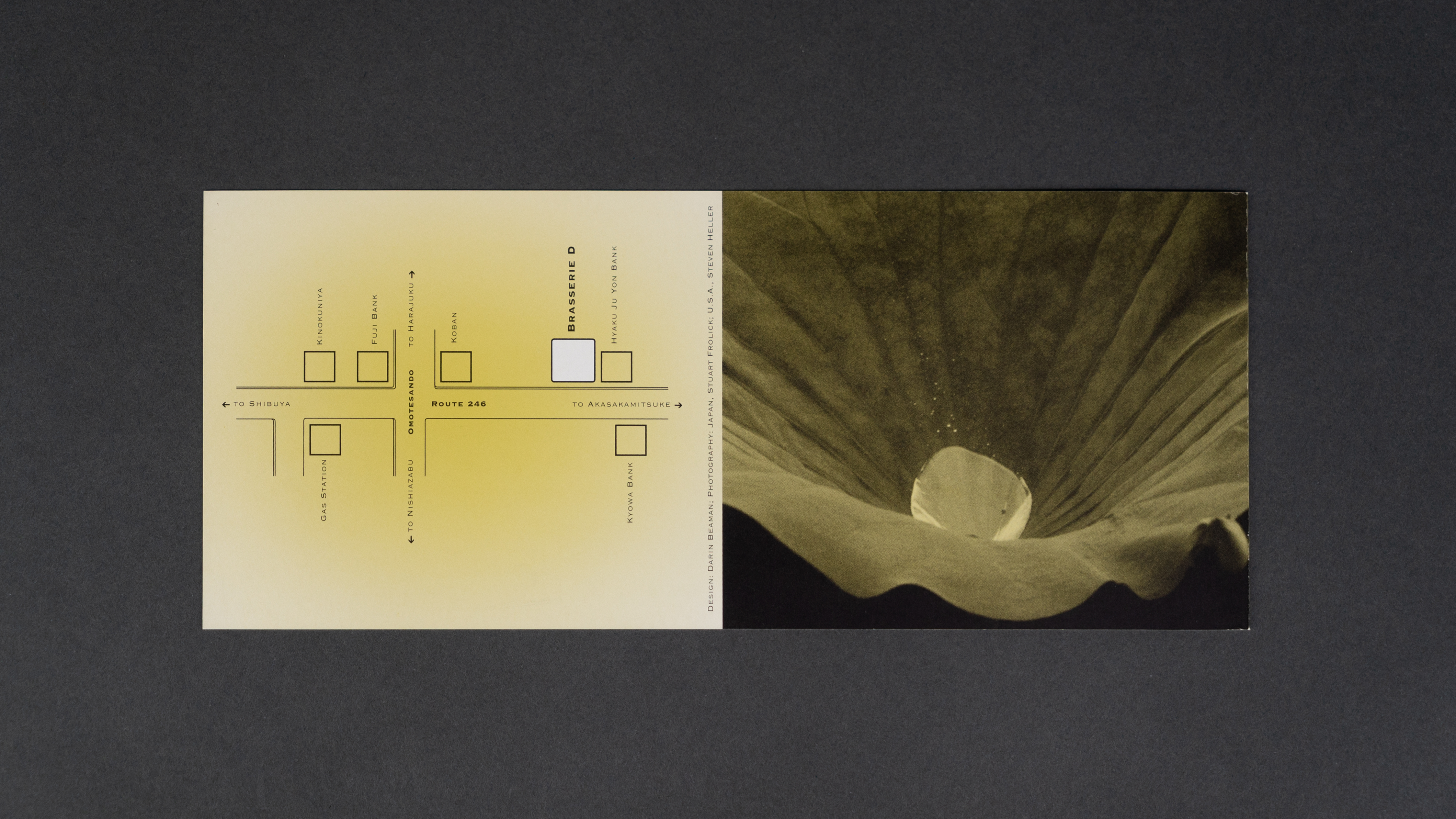
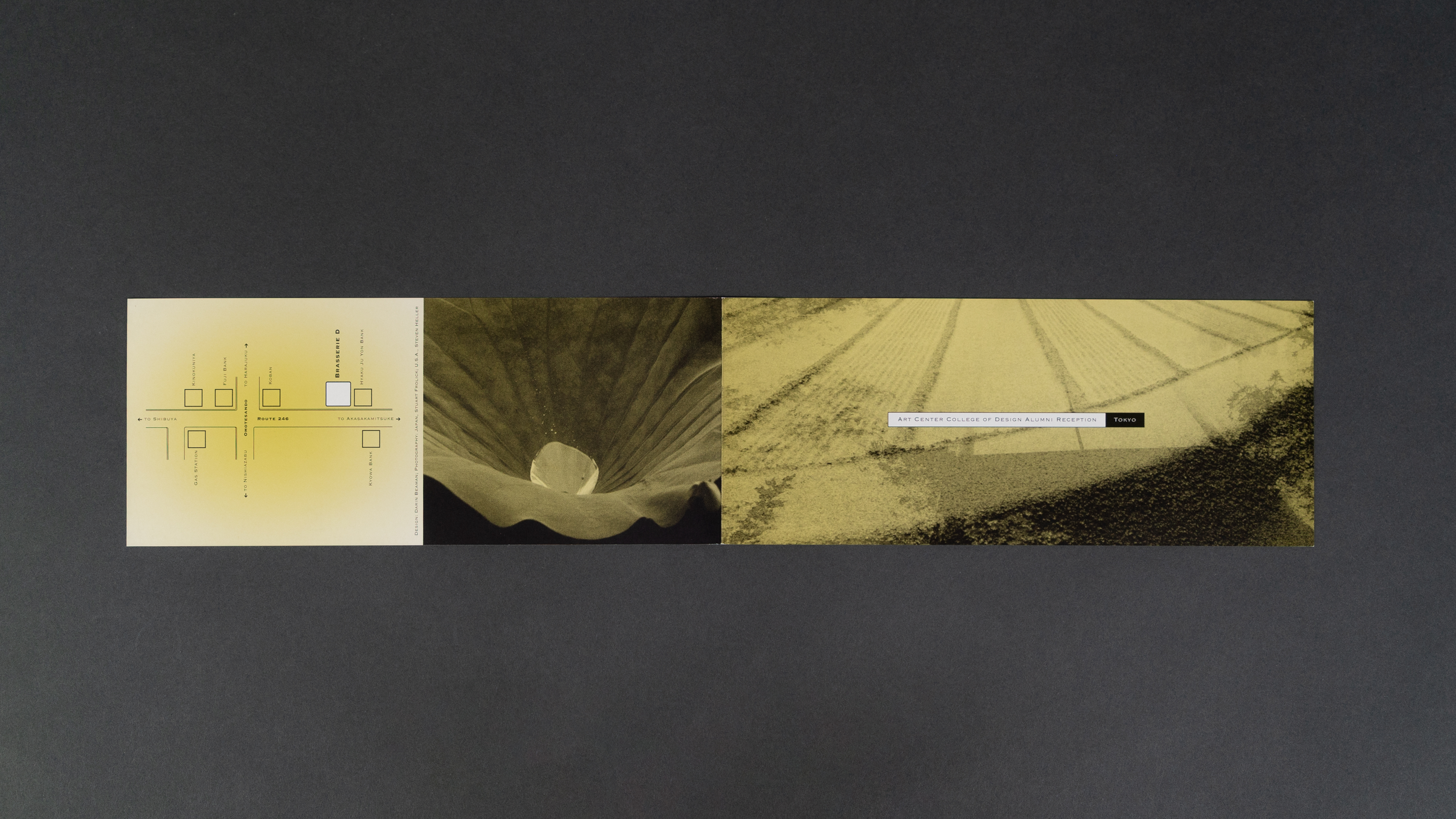
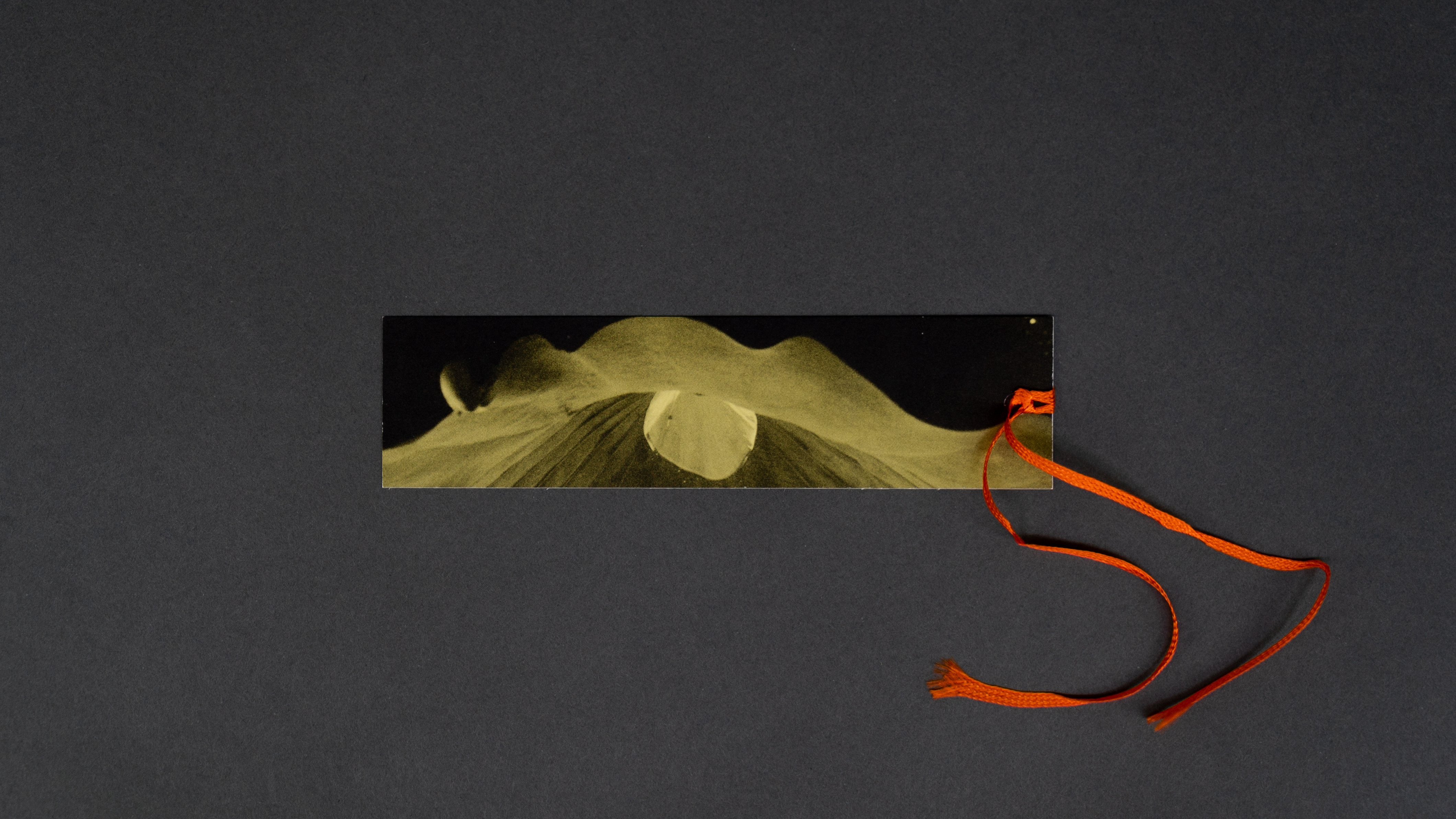
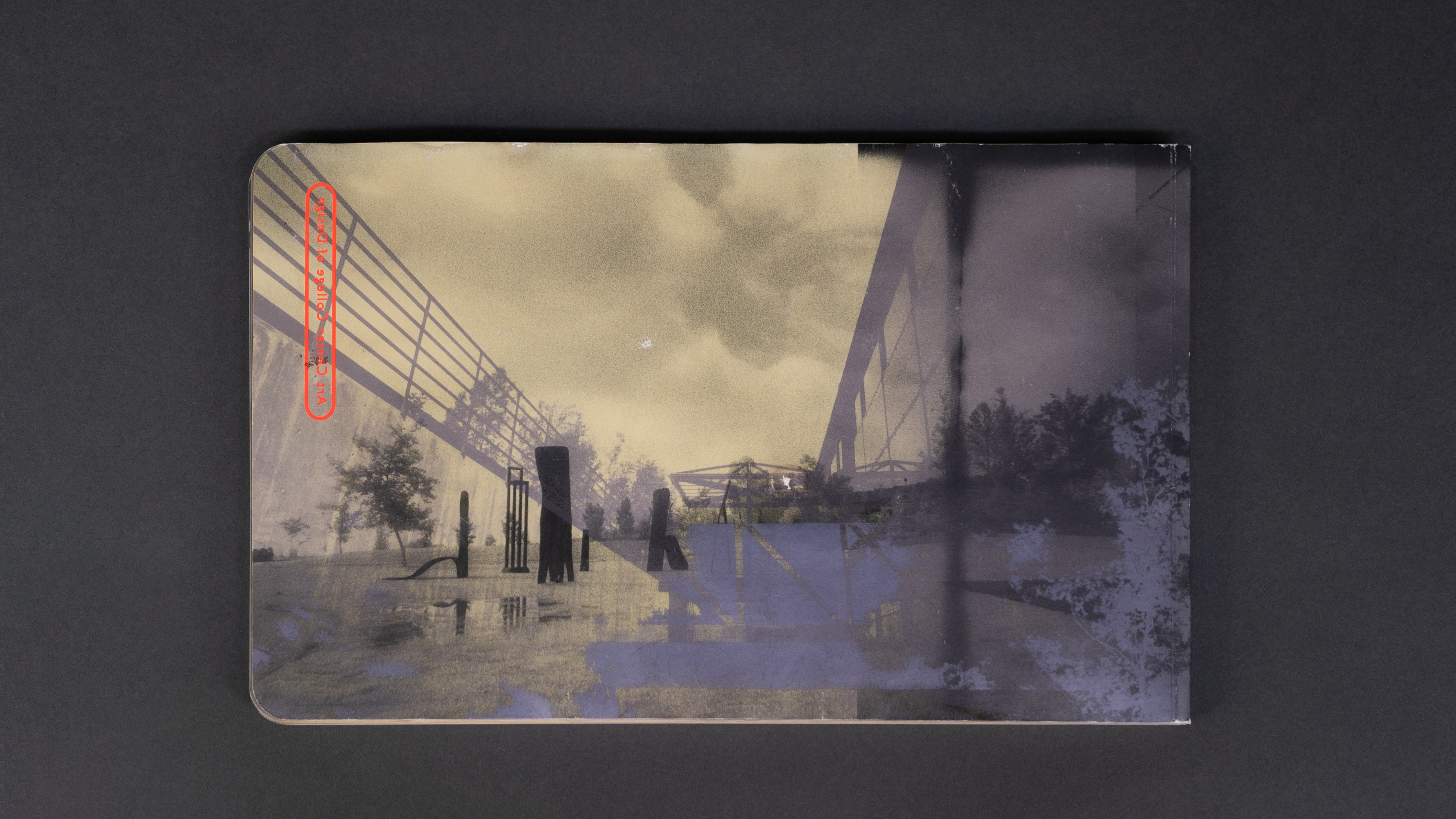
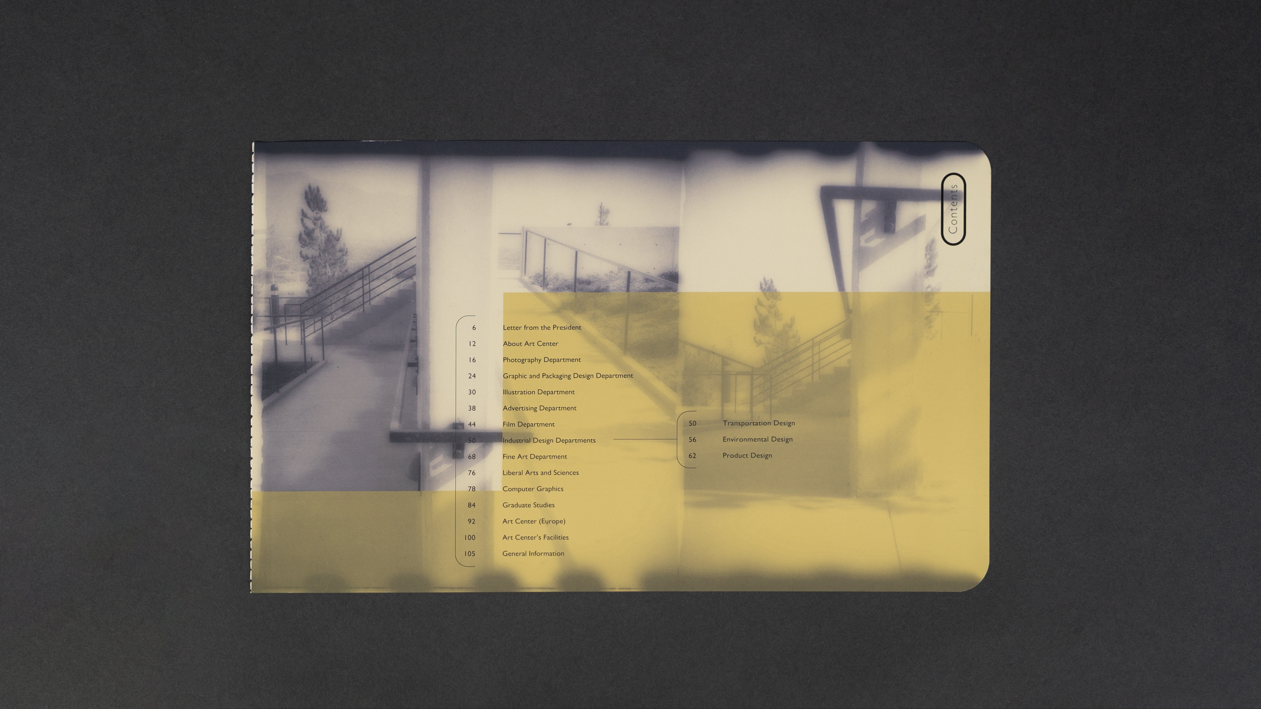
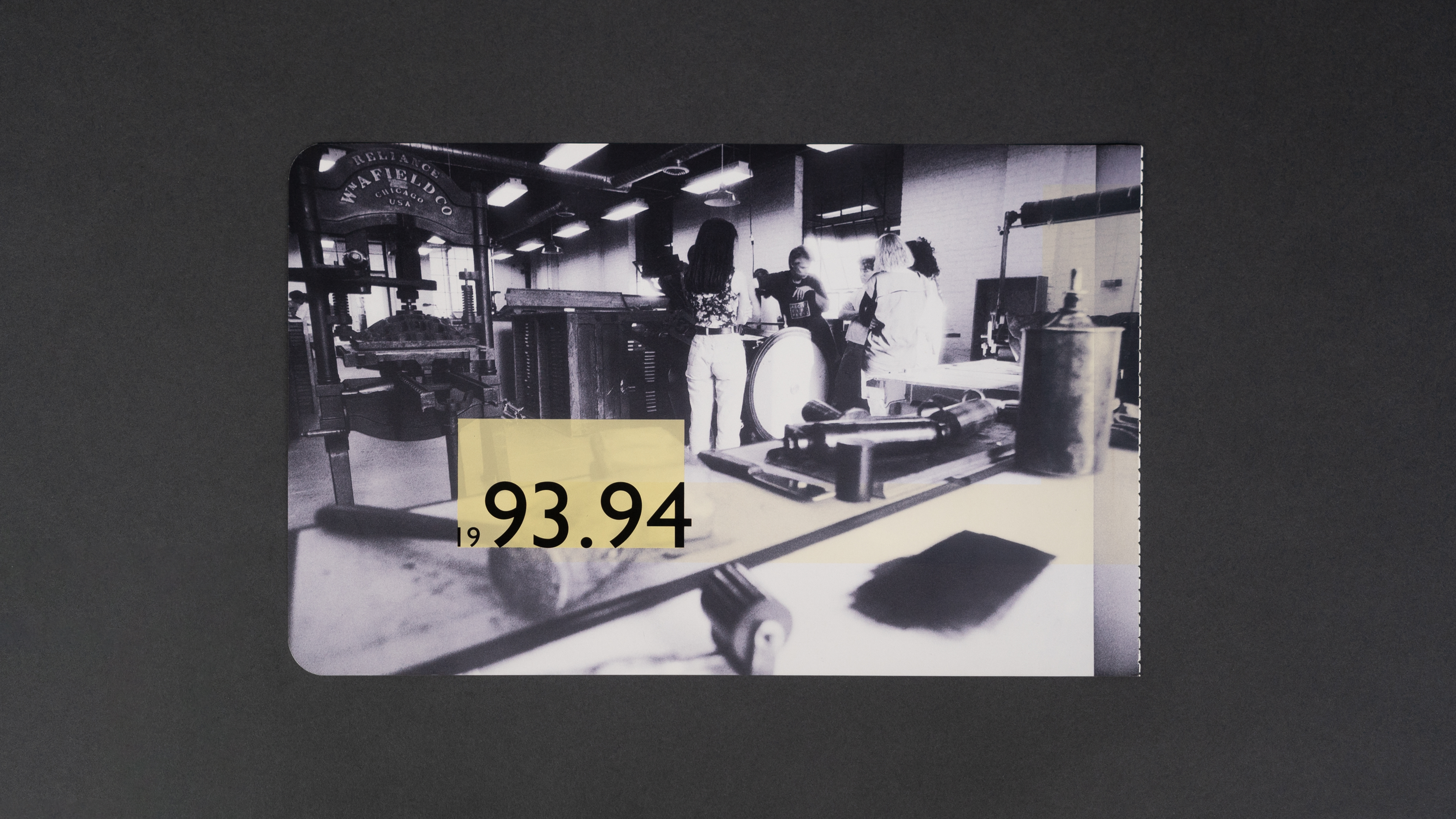
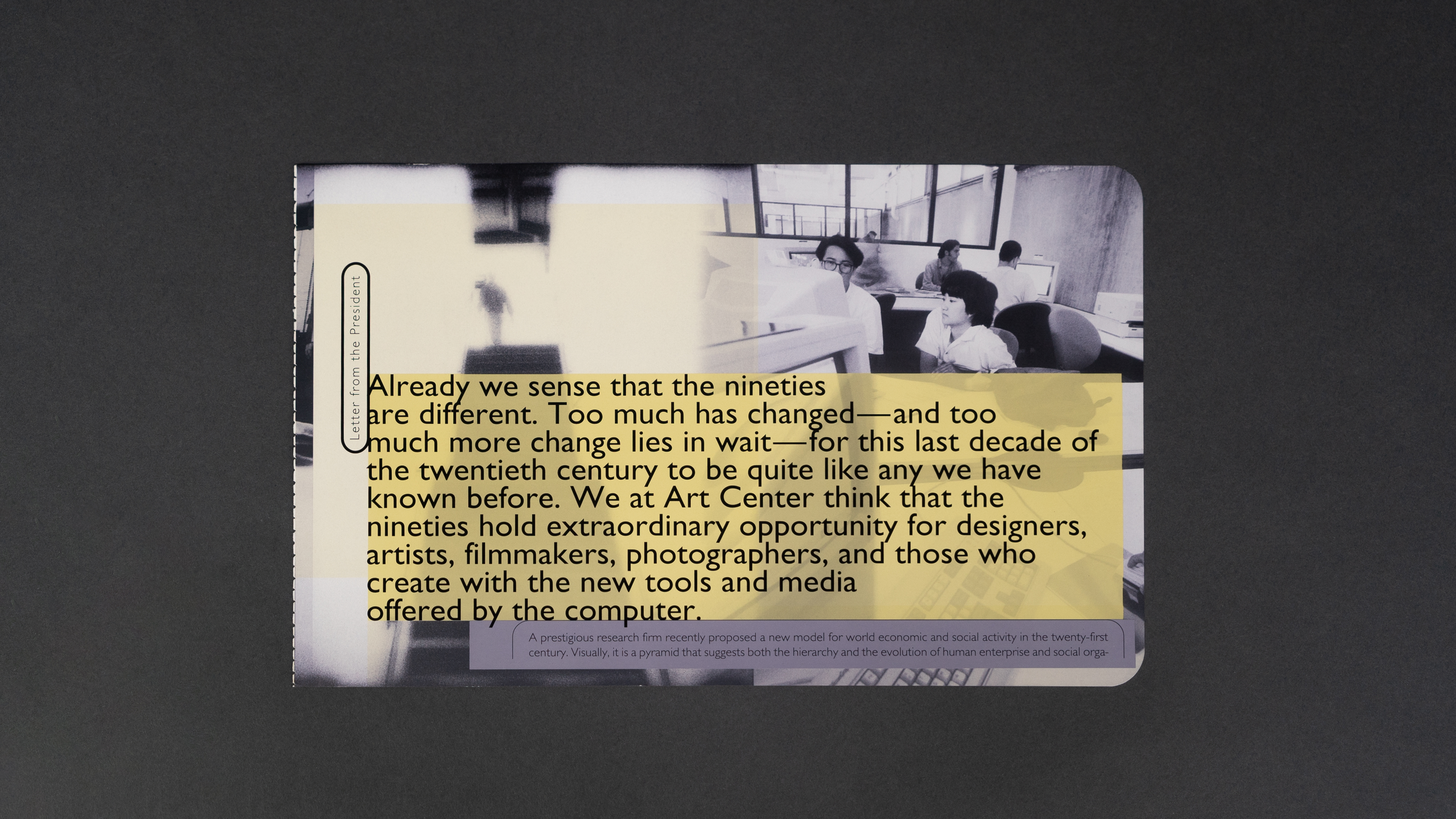
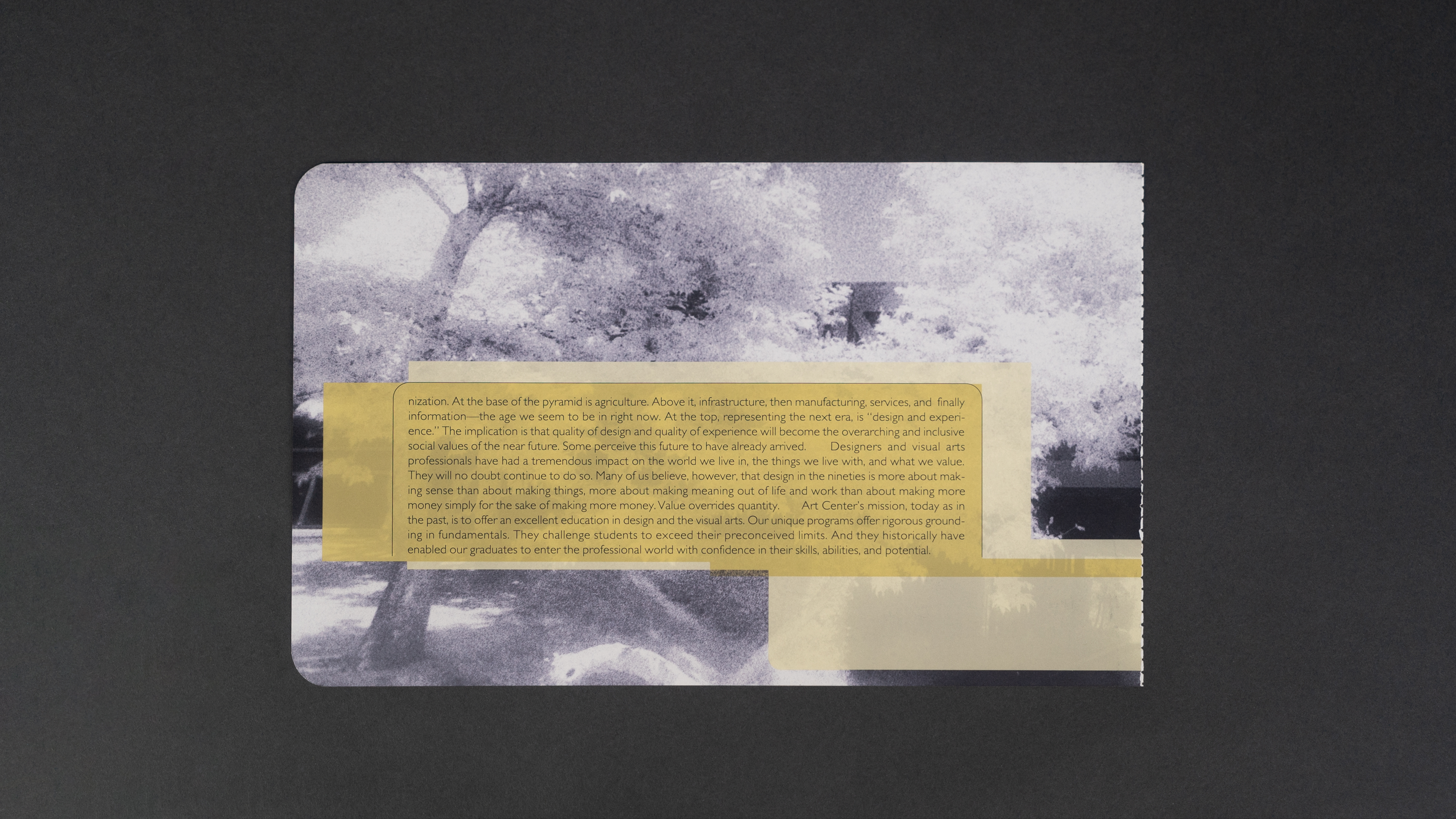
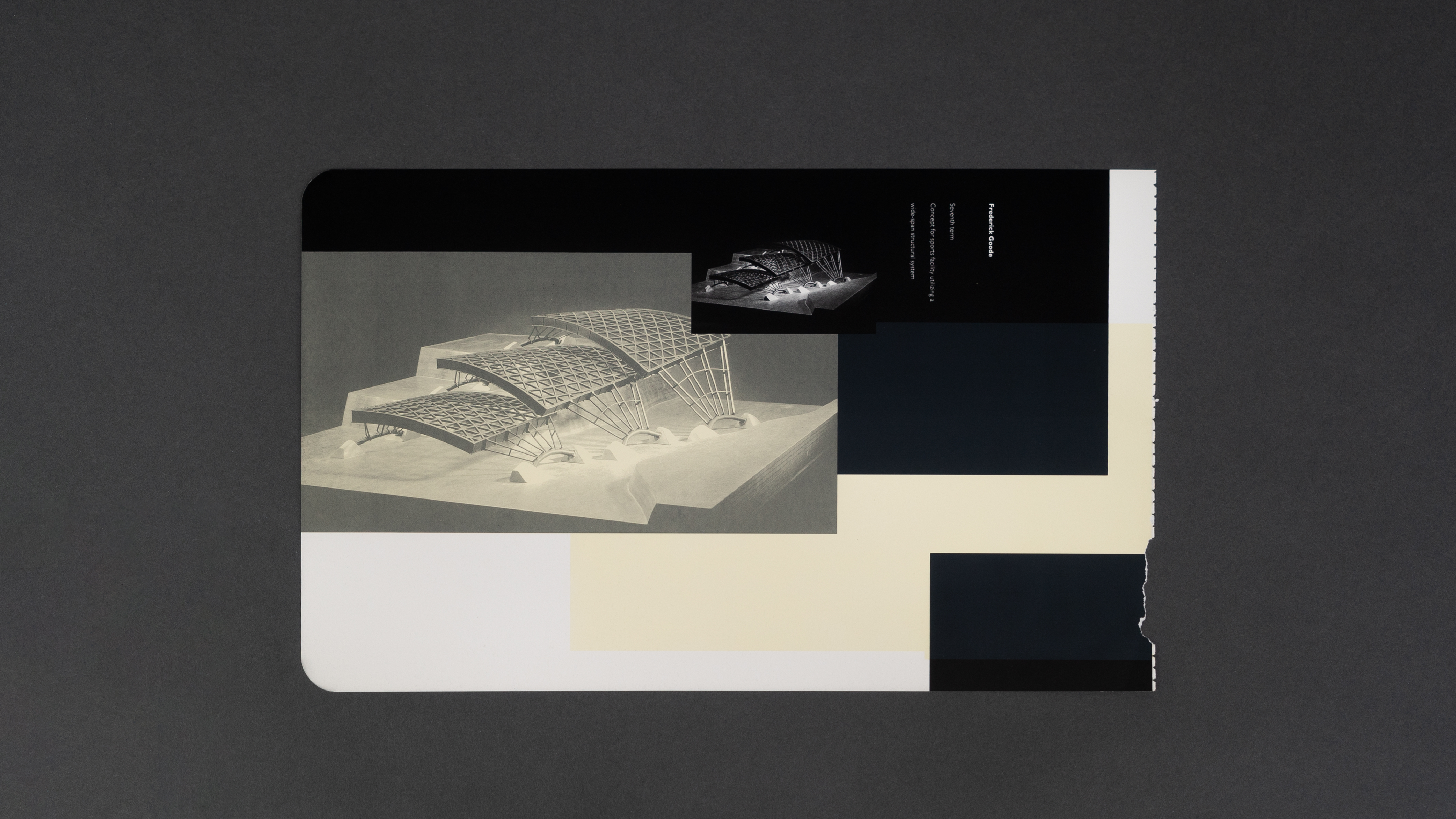
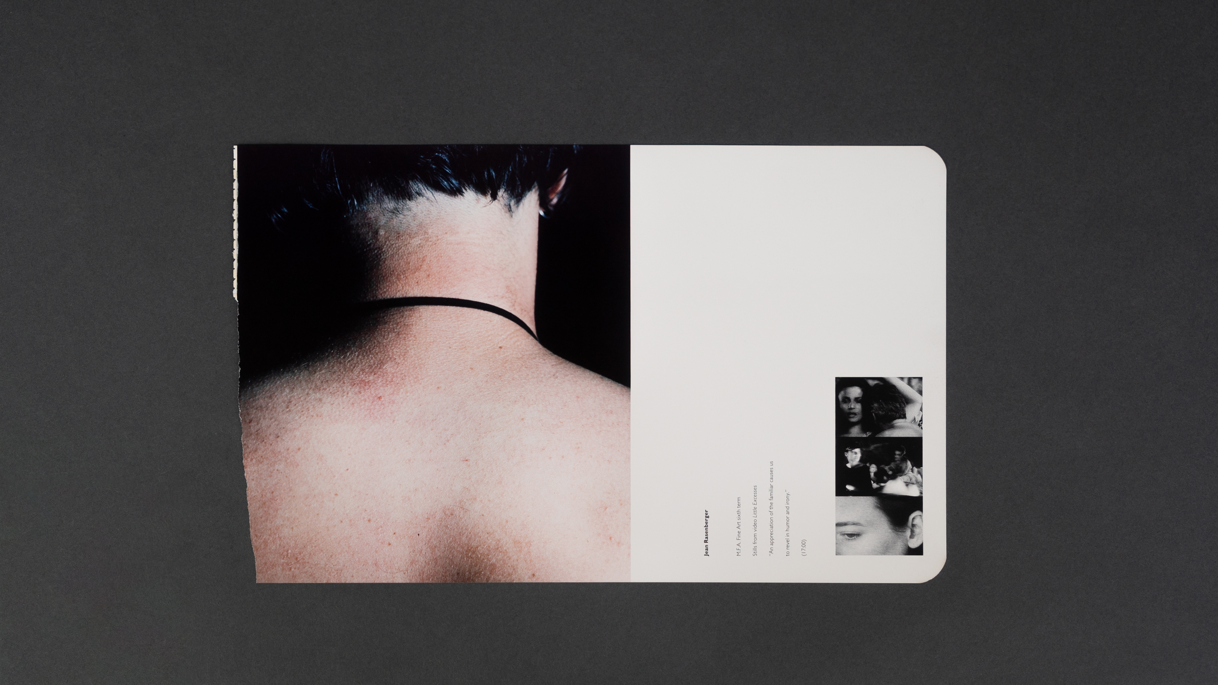
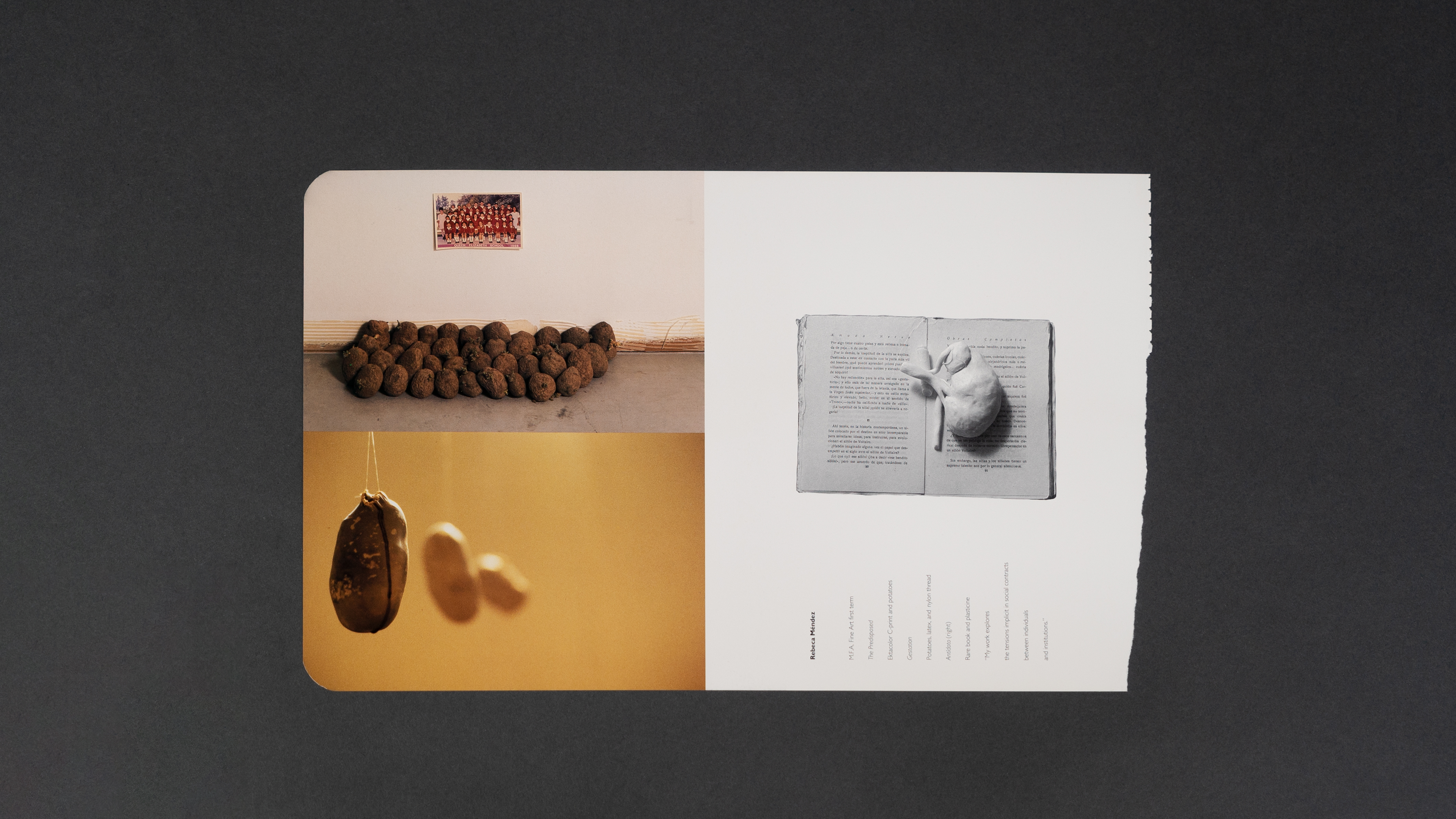
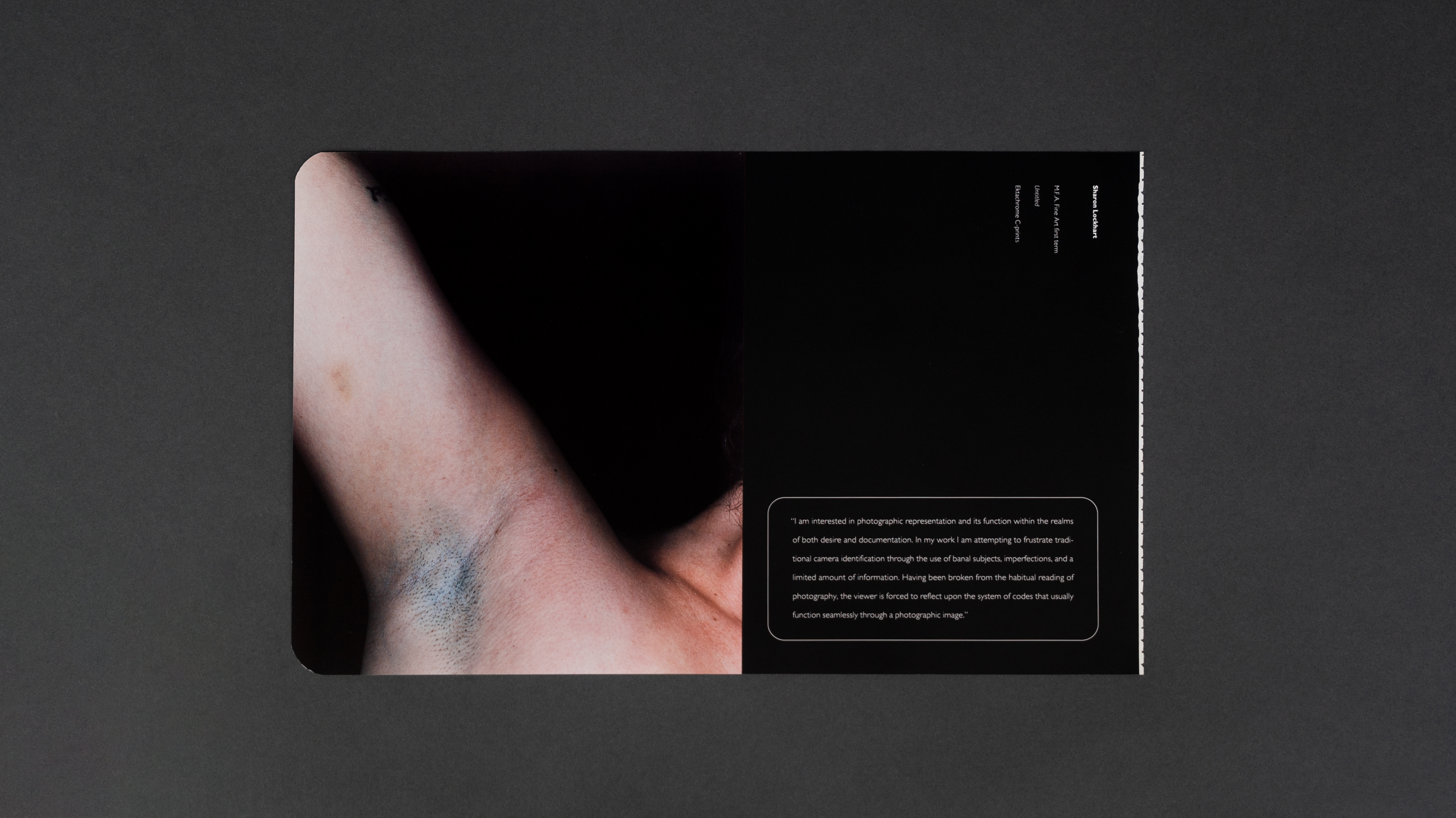
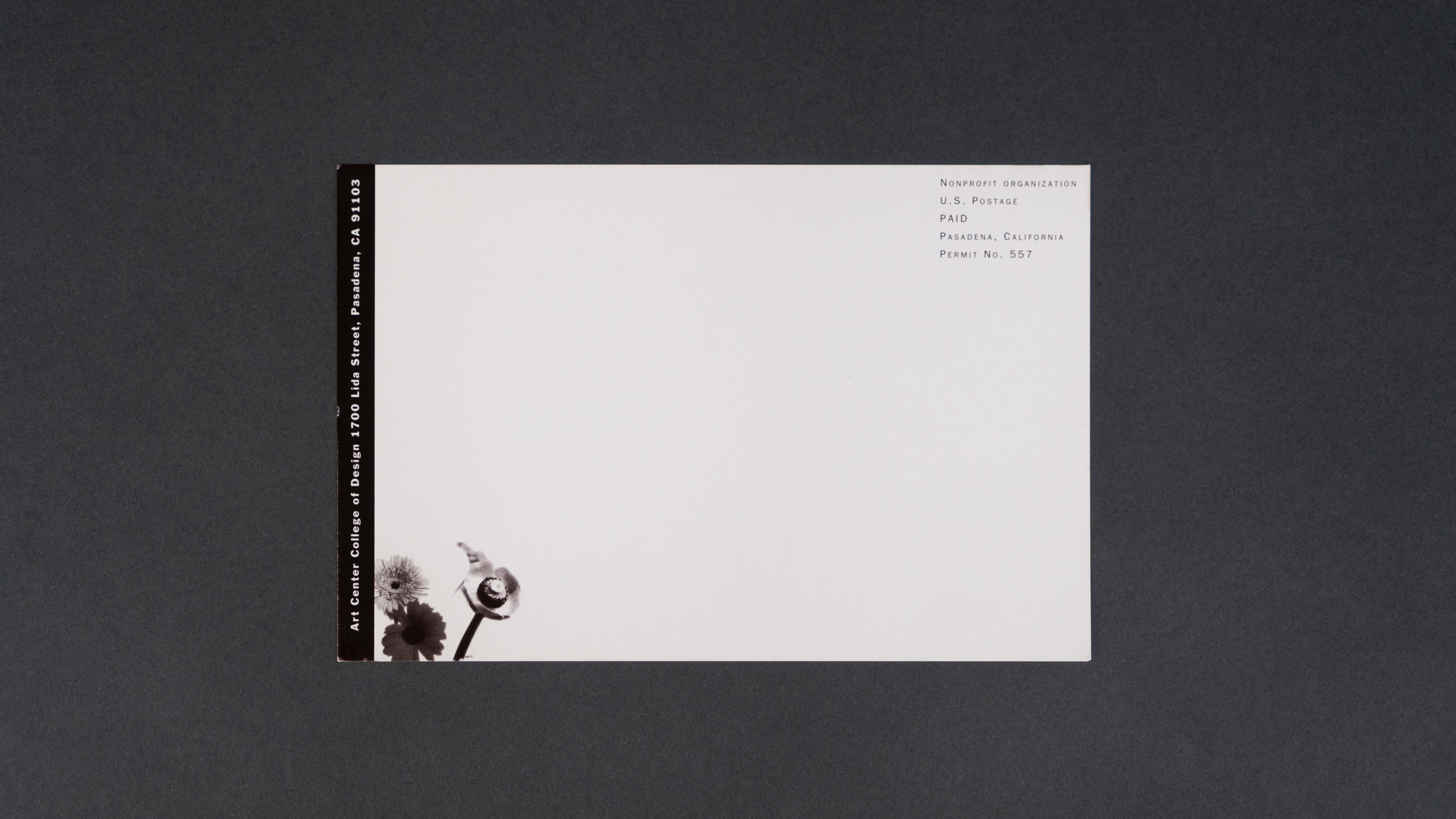
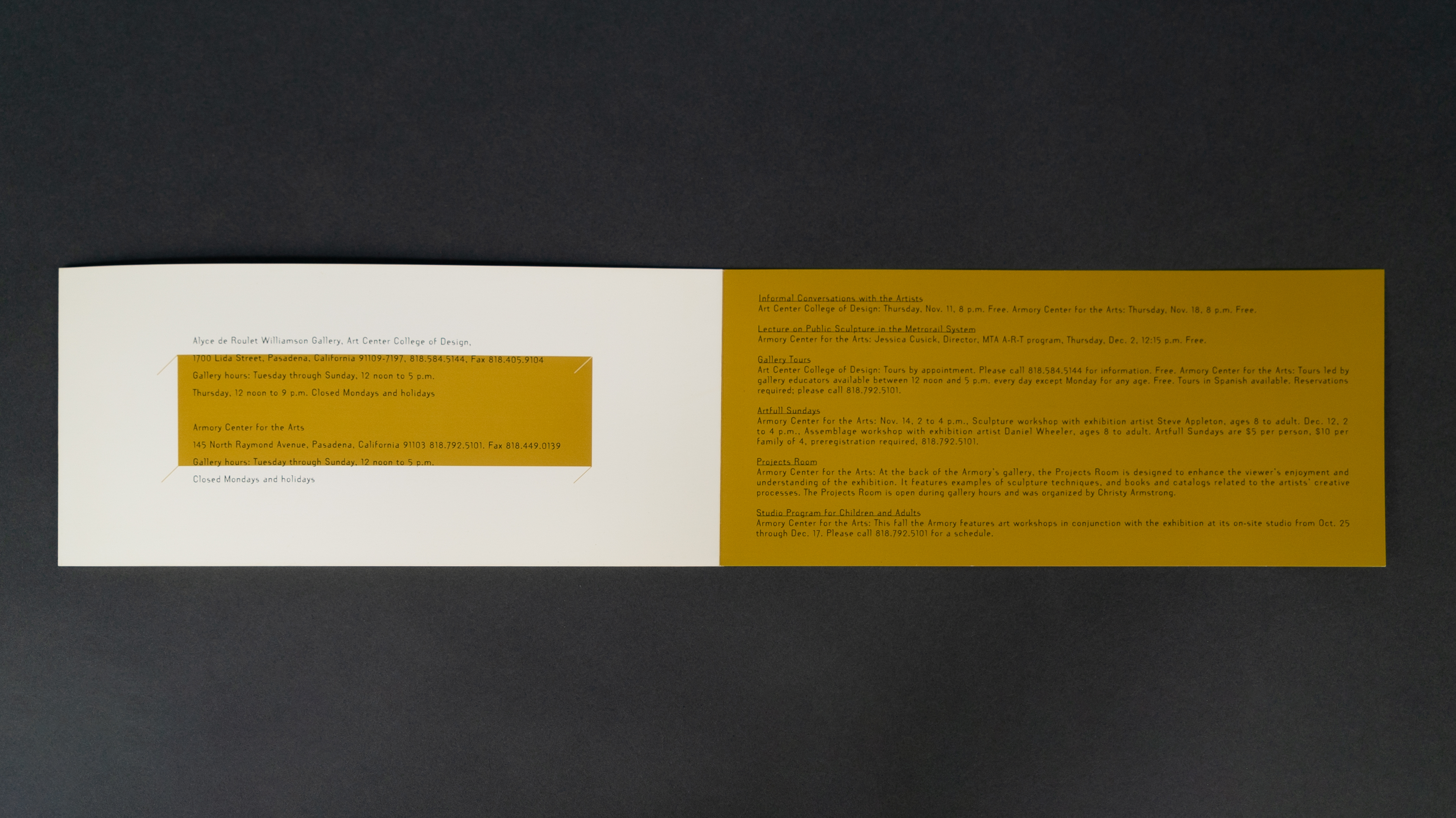
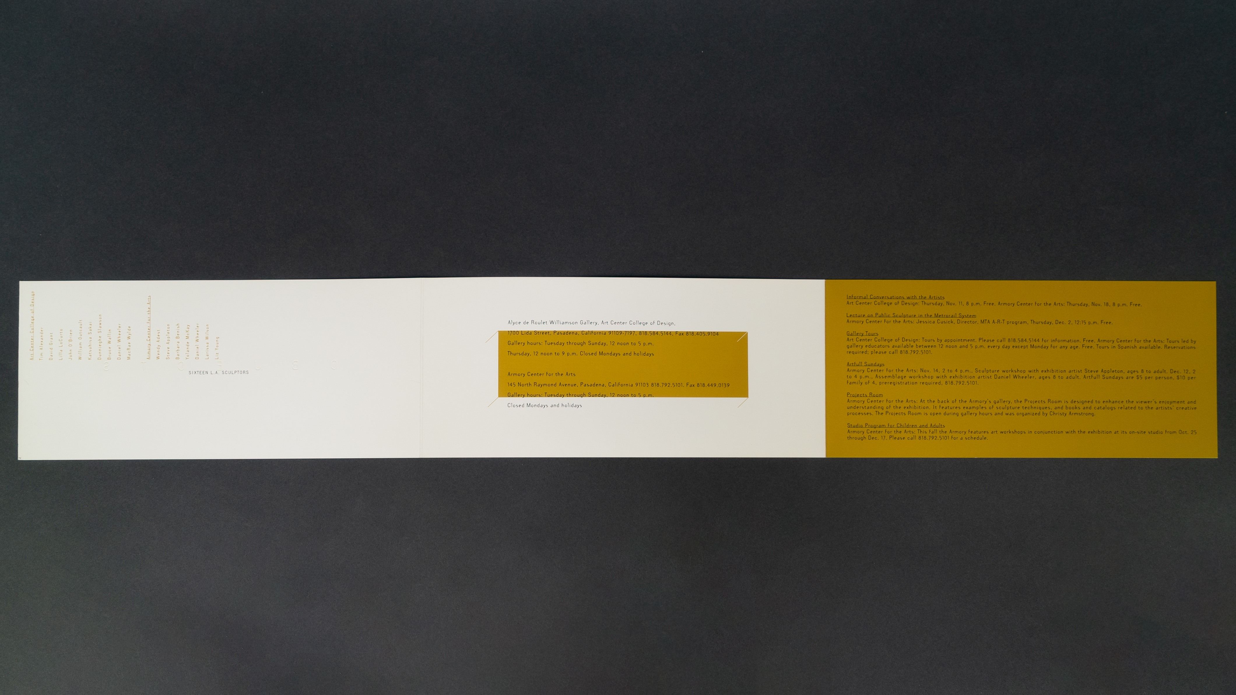
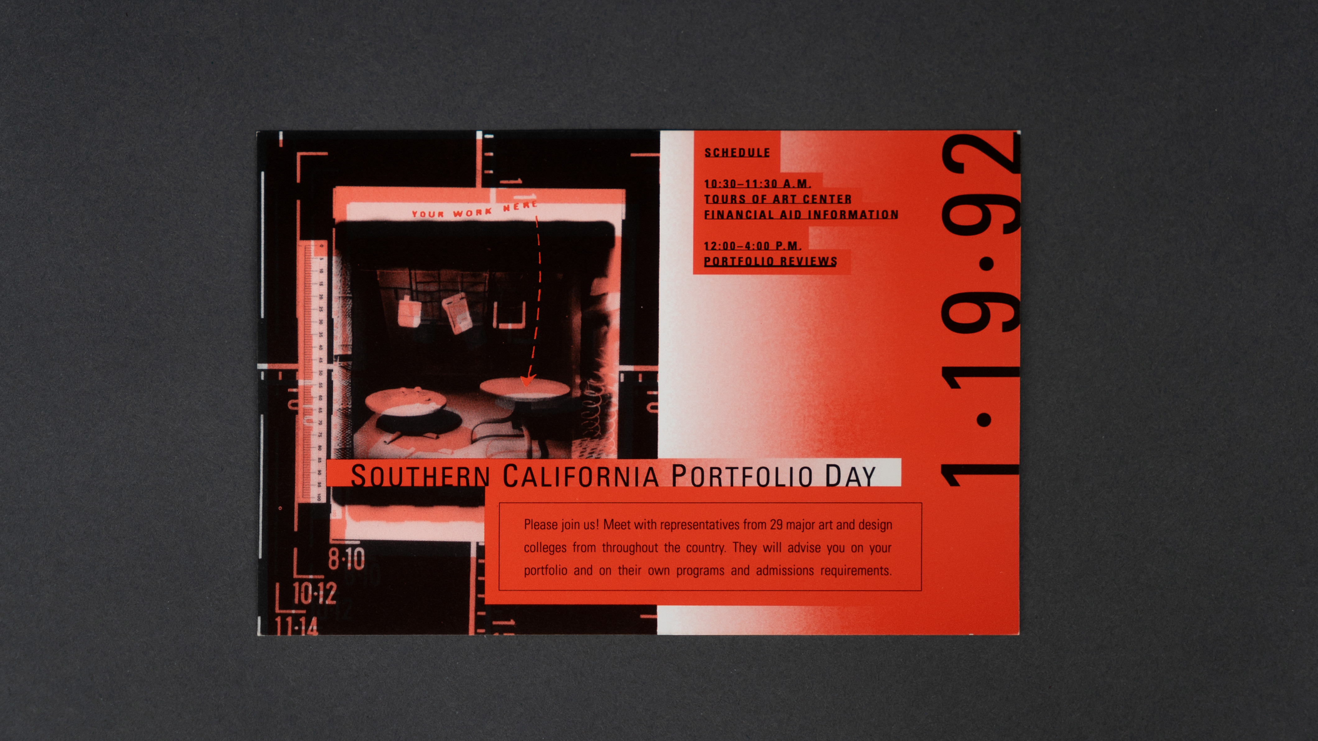
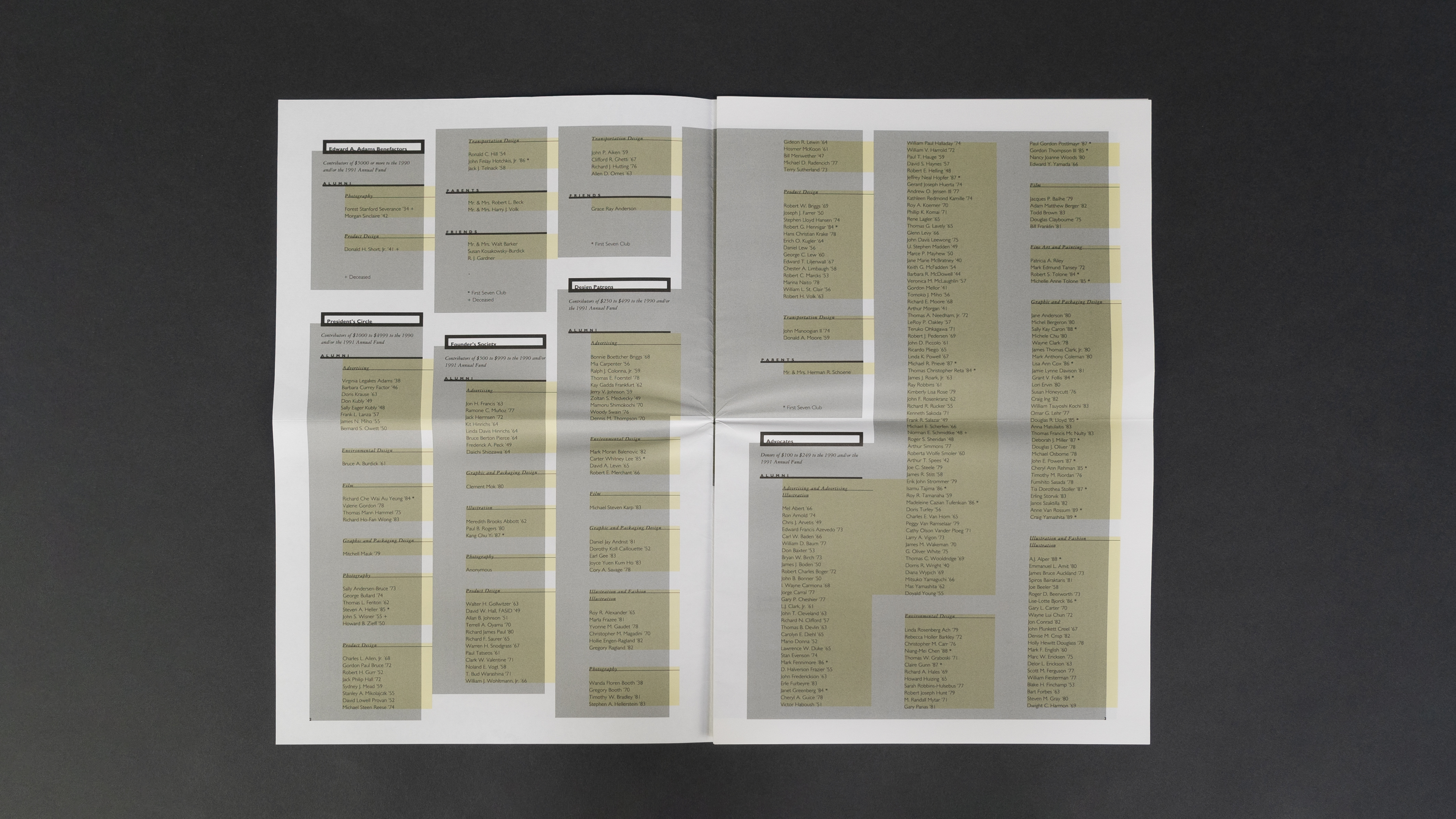
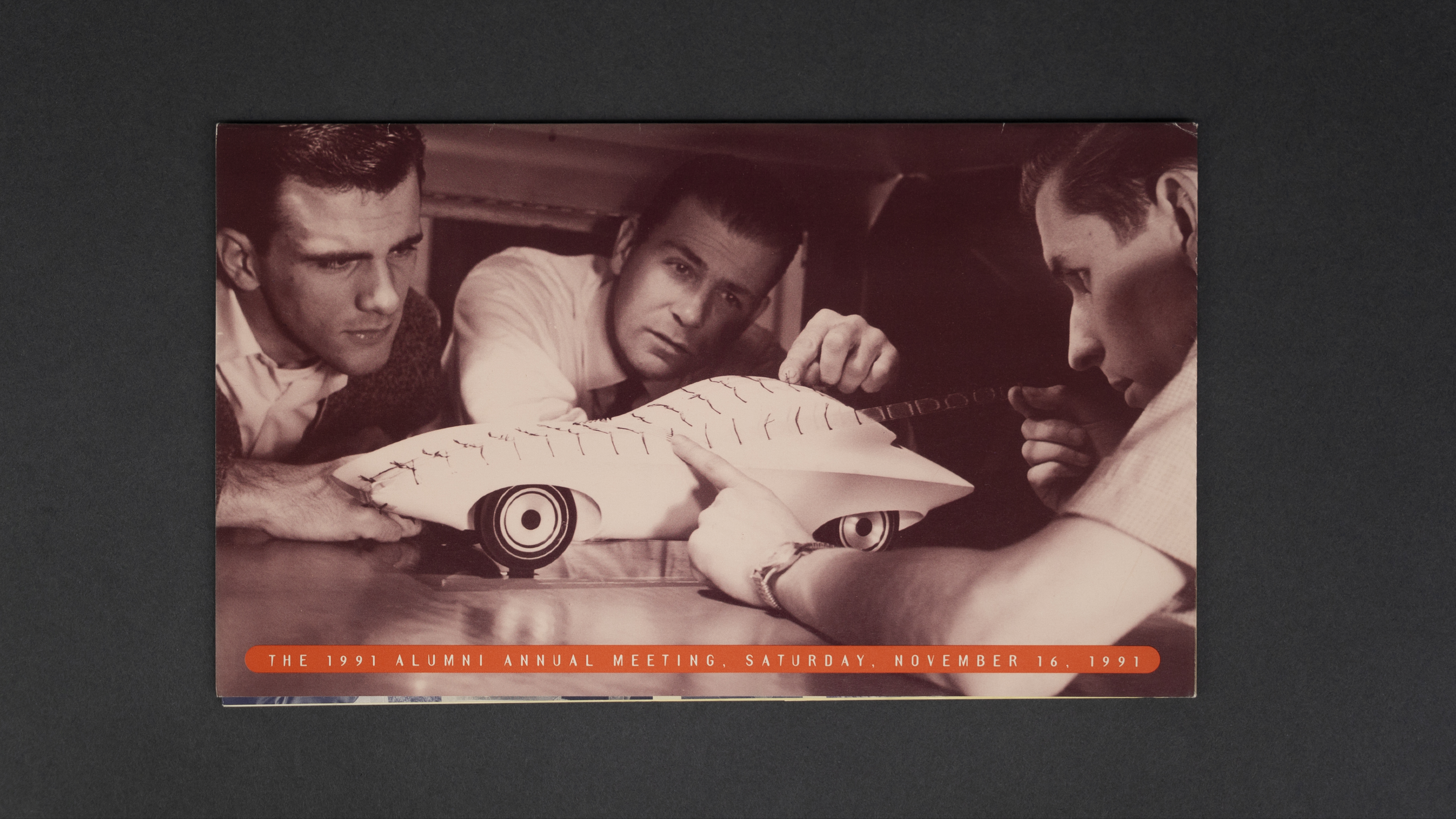
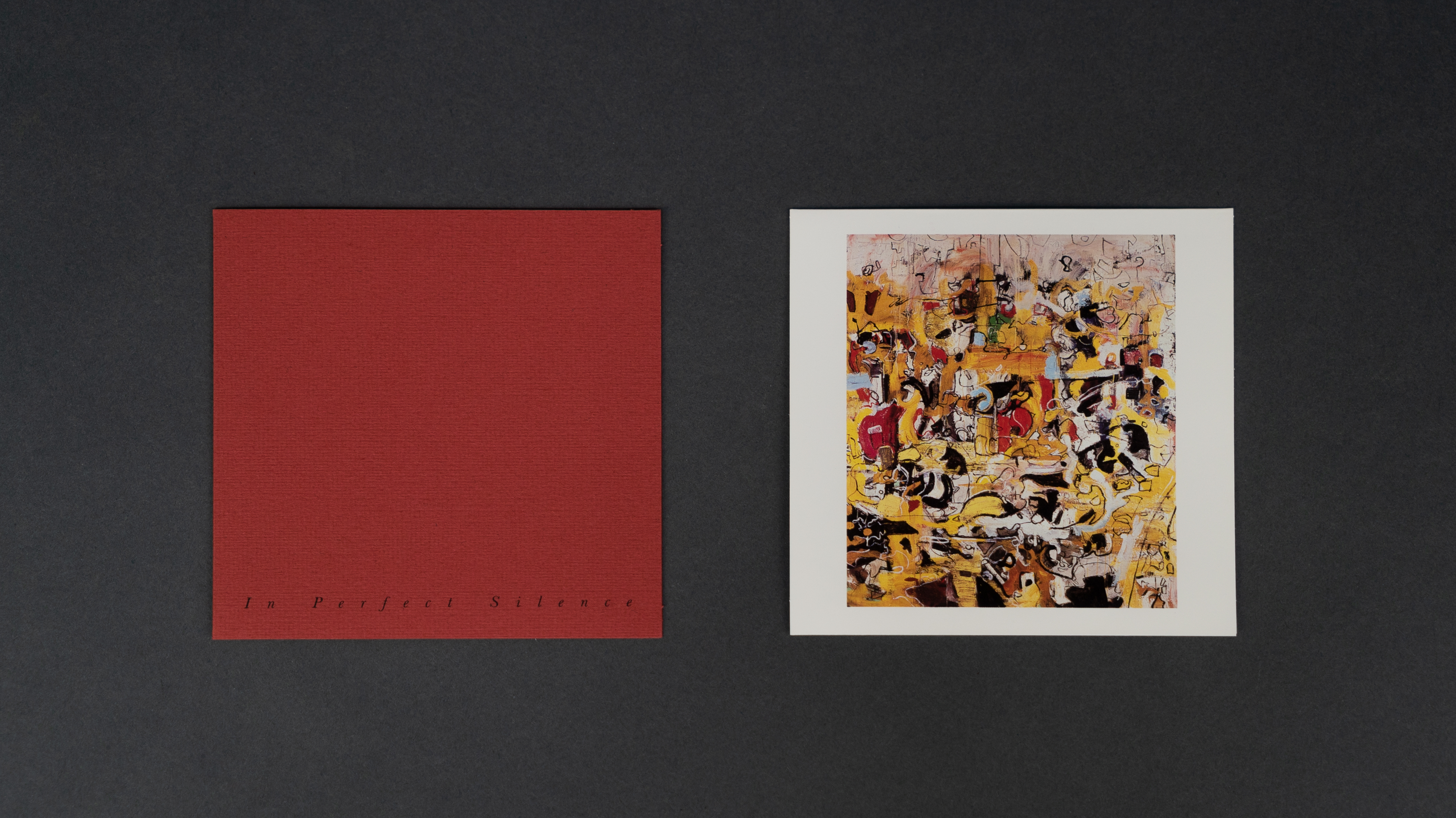
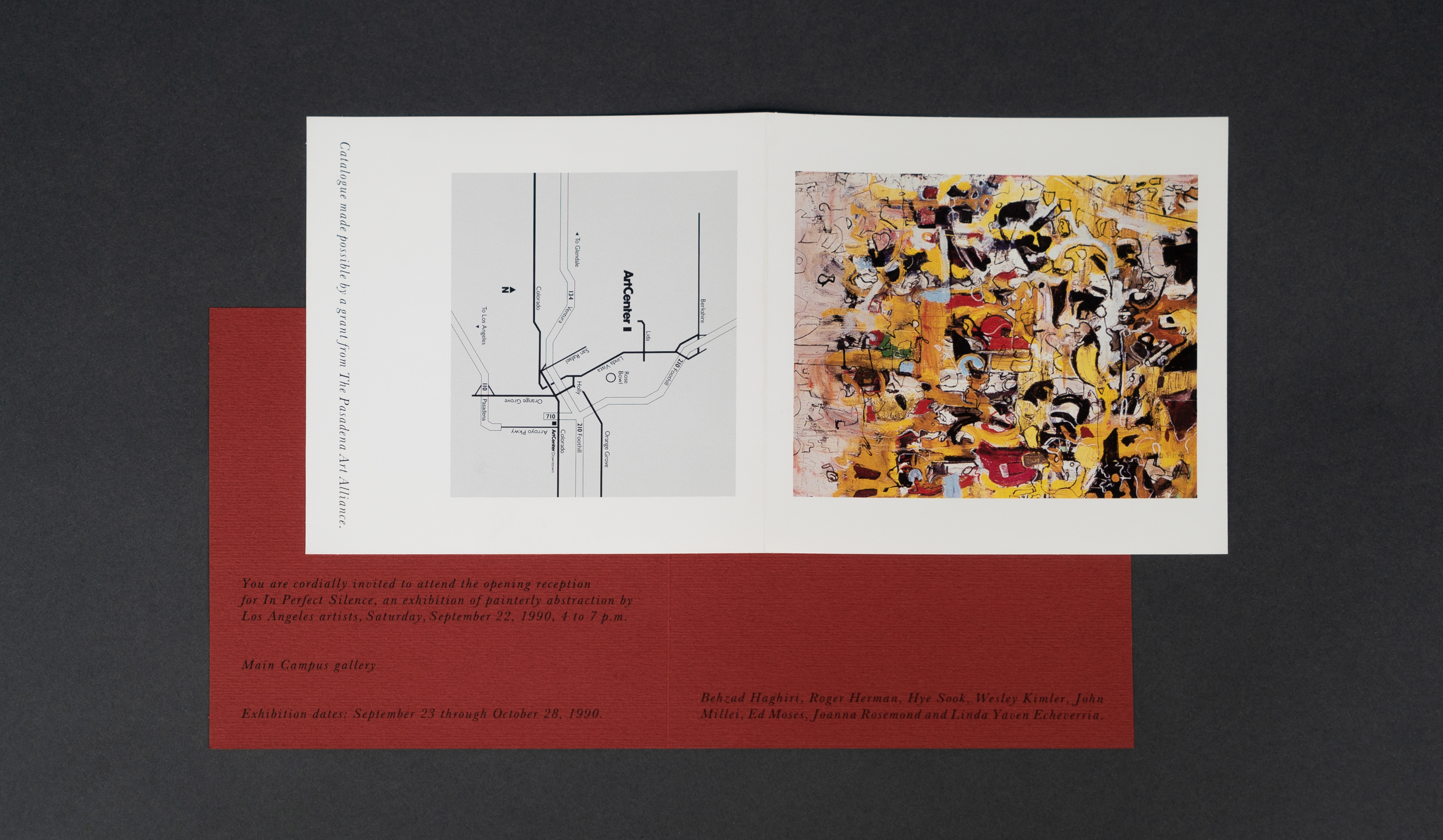
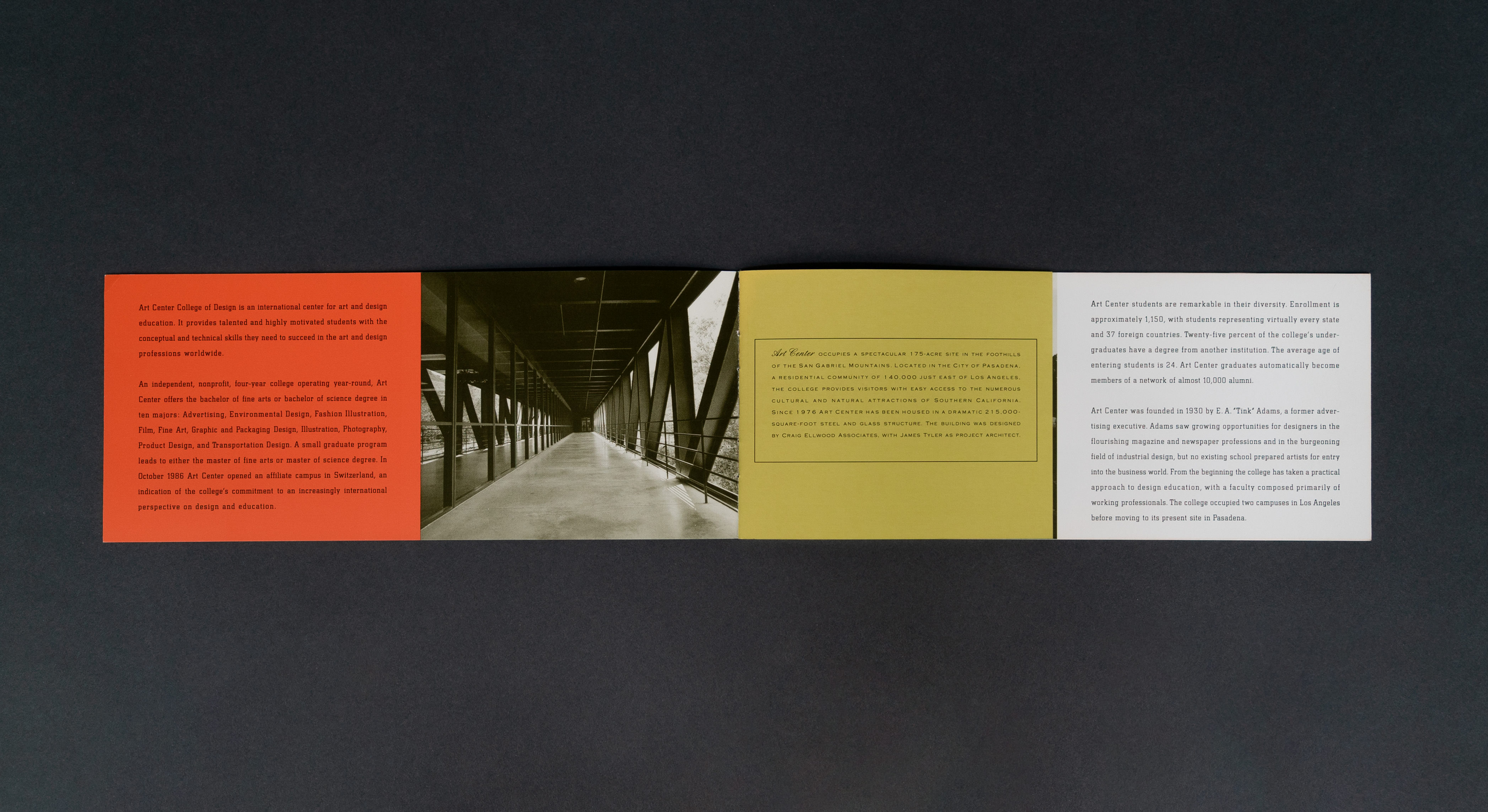
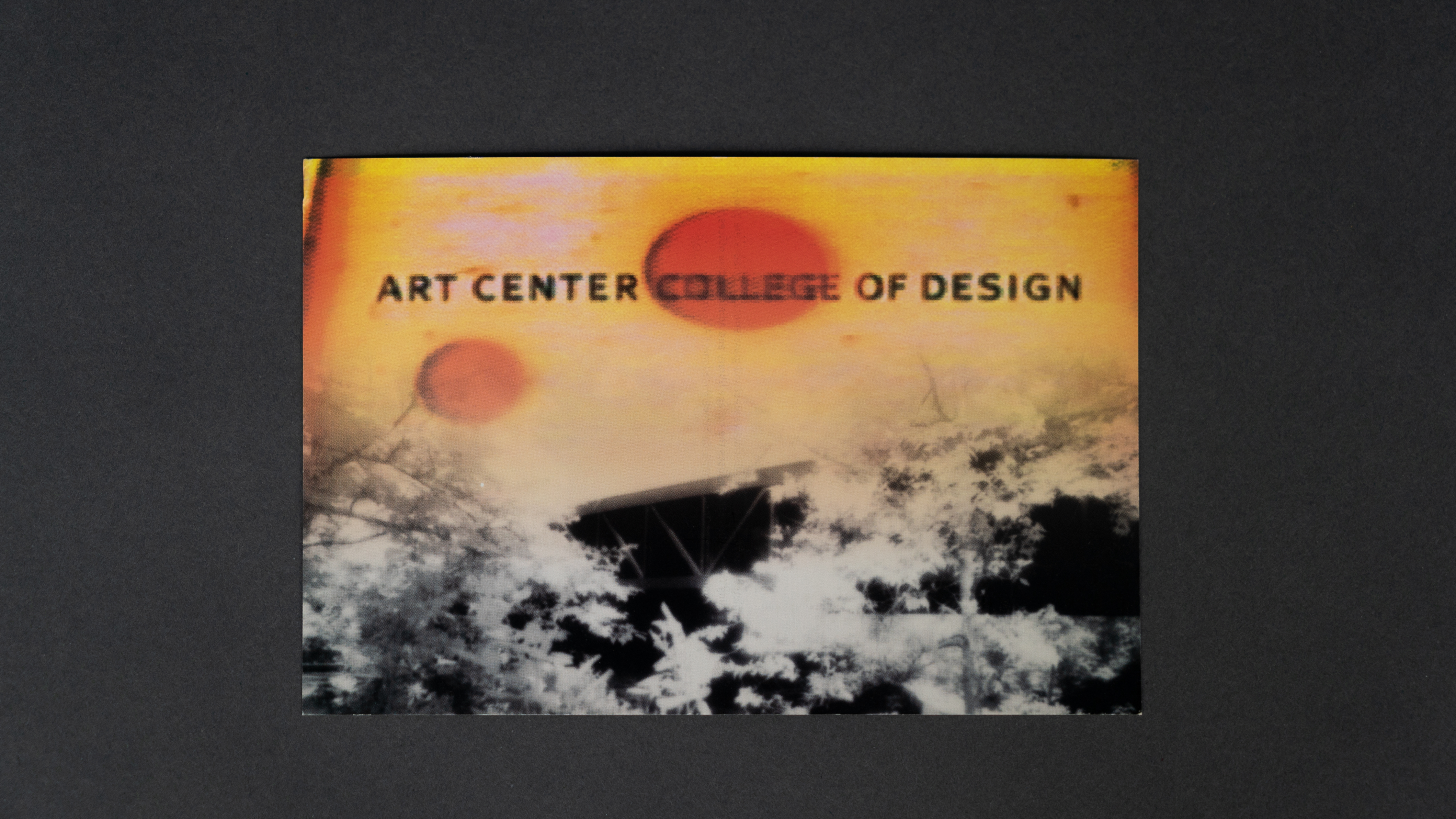
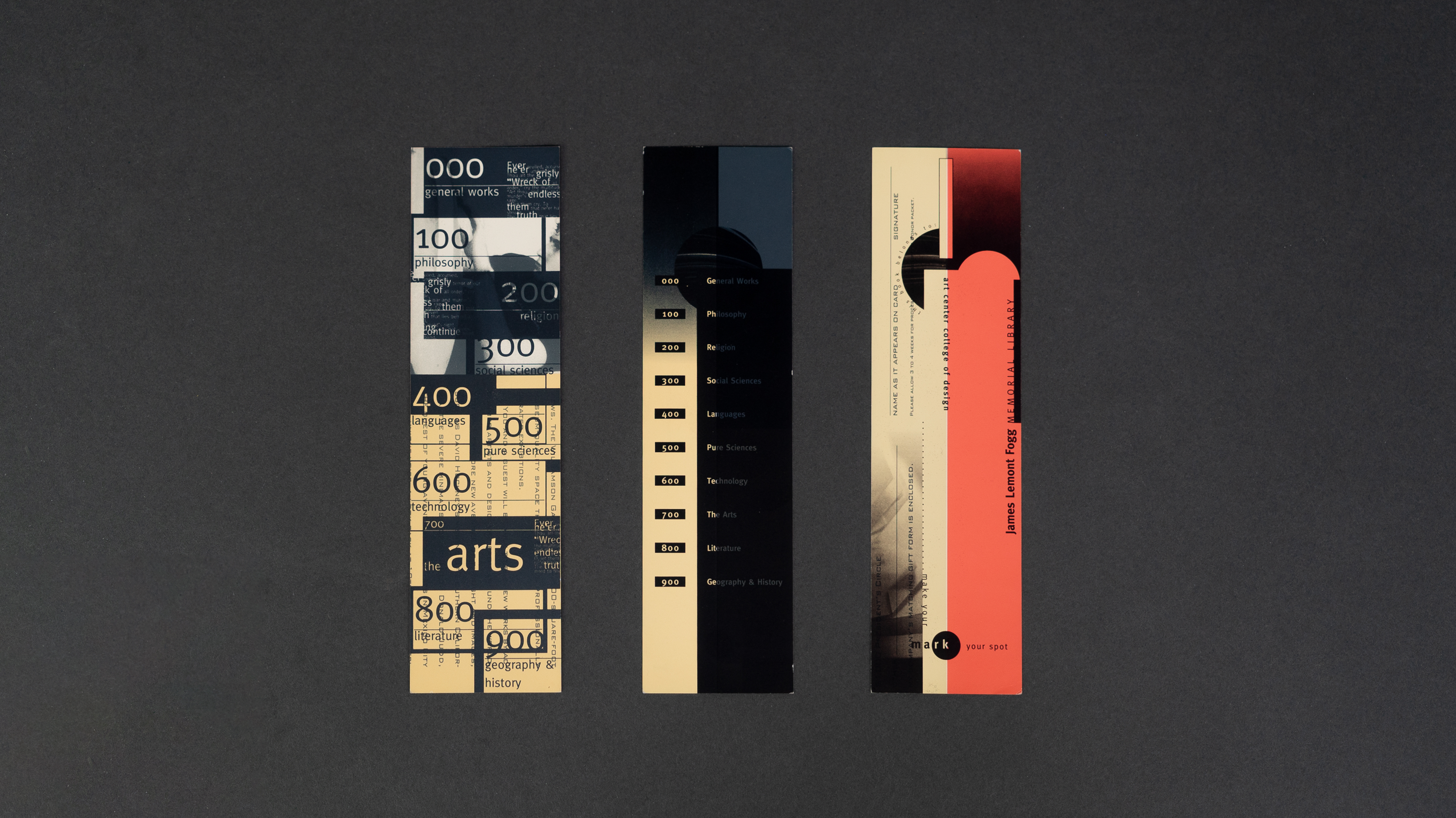
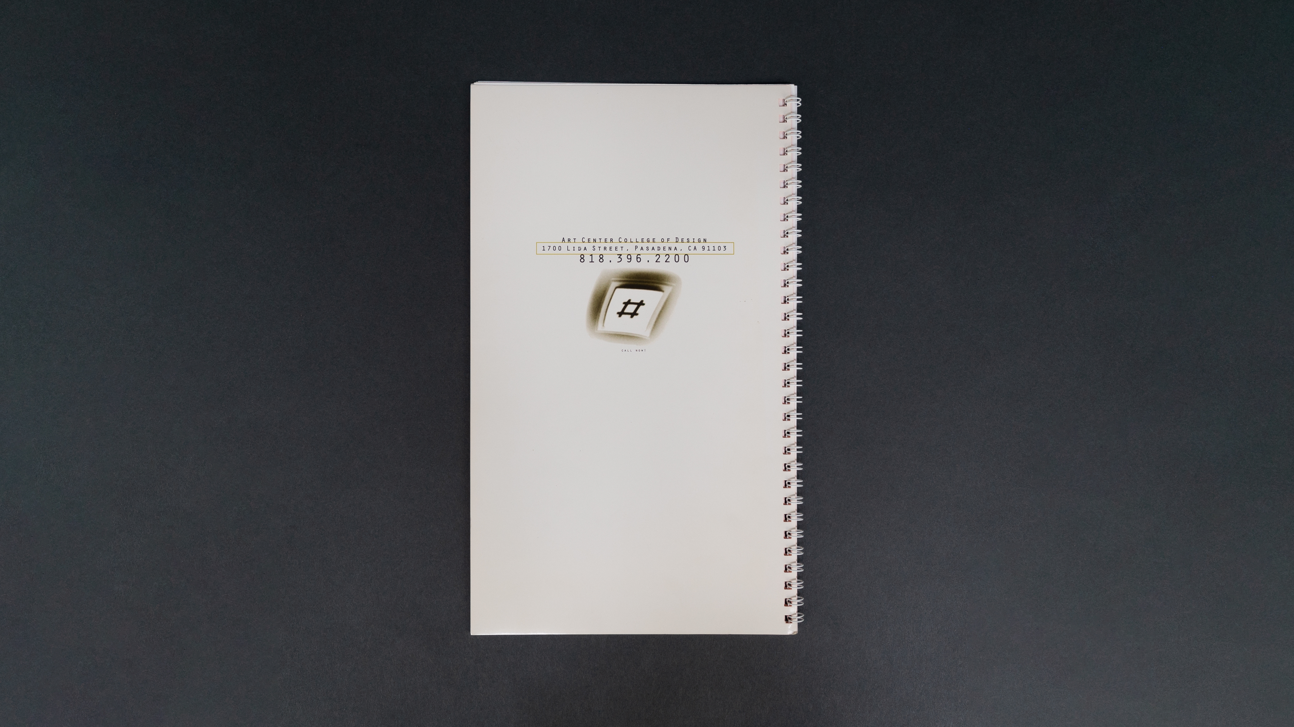
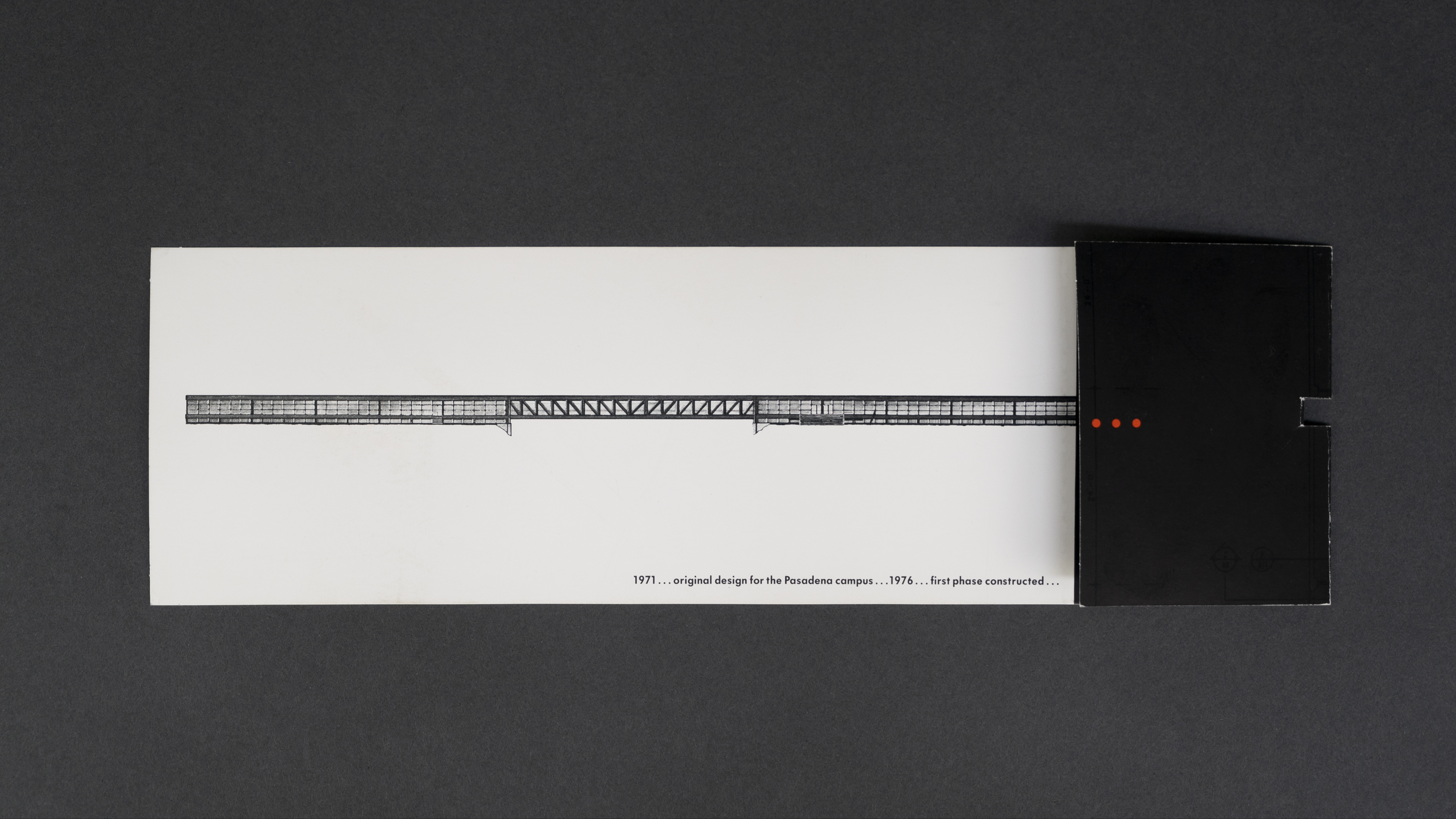
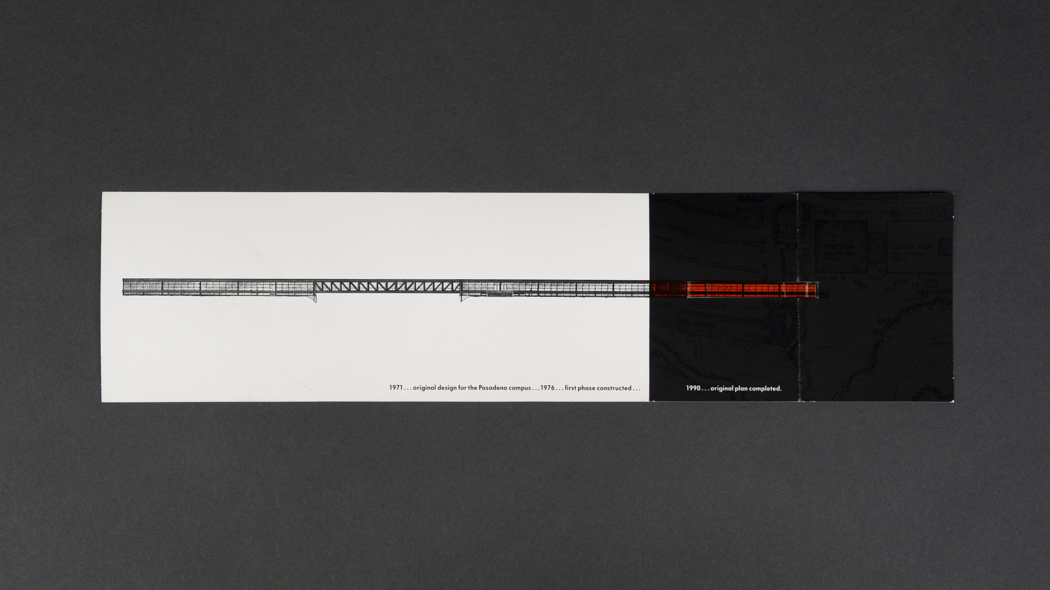
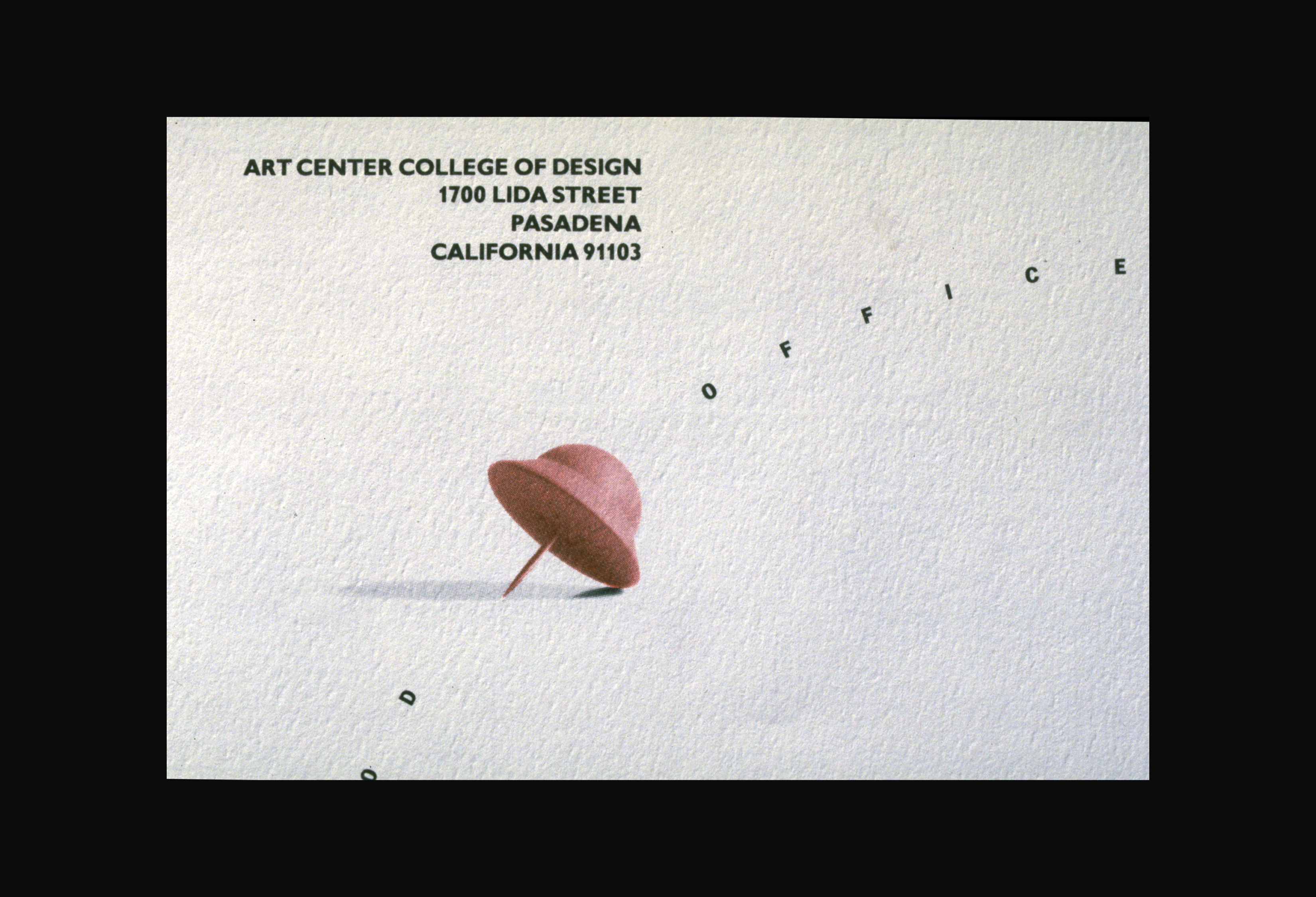
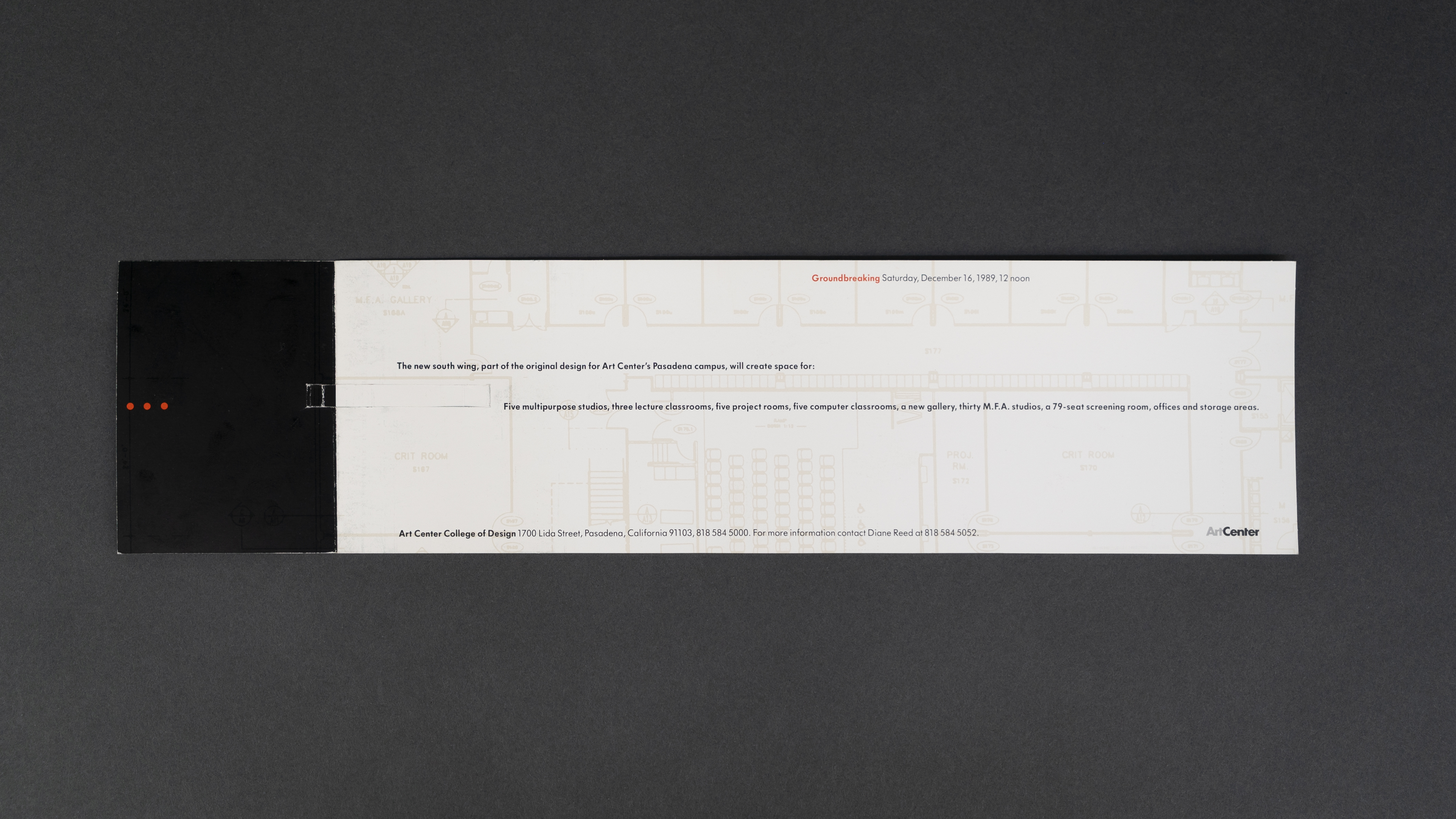
With the support of Stuart Frolick, Art Center vice president and creative director, Méndez and her staff designed and produced more than 300 ‘transitional’ projects a year–from recruitment brochures to campus signage. The college’s 1995–96 catalog, a 230-page book bisected horizontally by a systematic perforation, culminated what had been for her and the school a process of mutual self-discovery. “We randomly distressed certain elements of the typography so that it’s fluidity would be revealed,” she says. “The idea of a reconfigured book that could be split and broken emerged when we realized our ambivalence toward print in general, and books in particular.”
Recipients of numerous awards from such institutions as the American Center for Design, the American Institute of Graphic Arts, the Type Directors Club of New York an the Art Directors Club of Los Angeles, Méndez is considered by her peers as an outrider—someone ahead of her generation. “Her work for Art Center projected a very human and sensual image of design,” says Lorraine Wild, who teaches at CalArts, another California design school. “It seemed to capture the students’ vision more than the point of view of their teachers. Nowadays, young kids, who can Photoshop layouts to death, are tired of over-processed typography. Like Rebeca, they don’t want to sit passively in front of the computer all day. They’d rather do silkscreen or letterpress than stare at a screen.”
To appreciate the work of this Mexican and American designer, you need more than your eyes. You need your entire body. “When I first came to the US, I was seventeen and didn’t speak English,” she says. “Unable to use verbal communication, I turned to my body. I developed an acute affinity with the physical world.” Bypassing the mind, her work speaks to the nerve endings. A case in point: the perforated Art Center catalog. As each page comes apart–either one perforation at a time, like a zipper, or all at once, like a dry twig snapping–the ligaments in your body vibrate with the taut fibers of the paper. You wonder where the book ends and your body begins.”
“Her work for Art Center projected a very human and sensual image of design... It seemed to capture the students’ vision more than the point of view of their teachers.“
– Lorraine Wild, Designer and educator at California Institute of the Arts (CalArts)
Veronique Vienne
Text from ‘Designing from skin to screen, Graphis Magazine, Issue #306
Heir apparent to the likes of April Greiman and Laurie Haycock Makela, Rebeca Méndez was born and raised in Mexico City, and educated at the Art Center College of Design in Pasadena, California. She is known for her critical role in the redesign and reassessment of her alma mater’s corporate and cultural identity. Hired to teach in 1989 by James Miho, chairman of the department of graphic and packaging design, she held the position of design director between 1991 and 1996. Her weightless graphic compositions, elegantly poised on the page, have become synonymous with the college’s unexpectedly stylish persona. Once stodgy, the 66-year old institution is now perceived as being on the cutting edge of graphic design.
The transformation has been so dramatic that most people still wonder how someone like Rebeca Méndez, someone with her quiet demeanor and silent determination, was able to bring about such a colossal turnaround. But what else would you expect from a former gymnastics champion? Years of strenuous floor exercises and difficult routiness on the beam have taught Rebeca Méndez a thing or two about multiple rotations. She still looks like she can make an aerial front-double somersault and land on her feet. “The times I was best in gymnastics is when I felt weightless,” she says. “It is through dissolving my body in space that I find continuity.
I guess I am still trying to recapture this ethereal feeling in my graphic work and in my relationship with technology. For me, design is always a case of virtuality in the process of being actualized: It has more to do with duration—that is, the flow of time—than with space.”
Inspired by French philosopher Henri Bergson, who she discovered through the writings of Gilles Deleuze, Méndez wants her work to be about two directions of representations: that of perception which puts us at once with matter (located in space), and that of memory which puts us at once into mind (in duration). Her layouts are always in the state of becoming, displaying what she describes an an initial dissociation of this mixture of space and time, giving back to each its natural purity, and of their coexistence in the creation of change. But it is with a vengeance that she blurs the boundaries between time and space. There is something almost feral about the way she tears and scatters visual elements on a page. Reflecting the fact that Art Center, its student body and design in general were in a state of transition, she established for the school a fractured, hybrid and deliberately non-linear visual language. “Out of this world of abstraction and virtuality, I created an identity for Art Center, and in turn, this identity created me,” she says. “It was both incestuous and frightening.”
With the support of Stuart Frolick, Art Center vice president and creative director, Méndez and her staff designed and produced more than 300 ‘transitional’ projects a year–from recruitment brochures to campus signage. The college’s 1995–96 catalog, a 230-page book bisected horizontally by a systematic perforation, culminated what had been for her and the school a process of mutual self-discovery. “We randomly distressed certain elements of the typography so that it’s fluidity would be revealed,” she says. “The idea of a reconfigured book that could be split and broken emerged when we realized our ambivalence toward print in general, and books in particular.”
Recipients of numerous awards from such institutions as the American Center for Design, the American Institute of Graphic Arts, the Type Directors Club of New York an the Art Directors Club of Los Angeles, Méndez is considered by her peers as an outrider—someone ahead of her generation. “Her work for Art Center projected a very human and sensual image of design,” says Lorraine Wild, who teaches at CalArts, another California design school. “It seemed to capture the students’ vision more than the point of view of their teachers. Nowadays, young kids, who can Photoshop layouts to death, are tired of over-processed typography. Like Rebeca, they don’t want to sit passively in front of the computer all day. They’d rather do silkscreen or letterpress than stare at a screen.”
To appreciate the work of this Mexican and American designer, you need more than your eyes. You need your entire body. “When I first came to the US, I was seventeen and didn’t speak English,” she says. “Unable to use verbal communication, I turned to my body. I developed an acute affinity with the physical world.” Bypassing the mind, her work speaks to the nerve endings. A case in point: the perforated Art Center catalog. As each page comes apart–either one perforation at a time, like a zipper, or all at once, like a dry twig snapping–the ligaments in your body vibrate with the taut fibers of the paper. You wonder where the book ends and your body begins.”
“Her work for Art Center projected a very human and sensual image of design... It seemed to capture the students’ vision more than the point of view of their teachers.“
– Lorraine Wild, Designer and educator at California Institute of the Arts (CalArts)