MICROSOFT STORE
What Do You Mean, A “Living Store”?
Text by Jed Alder, writer at Wieden & Kennedy, for the presentation to Microsoft
So far we’ve talked about a store experience that is fairly traditional. People come into a space that’s divided into sensible categories - Working, Living, Learning. Perhaps they see a large screen display promoting the new release of Windows 98. They have the option of talking to a sales person, of picking up the box and checking it out, or -central to our pledge to get the software out of the box- they have the option of using a keyboard and a monitor to self-demo the product. Now, once customers enter into this relationship -a keyboard under their fingers, a screen sixteen inches away- they are in Microsoft’s core territory. This is where the real magic can happen.
Imagine an expert system -like the Office Assistant we talked about but with a much higher IQ. Let’s call it a Store Assistant, designed to greet and guide people through the store. Suddenly limitations dissolve; everything -from the tone and direction of the conversation to the form of payment and delivery- is determined by the needs and wants of the customer. Oddly enough, this most modern technology lets us return to a very old idea of customer service that is individualized, immediate and nuanced.
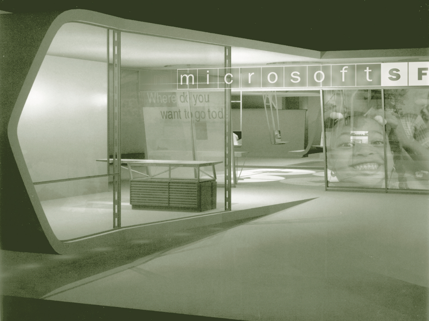
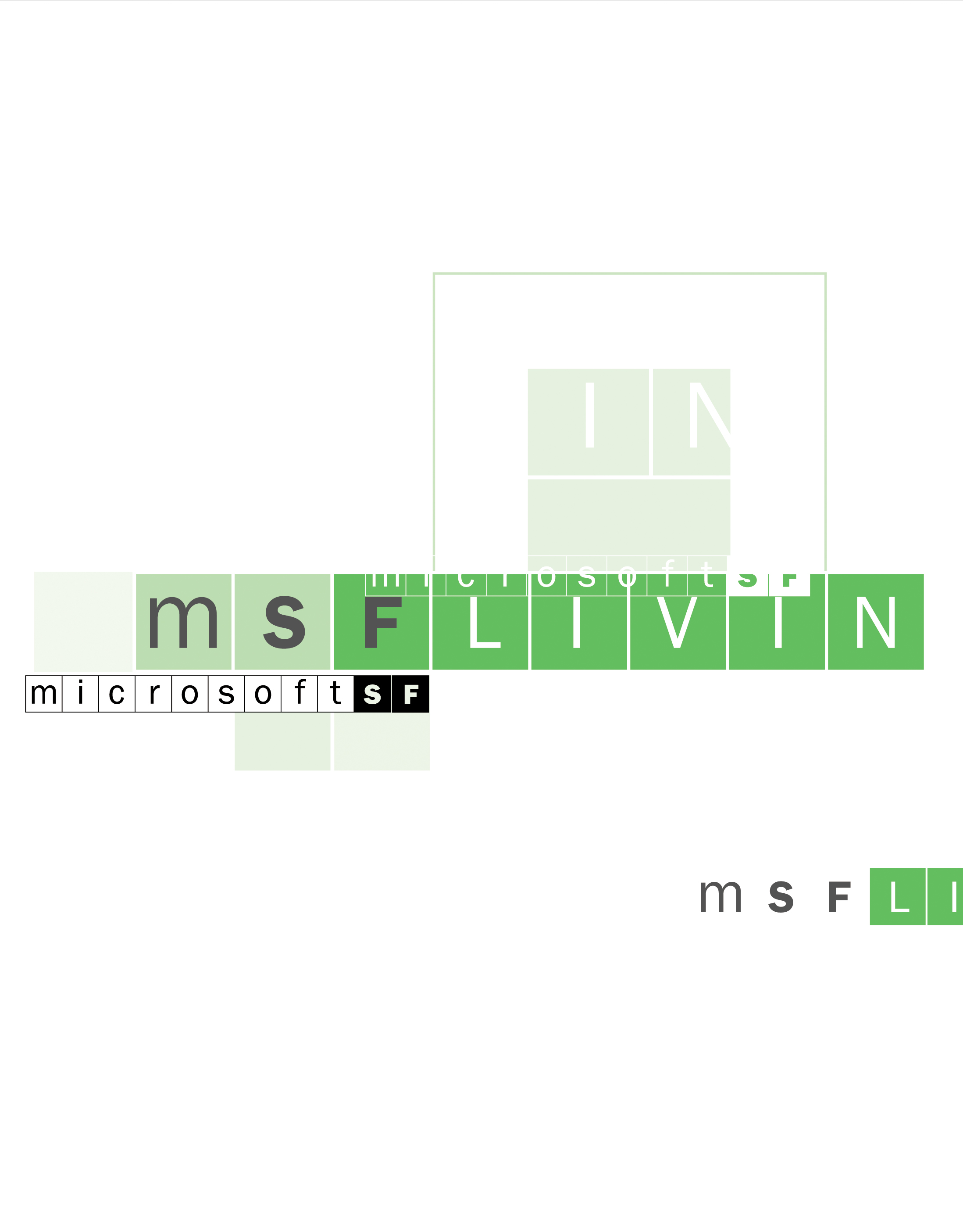
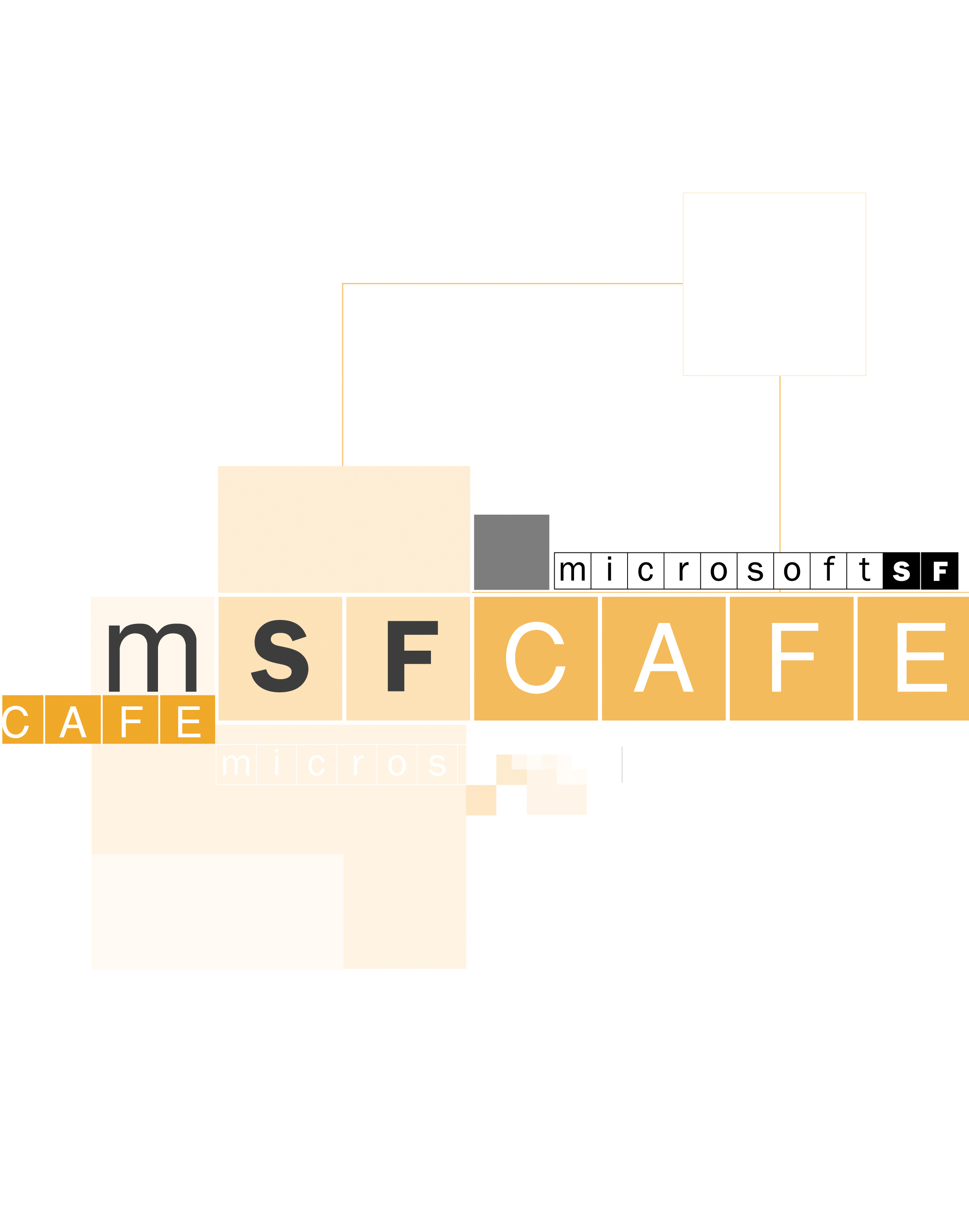
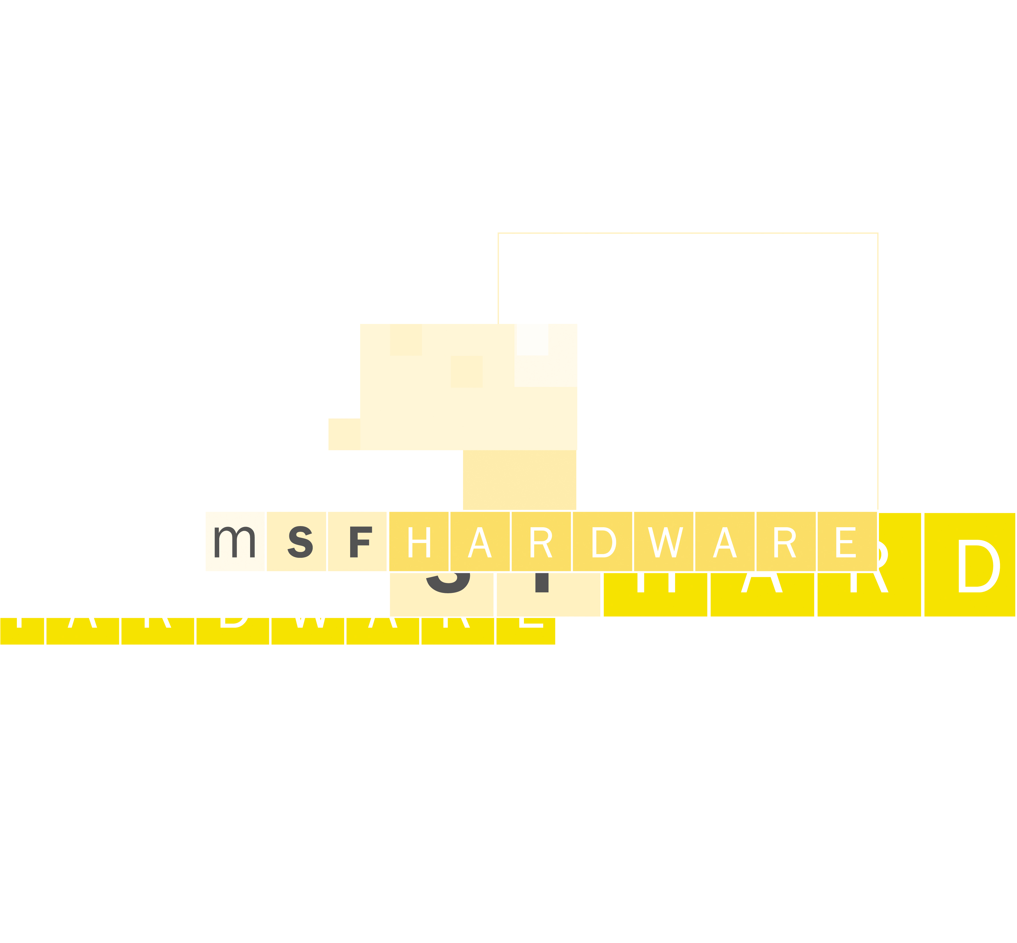
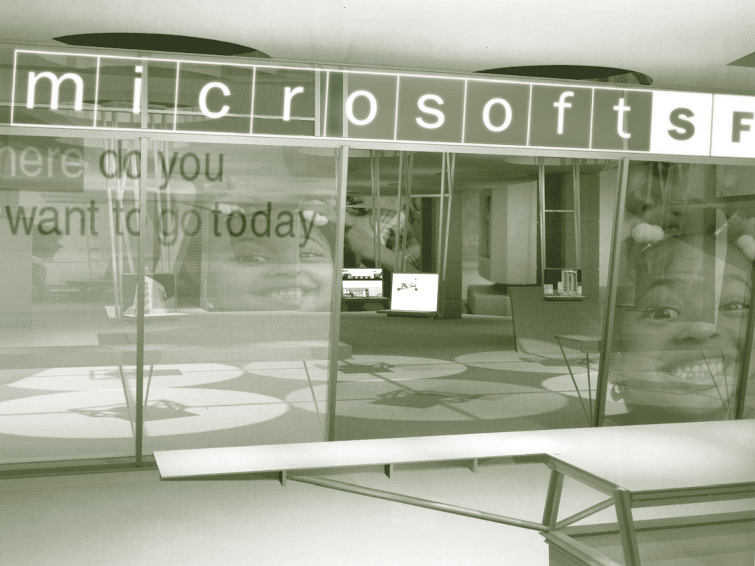
As a consultant to Wieden and Kennedy, Portland, I was part of a team who collaborated in the development of a concept for a Microsoft Retail Store. Our task was for the store to embody the Microsoft brand-to fulfill the promise of “access to exciting possibilities,” and also create a practical store environment that generates profit. My involvement was primarily in the store’s name generation, typography and signage system design, and in the conception and design of digital wall projections. Microsoft’s core brand “owns white space and this demands attention,” it also owns the pixel: (picture element) the basic unit of visual information. By combining pixels, any shape can be created. The grid takes this freedom and gives it structure. The design solution brings the brand elements to life as architectural modules that explore space-the working, living and learning space. The signage system consists of one plasm screen for each letter of the signage, within a structure of glass cubes suspended from the ceiling. Monochromatic moving images of scenes of the working environment act as background to the display of words, not only those relating to “Working,” but potentially relating words in other languages, addressing Microsoft’s international presence. The name of the store is straight forward, clear and honest.


