SUPRASENSORIAL BOOK

Exhibition catalogue for Suprasensorial: Experiments in Light, Color and
Space exhibition organized by Alma Ruiz and presented at The Museum
of Contemporary Art, Los Angeles, The Geffen Contemporary at MOCA,
12 December 2010–27 February 2011.
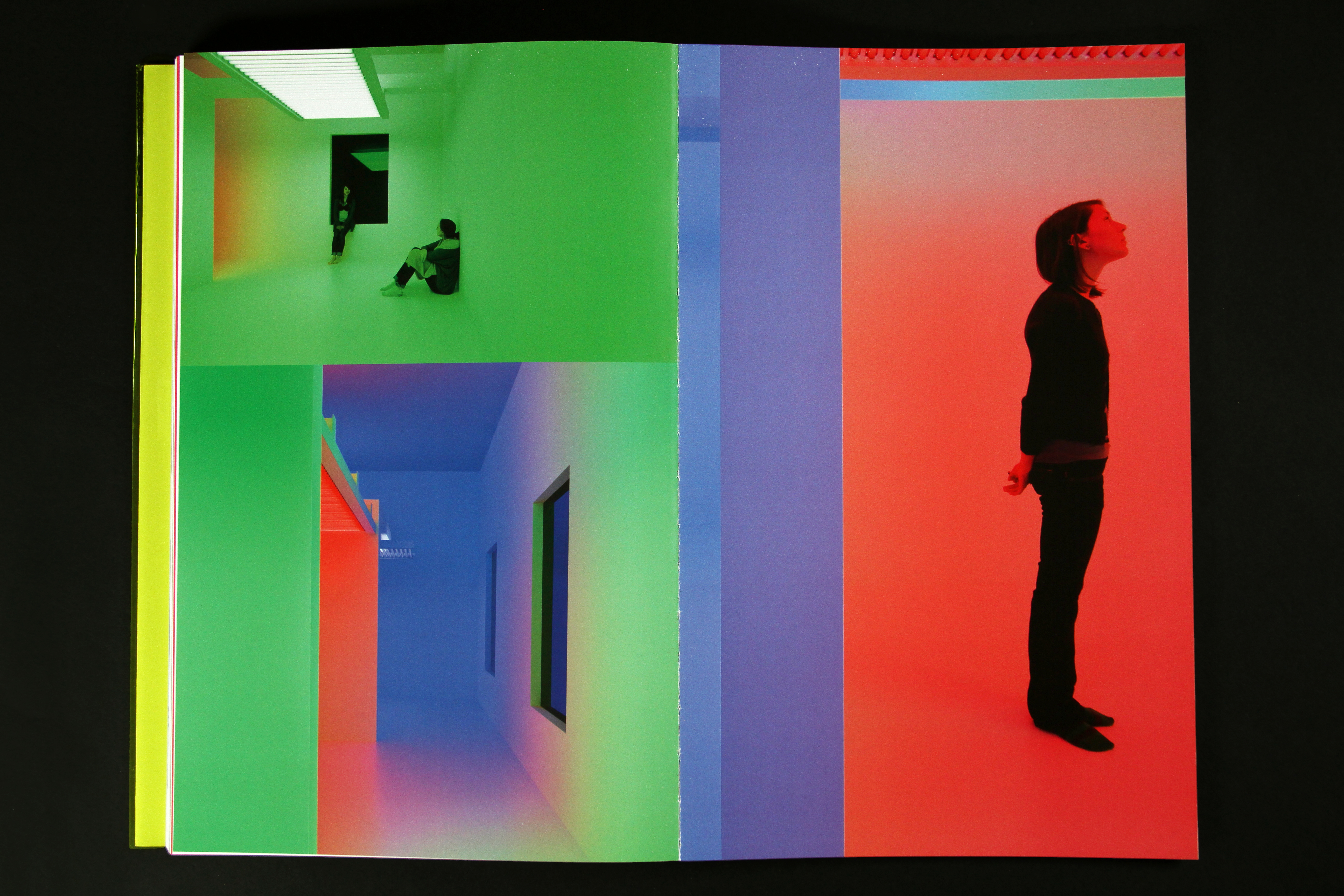
Suprasensorial presented five large-scale environments that exemplify the artists’ temporary or eventual abandonment of the two-dimensional plane for new aesthetic propositions and more subjective forms based on notions of light, color and space and a new object-viewer relationship. Rather than trying to create or invent new categories in art, these artists intended to give the viewer freedom to exercise his or her own imagination through active participation and to make art more accessible to a broader spectrum of people. The proposition of an experience that goes beyond the aesthetic—what Hélio Oiticica described as suprasensorial— allowed the viewer to shift his or her attitude toward art, demystifying it by making it part of everyday life. The viewer no longer needed to stand in front of an artwork as with a painting, or walk around it as with a sculpture, but could actually step into it and become fully engaged in a kind of “sensorial exaltation.” The viewer was an indispensable part of the creative process: his or her presence determined the completion of the artwork.
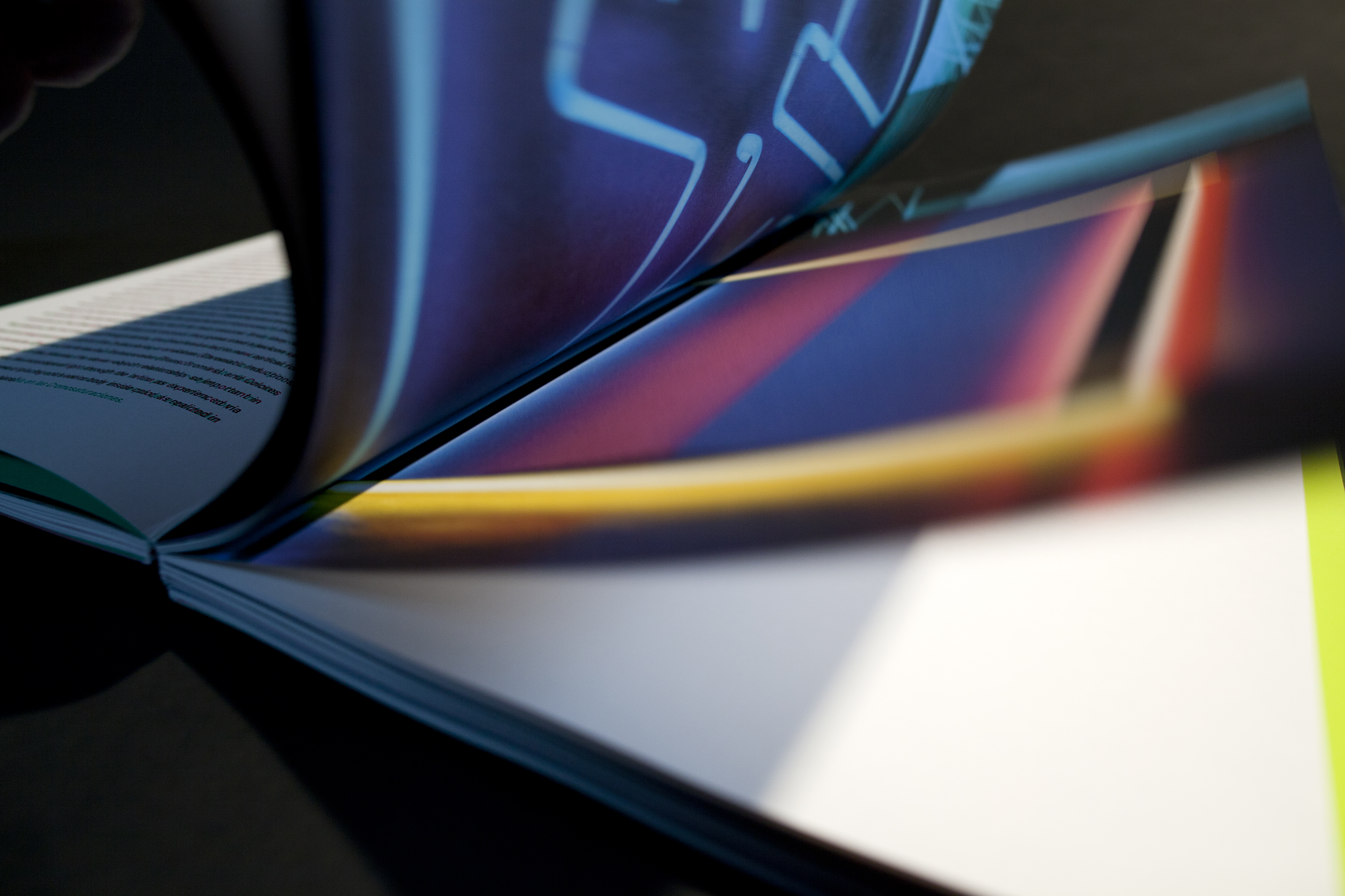
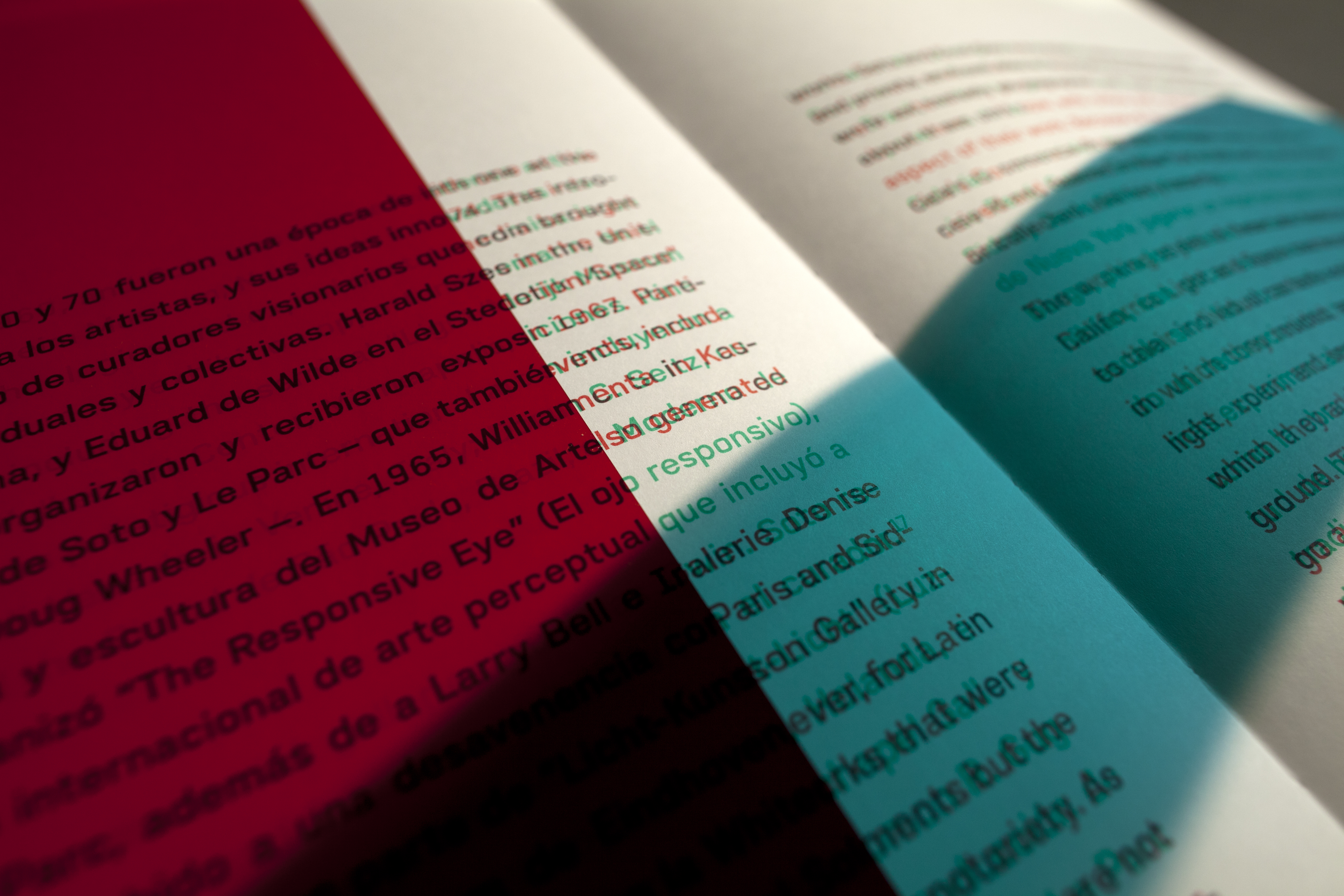
The book design reflects the participatory nature of the exhibition in that the reader is invited to participate actively in order to fully experience the book. The specific inspiration came from Carlos Cruz-Diez, who, in the documentary film Life in Color: Cruz-Diez by Cine Archivo, explains how he was able to produce a whole solar spectrum using only two colors, red and green: ‘If the two colors are side by side, a third color is generated.’ By turning a ‘rectangular’ module into a linear one and engaging in a specific action, he was able to generate a third color (yellow) where the two lines touch. ‘I destroyed the original form and eternal binomial form-color.’ Cruz-Diez’s realization that ‘color is an autonomous event that does not require form’ became the platform and core of all his subsequent work.
The red and green colored gels included in the book work by absorbing their own color wavelength in the spectrum, thus revealing other colors. place the red gel over the text to read the green text (Spanish) and place the green gel over the text to read the red text (English).
“‘The more I handle the book, the more I like it. It’s a beautiful and challenging object.’.”
– Alma Ruiz, Sr. Curator, Museum of Contemporary Art, Los Angeles (MOCA)
“Upon seeing the work, MOCA director Jeffrey Deitch said to exhibition curator Alma Ruiz, ‘This is a collectors’ item, keep a few samples around.’ Ruiz writes in her acknowledgements, ‘I am greatly indebted to the designer of this exquisite catalogue, Rebeca Méndez, and her team, Adam Eeuwens and Leigh Anne Abiouness, for their extraordinary insight, creative focus and sensitivity to the subject matter.’ In a text message, Alma wrote: ‘The more I handle the book, the more I like it. It’s a beauti- ful and challenging object.’ Rebeca Méndez’s response to her text is why we consider it a success: ‘Thank you for your text...I also like the book more and more every day. The yellow keeps surprising me, as it changes completely from day to night and under different light conditions. So do the gels inside. It’s definitely an object that goes beyond expectations of an exhibition catalogue, and demands a different—more interactive and playful—relationship. At the same time, its typographic design is quite simple, therefore one always has a familiar point of entry. The book is not just a documentation of the exhibition but also an extension of ‘Supra- sensorial’ and an experiment on light, color and space.’”
– AIGA Design Archives, Excerpt from AIGA Design Archives: 50 Books / 50 Covers, 2011 Selection
Suprasensorial presented five large-scale environments that exemplify the artists’ temporary or eventual abandonment of the two-dimensional plane for new aesthetic propositions and more subjective forms based on notions of light, color and space and a new object-viewer relationship. Rather than trying to create or invent new categories in art, these artists intended to give the viewer freedom to exercise his or her own imagination through active participation and to make art more accessible to a broader spectrum of people. The proposition of an experience that goes beyond the aesthetic—what Hélio Oiticica described as suprasensorial— allowed the viewer to shift his or her attitude toward art, demystifying it by making it part of everyday life. The viewer no longer needed to stand in front of an artwork as with a painting, or walk around it as with a sculpture, but could actually step into it and become fully engaged in a kind of “sensorial exaltation.” The viewer was an indispensable part of the creative process: his or her presence determined the completion of the artwork.
The book design reflects the participatory nature of the exhibition in that the reader is invited to participate actively in order to fully experience the book. The specific inspiration came from Carlos Cruz-Diez, who, in the documentary film Life in Color: Cruz-Diez by Cine Archivo, explains how he was able to produce a whole solar spectrum using only two colors, red and green: ‘If the two colors are side by side, a third color is generated.’ By turning a ‘rectangular’ module into a linear one and engaging in a specific action, he was able to generate a third color (yellow) where the two lines touch. ‘I destroyed the original form and eternal binomial form-color.’ Cruz-Diez’s realization that ‘color is an autonomous event that does not require form’ became the platform and core of all his subsequent work.
The red and green colored gels included in the book work by absorbing their own color wavelength in the spectrum, thus revealing other colors. place the red gel over the text to read the green text (Spanish) and place the green gel over the text to read the red text (English).
“‘The more I handle the book, the more I like it. It’s a beautiful and challenging object.’.”
– Alma Ruiz, Sr. Curator, Museum of Contemporary Art, Los Angeles (MOCA)
“Upon seeing the work, MOCA director Jeffrey Deitch said to exhibition curator Alma Ruiz, ‘This is a collectors’ item, keep a few samples around.’ Ruiz writes in her acknowledgements, ‘I am greatly indebted to the designer of this exquisite catalogue, Rebeca Méndez, and her team, Adam Eeuwens and Leigh Anne Abiouness, for their extraordinary insight, creative focus and sensitivity to the subject matter.’ In a text message, Alma wrote: ‘The more I handle the book, the more I like it. It’s a beauti- ful and challenging object.’ Rebeca Méndez’s response to her text is why we consider it a success: ‘Thank you for your text...I also like the book more and more every day. The yellow keeps surprising me, as it changes completely from day to night and under different light conditions. So do the gels inside. It’s definitely an object that goes beyond expectations of an exhibition catalogue, and demands a different—more interactive and playful—relationship. At the same time, its typographic design is quite simple, therefore one always has a familiar point of entry. The book is not just a documentation of the exhibition but also an extension of ‘Supra- sensorial’ and an experiment on light, color and space.’”
– AIGA Design Archives, Excerpt from AIGA Design Archives: 50 Books / 50 Covers, 2011 Selection