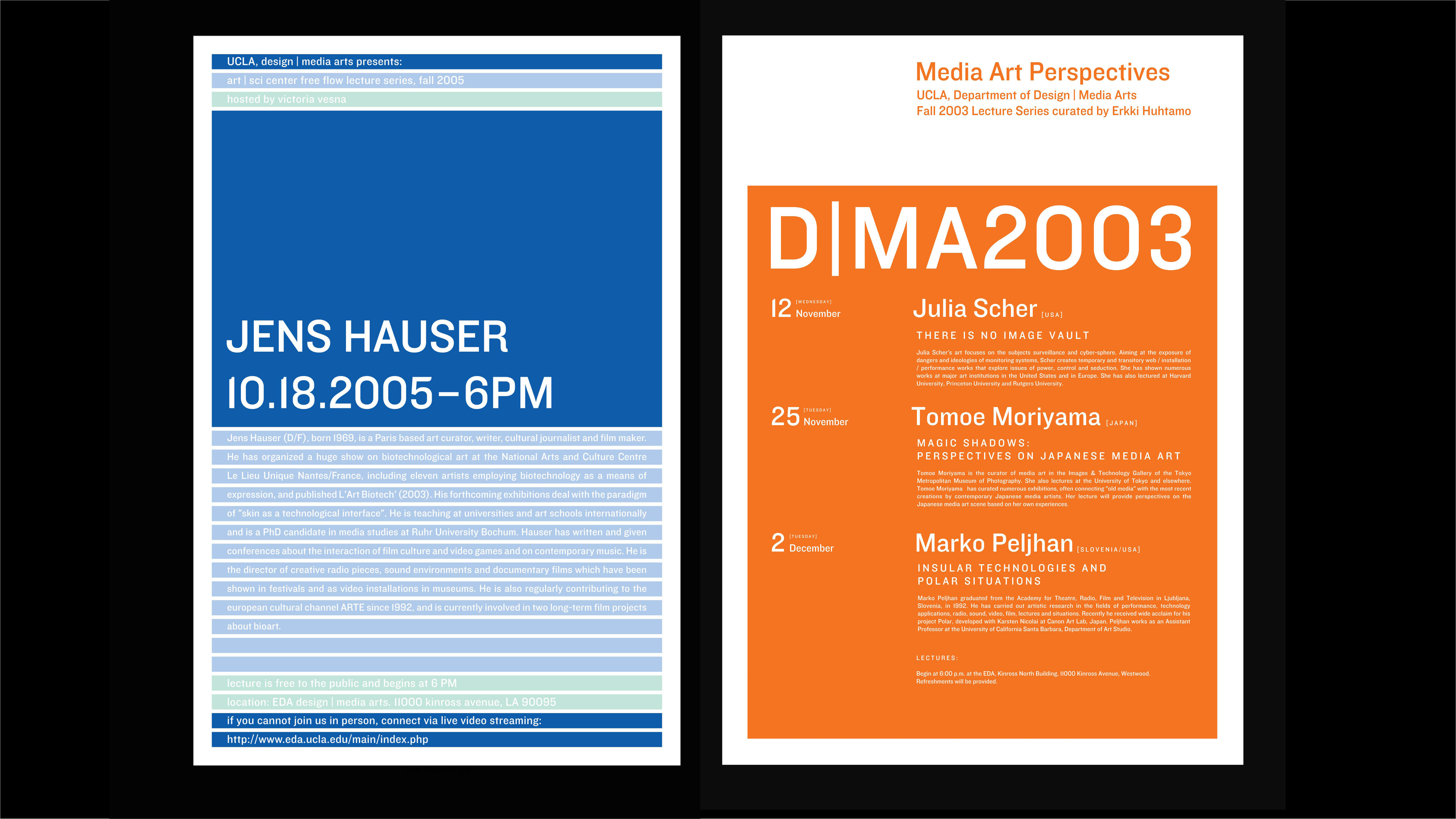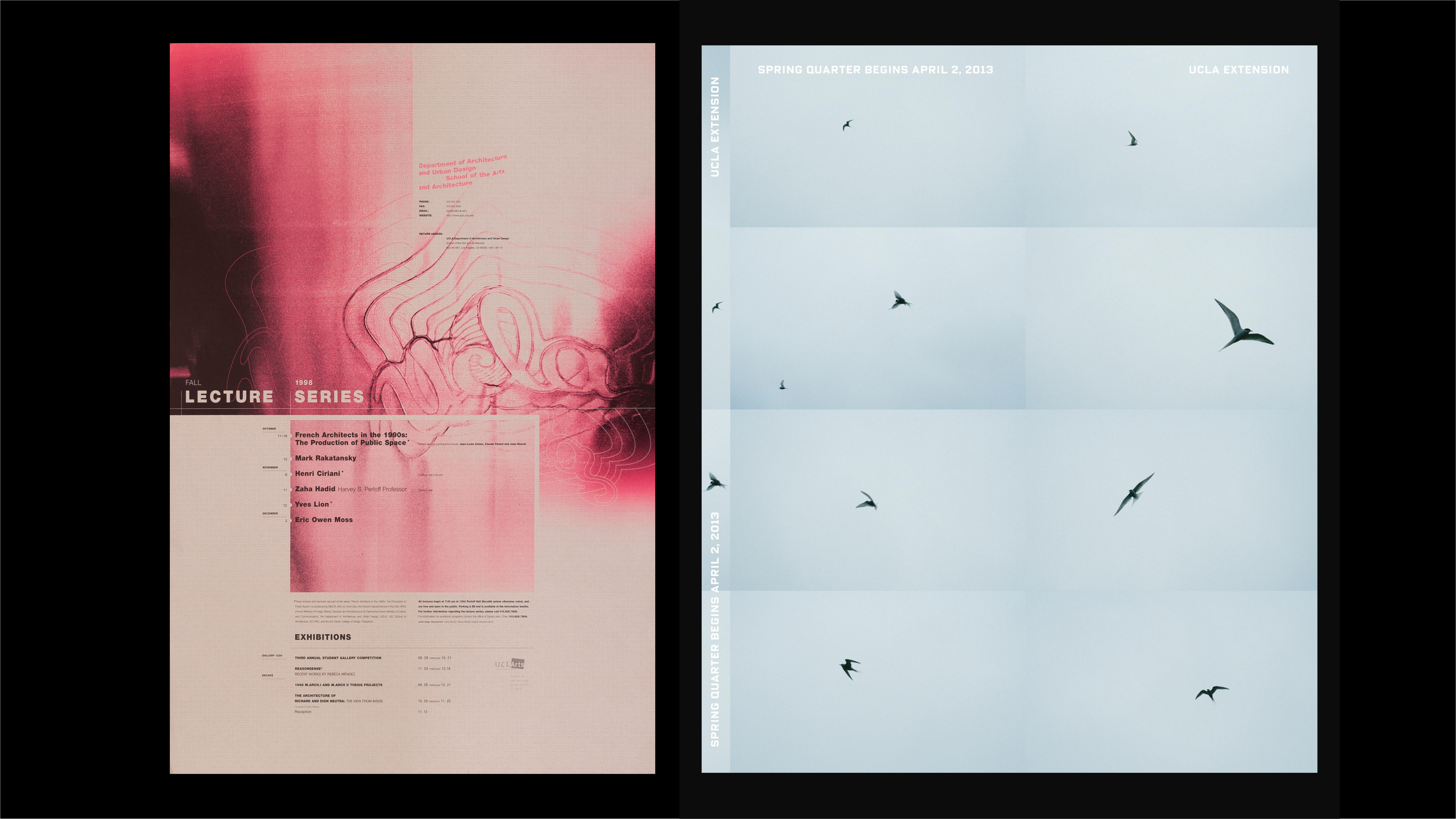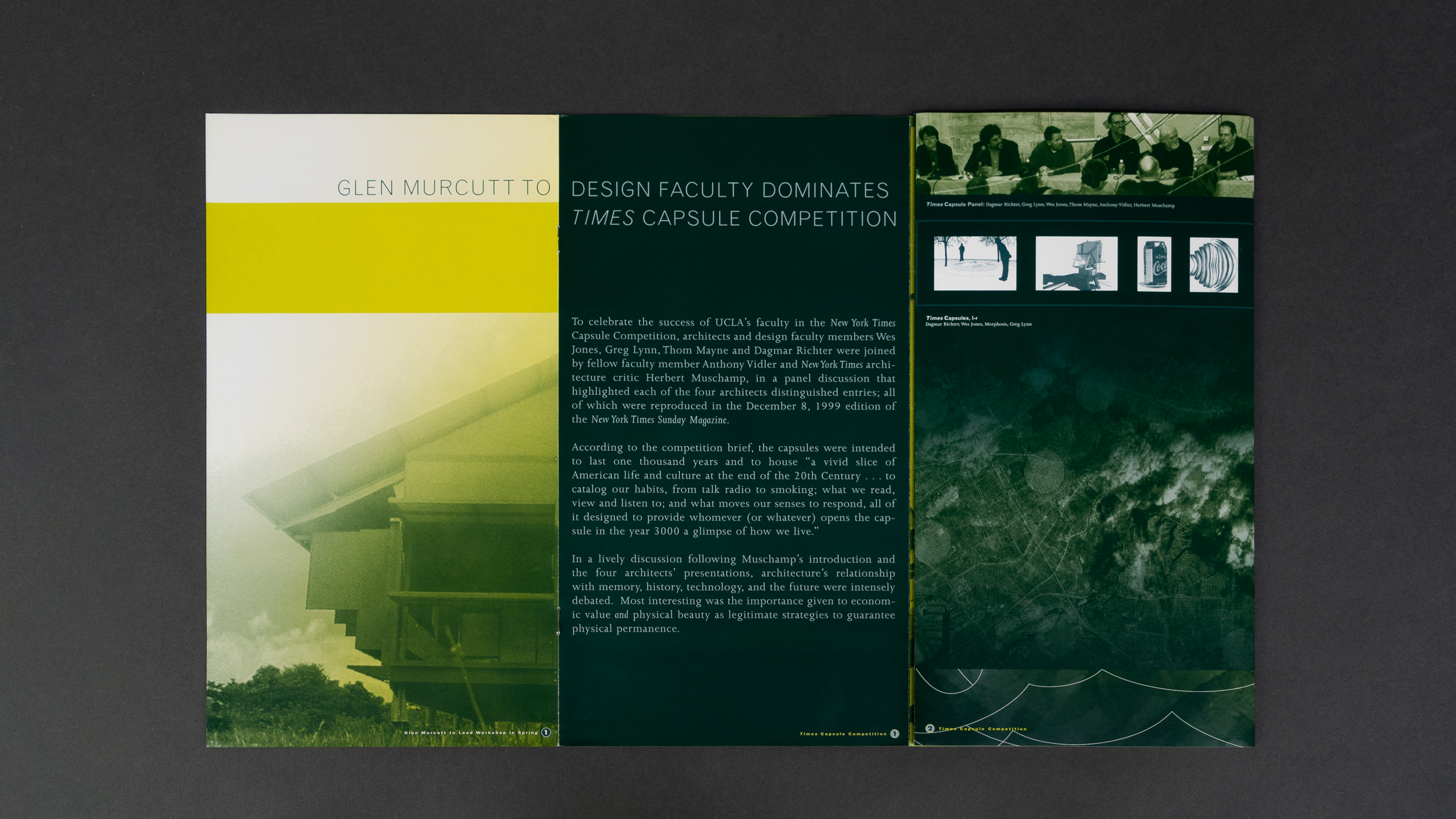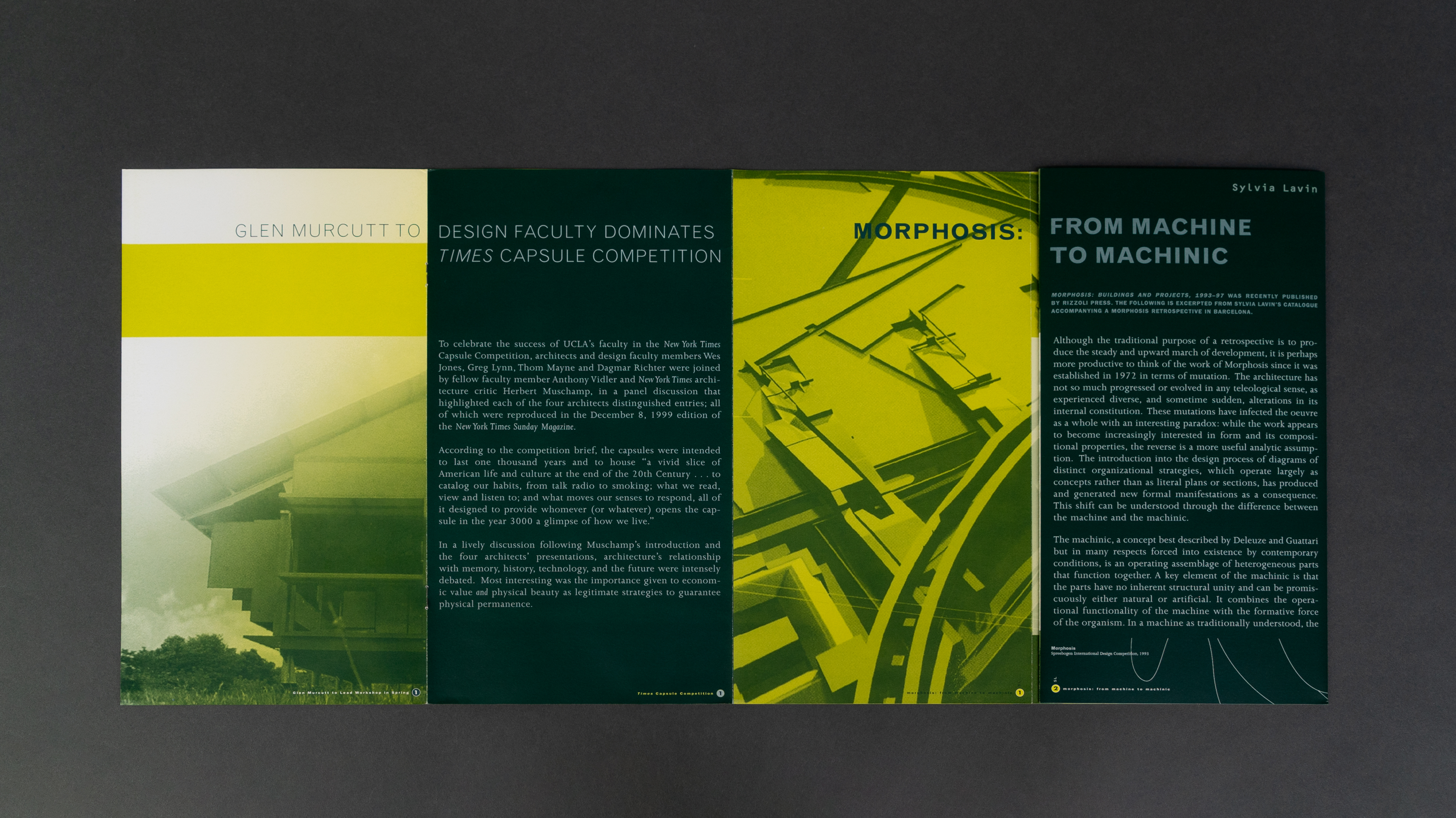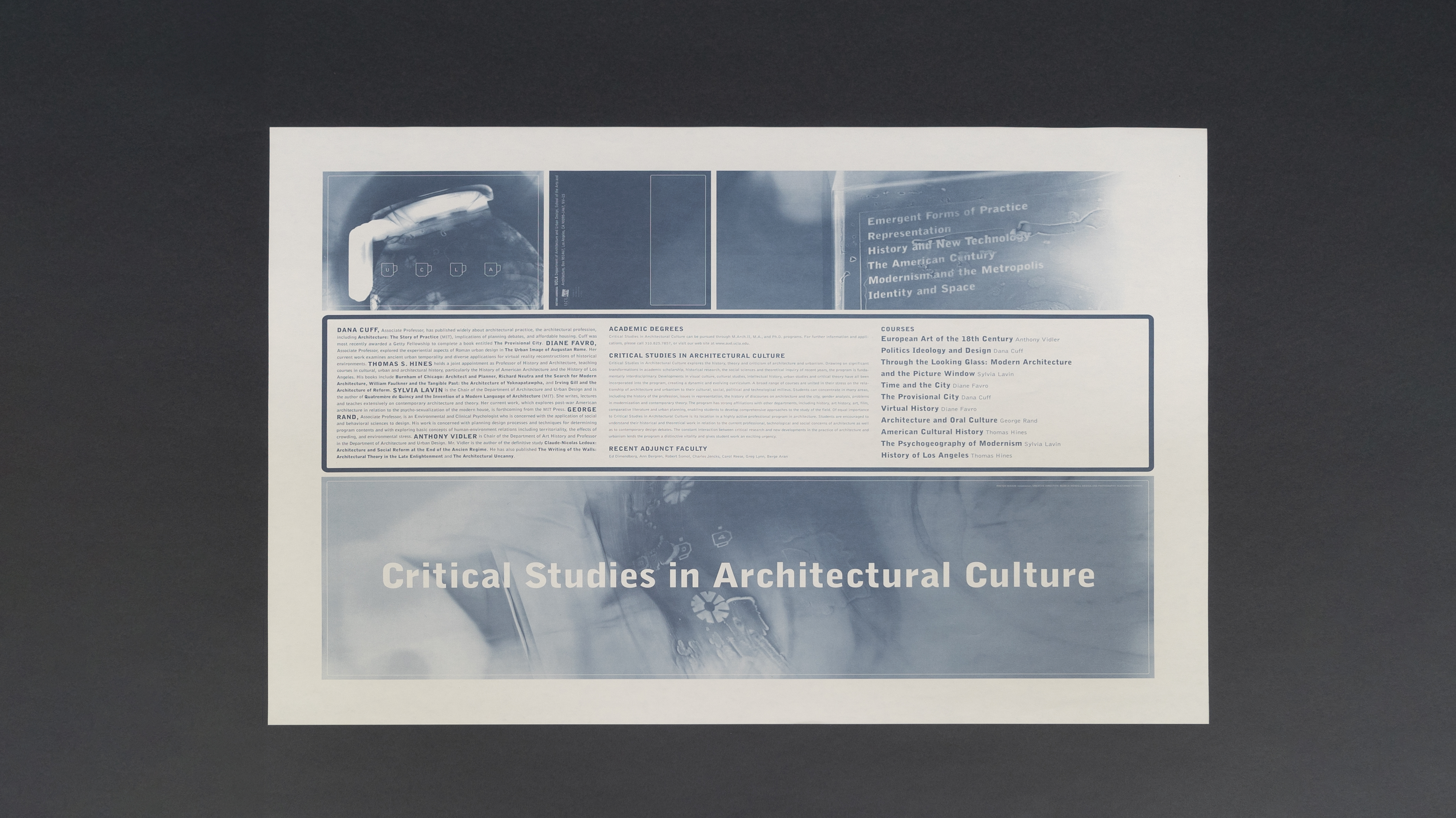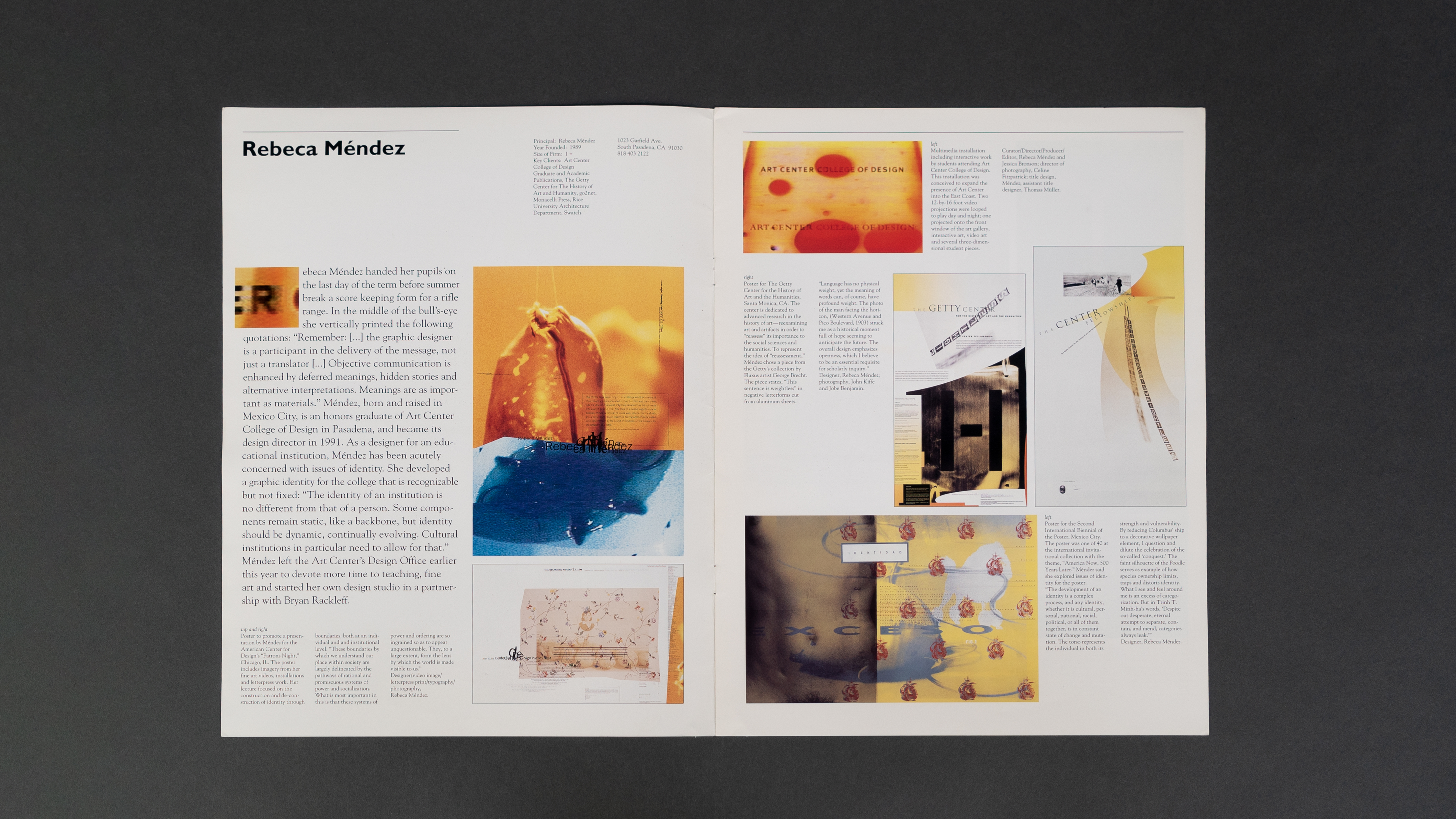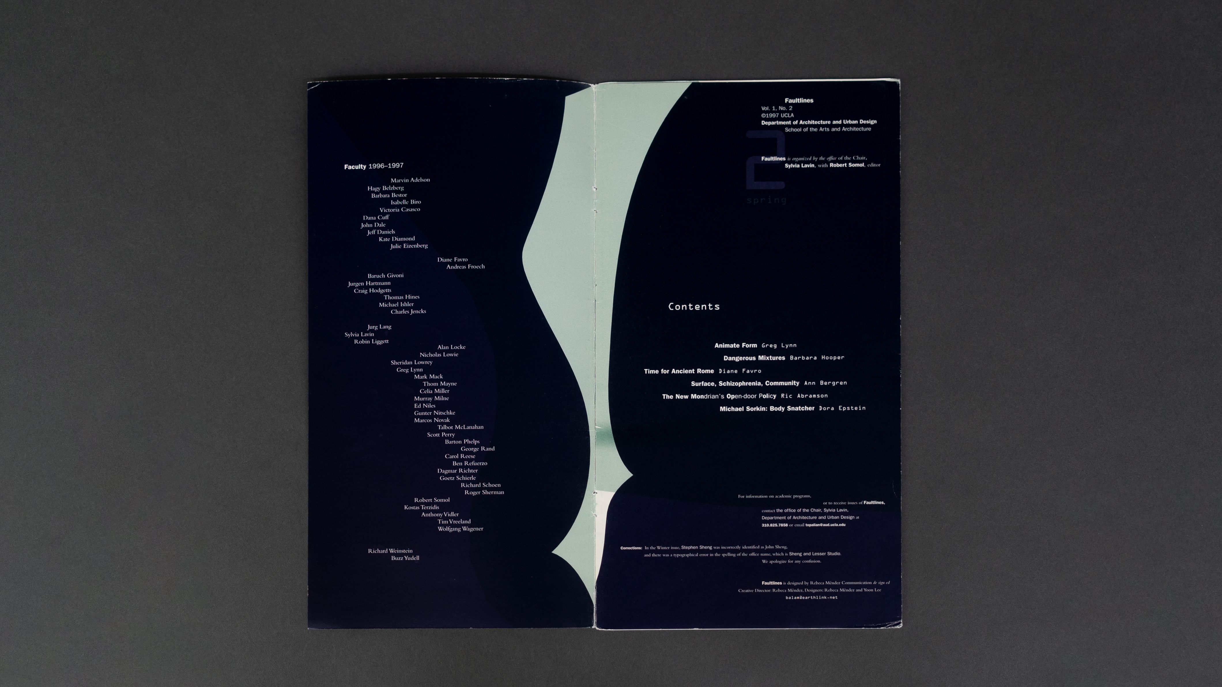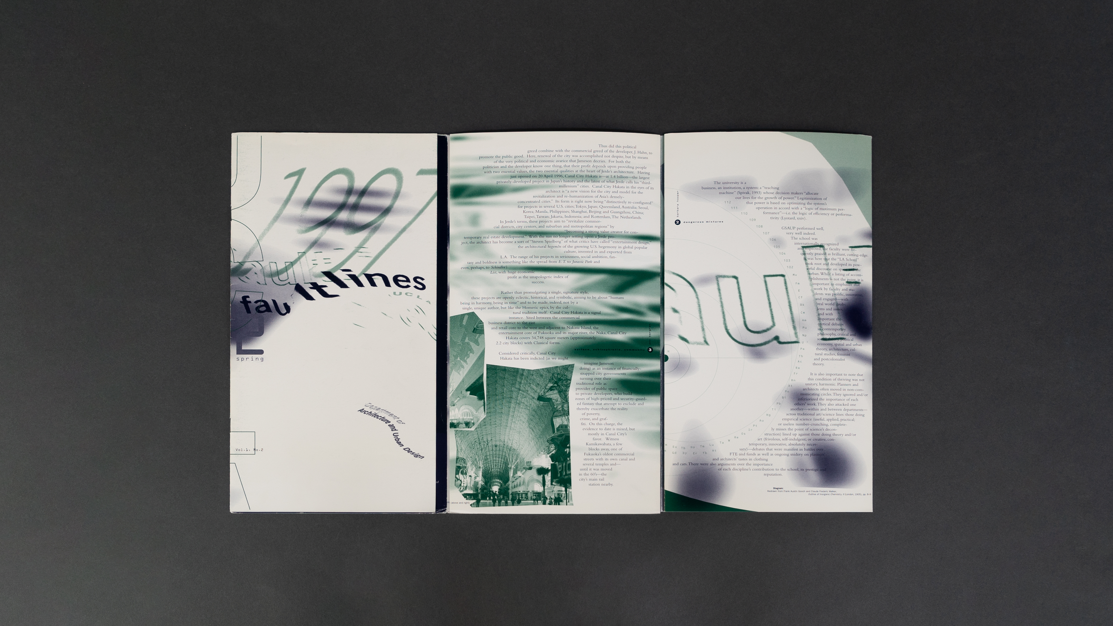
UCLA COLLECTION
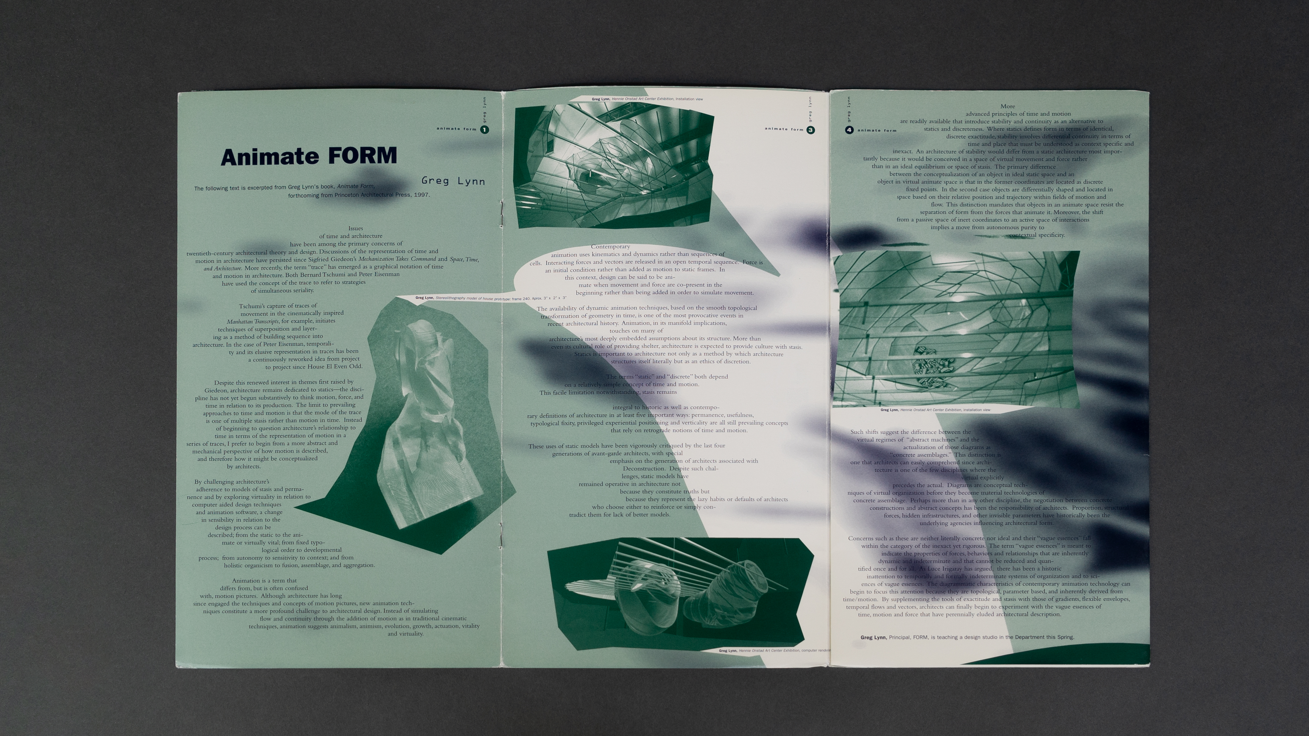
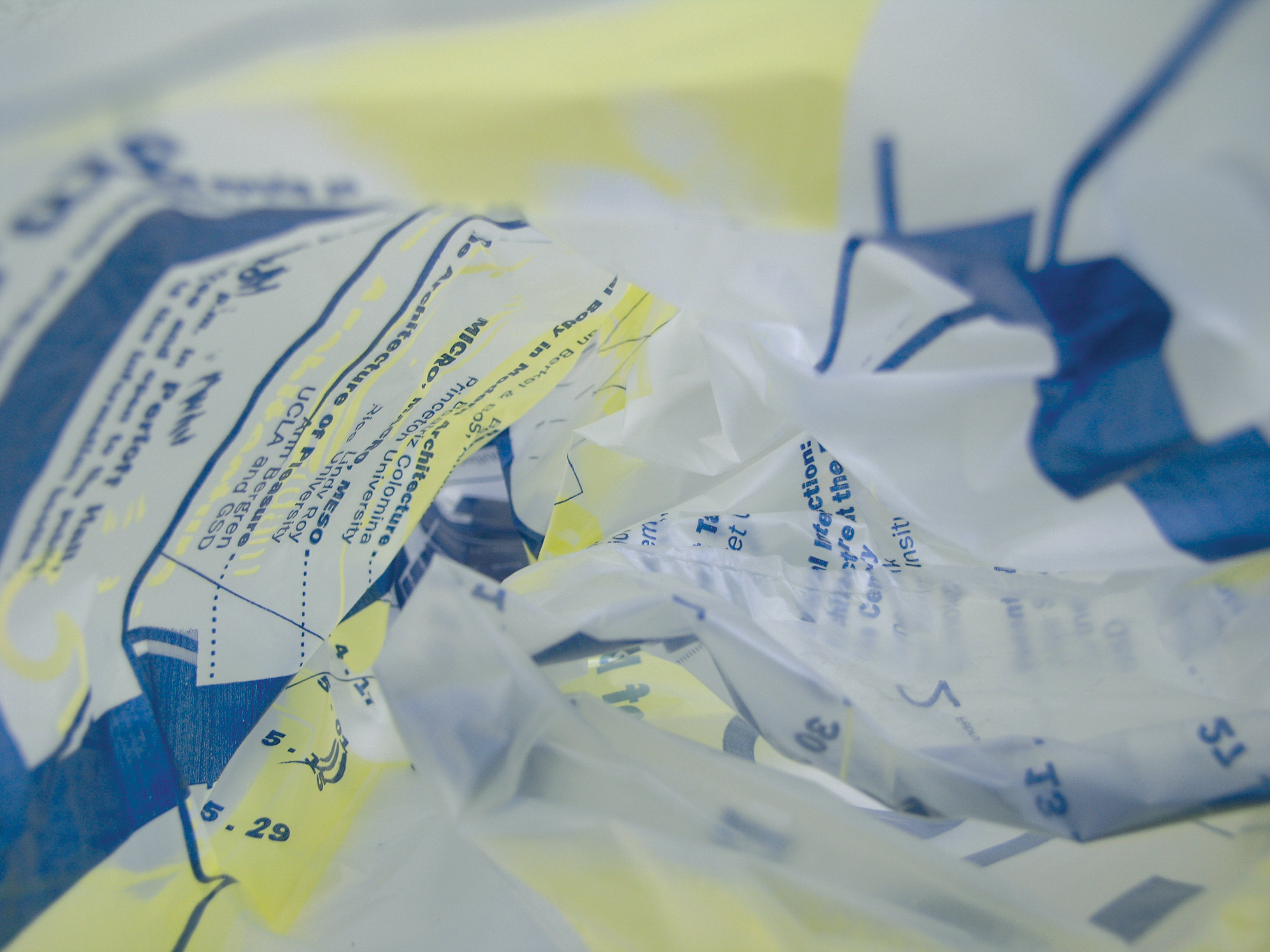
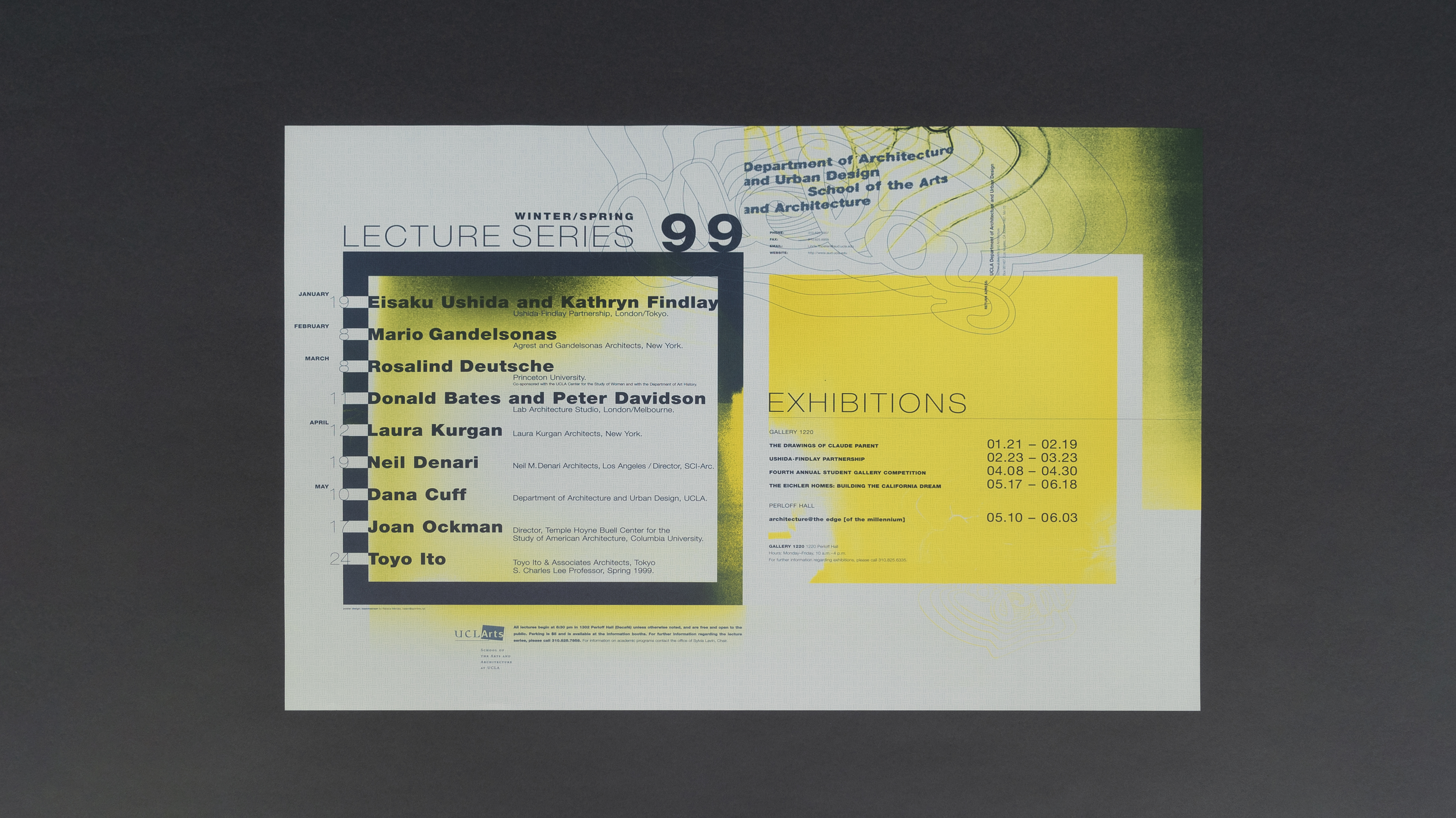
The design solution jumped from the preoccupations of chair Silvia Lavin and those in late twentieth-century architectural theory and design, revolving around the issue of time and architecture. Lavin understood that her communications would express the vision for the department and we both pushed the industry standards to their limits to express ‘matter as time.’ We were both inspired by the words of architect Greg Lynn, professor at UCLA Architecture, who writes in his book Animate Form: “... Instead of simulating flow and continuity through the addition of motion as in traditional cinematic techniques, animation suggests animalism, animism, evolution, growth, actuation, vitality and virtuality.”
Aaron Betsky
Curator of Architecture and Design, San Francisco Museum of Modern Art, 1998
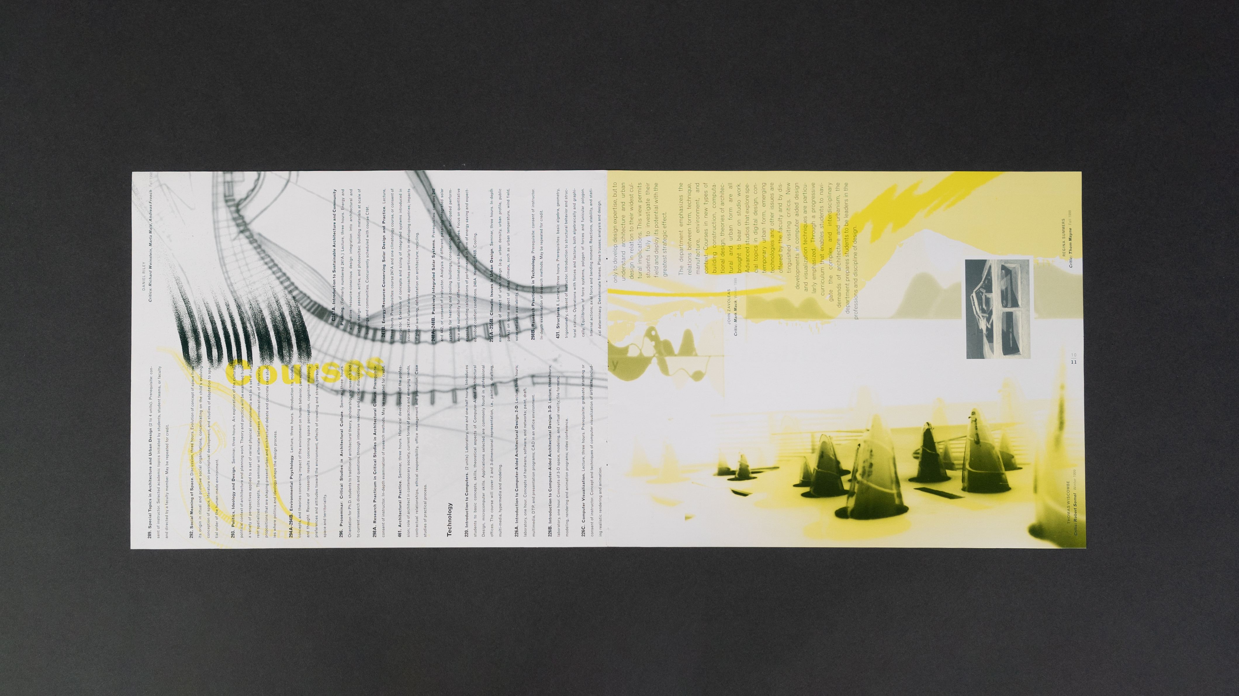
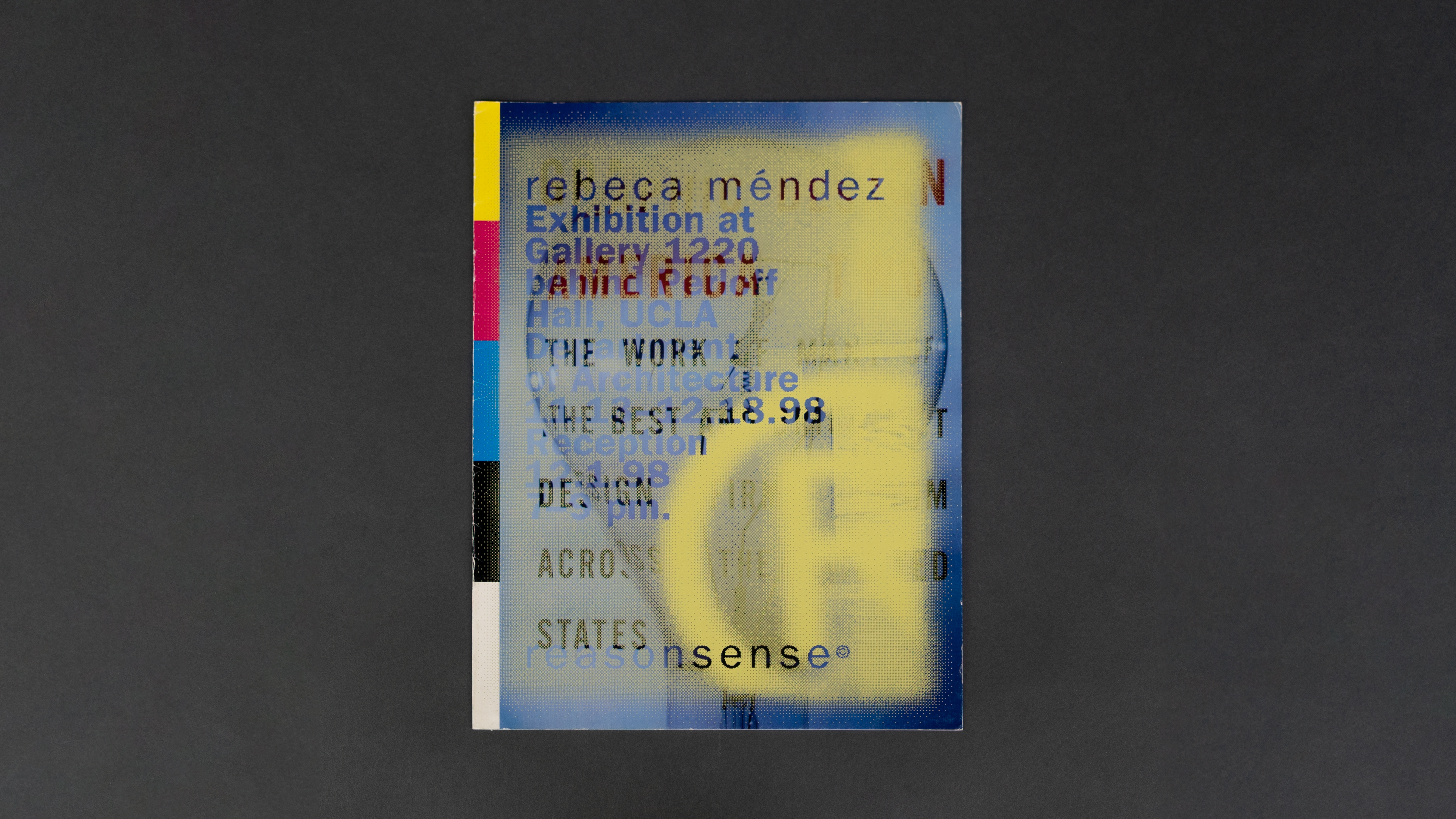
“With a gesture and a caress, Rebeca Méndez draws graphic design away from the cool world of lines and letter faces and into a more sensual reality. Her designs are alive with color and gauzy with suggestion. Relying on a palette of soft tones, a language of curves and sweeping arcs, and the mutating of images through the application of screens, Méndez massages her posters, books, and identity materials into designed objects that seem to have bodies.
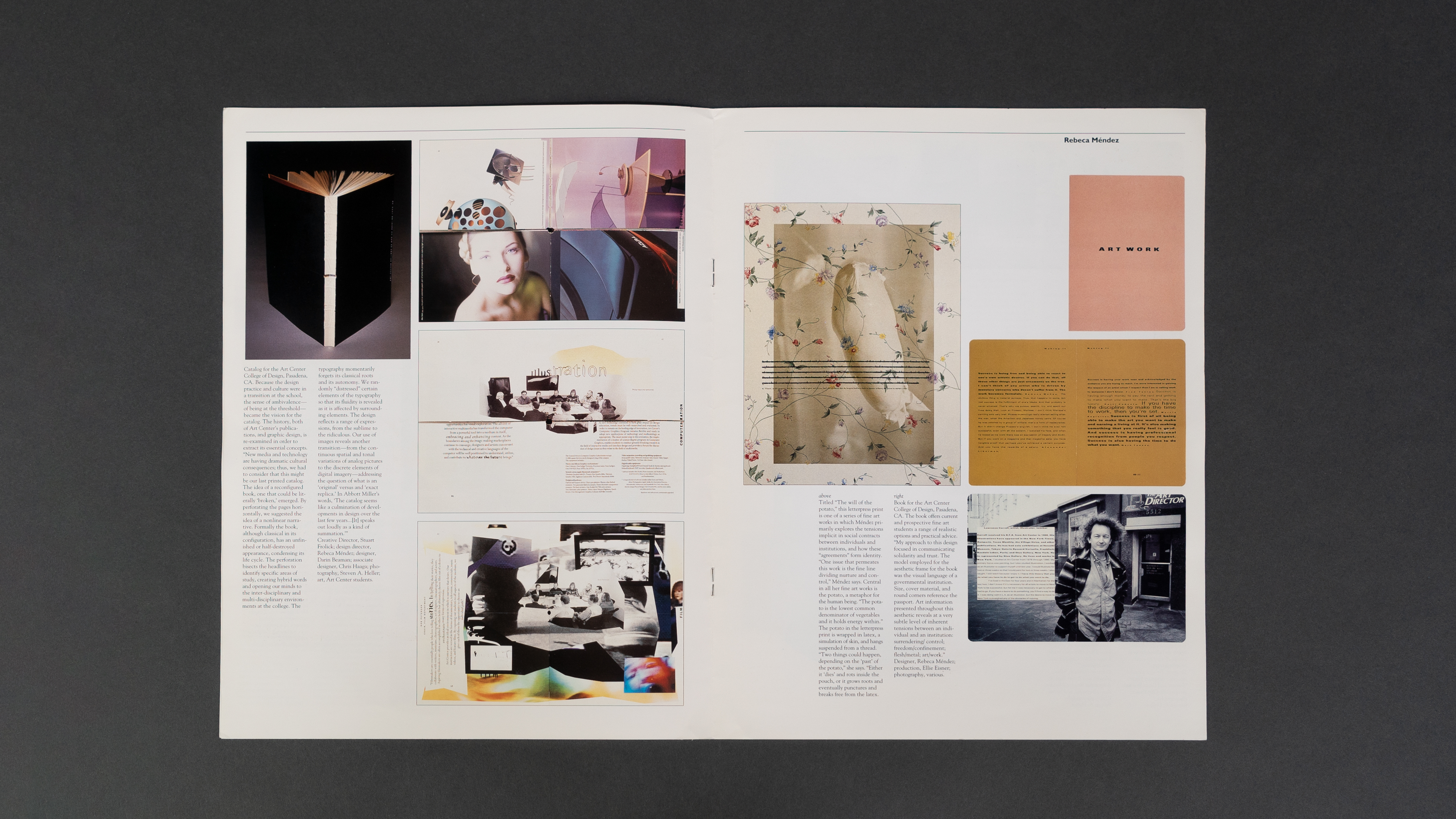
In one catalogue for Pasadena’s Art Center College of Design, for example, she perforated the pages so that it can be read the usual way or assembled into collages by separating the book at a center horizon line and reading top and bottom in different sequences.
In more recent work, Méndez has adopted the curved containing lines and metallic types associated with the revival of 1970’s imagery, but she softens and heightens the impact of the works by washing it with fluorescent yellows and greens. Her catalogue for the Bill Viola retrospective at the Whitney Museum of American Art (at SFMOMA in 1999) is infused with the deep colors used by Viola so that the book pays homage to the magic of the artist’s work.”
“Méndez is both an artist and a graphic designer. She is a master at organizing information into minimal yet clear blocks. What is distinctive about her work is what happens around and underneath this information.”
– Aaron Betsky, From ‘Rebeca Méndez: Selections From the Permanent Collection of Architecture and Design,’ SFMOMA, 1998
Aaron Betsky
Curator of Architecture and Design, San Francisco Museum of Modern Art, 1998
“With a gesture and a caress, Rebeca Méndez draws graphic design away from the cool world of lines and letter faces and into a more sensual reality. Her designs are alive with color and gauzy with suggestion. Relying on a palette of soft tones, a language of curves and sweeping arcs, and the mutating of images through the application of screens, Méndez massages her posters, books, and identity materials into designed objects that seem to have bodies.
In one catalogue for Pasadena’s Art Center College of Design, for example, she perforated the pages so that it can be read the usual way or assembled into collages by separating the book at a center horizon line and reading top and bottom in different sequences.
In more recent work, Méndez has adopted the curved containing lines and metallic types associated with the revival of 1970’s imagery, but she softens and heightens the impact of the works by washing it with fluorescent yellows and greens. Her catalogue for the Bill Viola retrospective at the Whitney Museum of American Art (at SFMOMA in 1999) is infused with the deep colors used by Viola so that the book pays homage to the magic of the artist’s work.”
“Méndez is both an artist and a graphic designer. She is a master at organizing information into minimal yet clear blocks. What is distinctive about her work is what happens around and underneath this information.”
– Aaron Betsky, From ‘Rebeca Méndez: Selections From the Permanent Collection of Architecture and Design,’ SFMOMA, 1998