WOVEN: BRAND ELEMENTS
For Woven Accents’ brand identity, I proposed dropping the word ‘Accents’ from their name so that Woven could act as both a noun and verb. We advised our client to buy the domain woven.is to make the domain name itself an engine of meaning: for instance woven.is/contemporary_rugs and woven.is/antique_rugs etc.
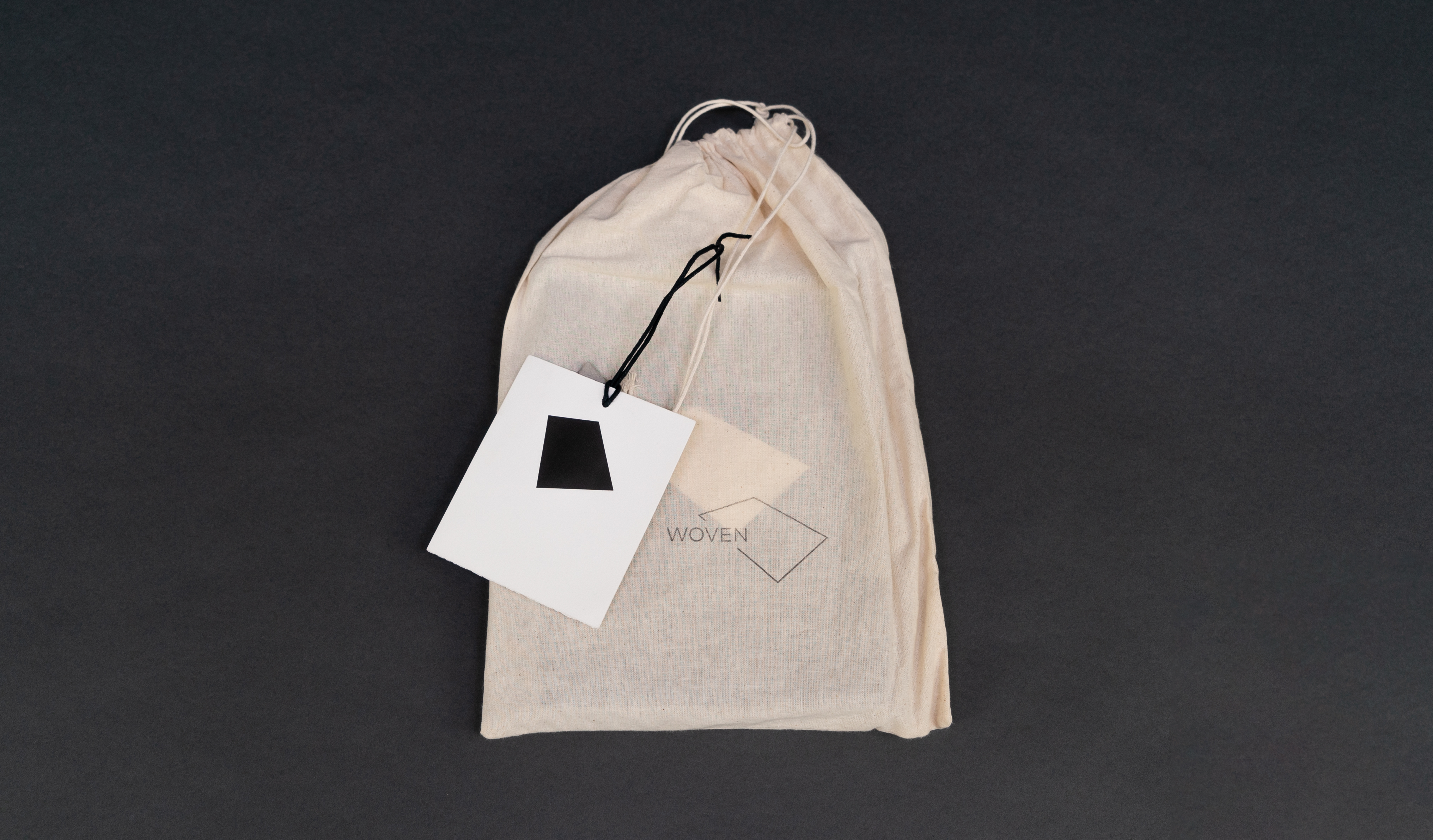
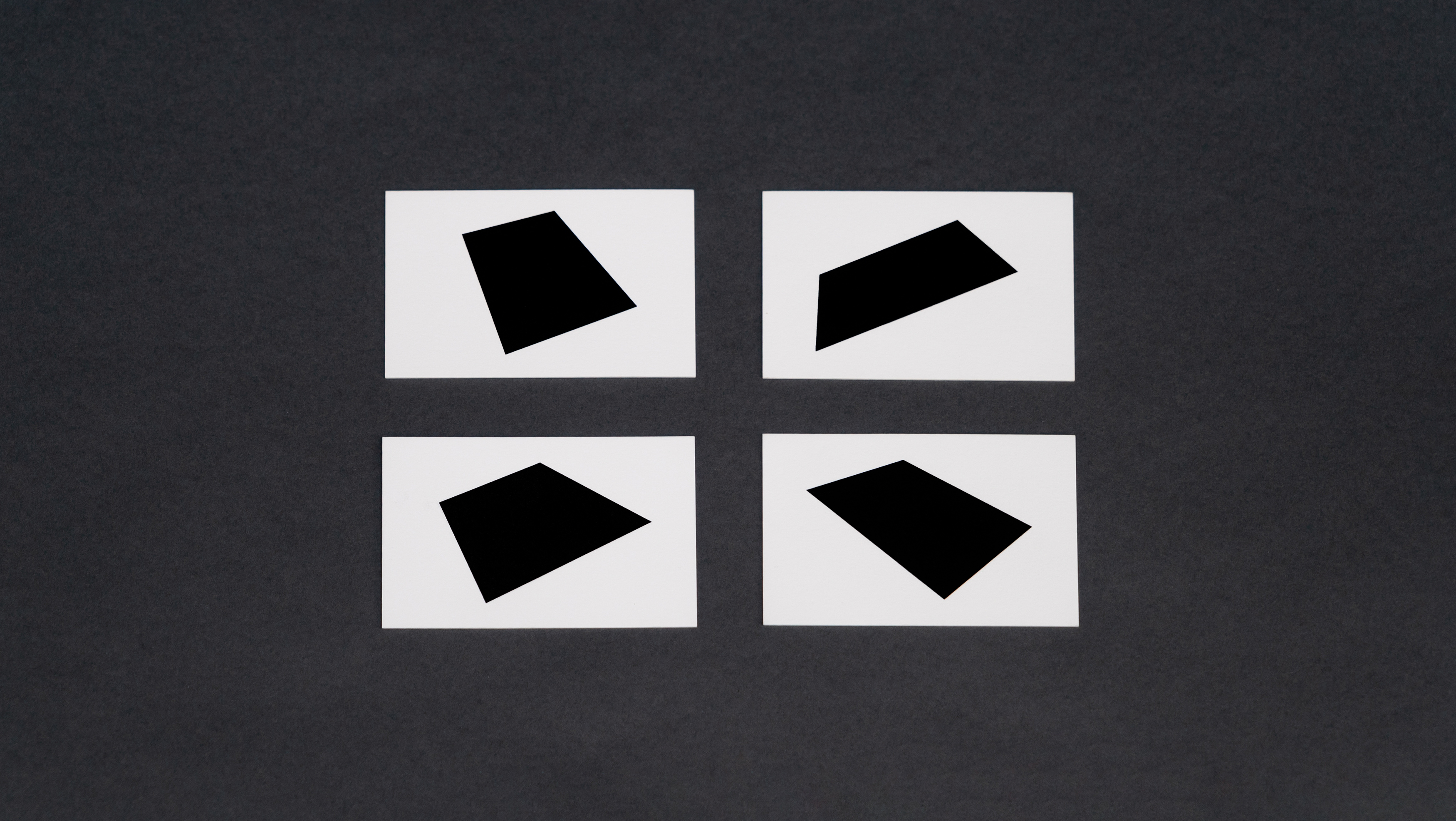
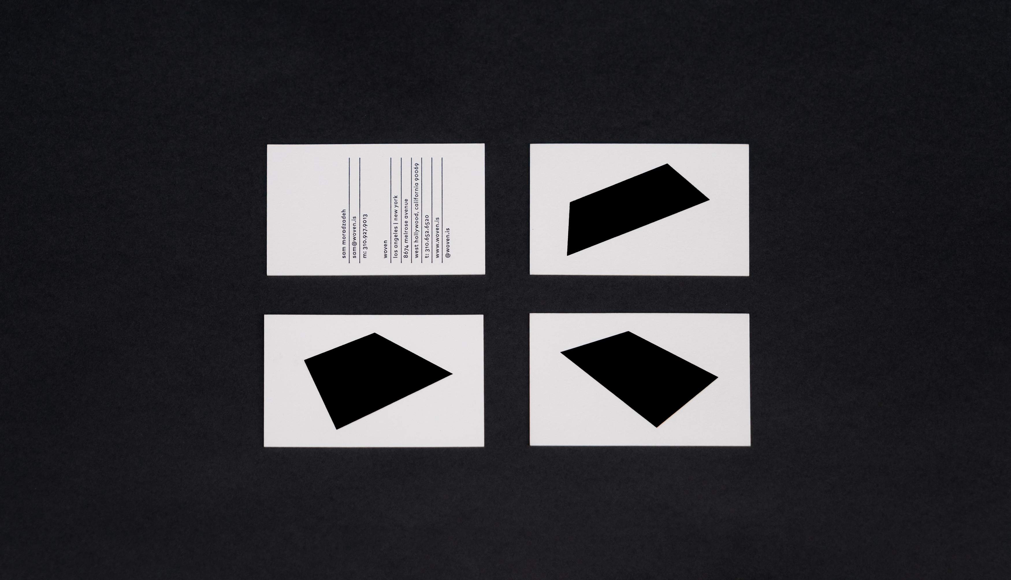
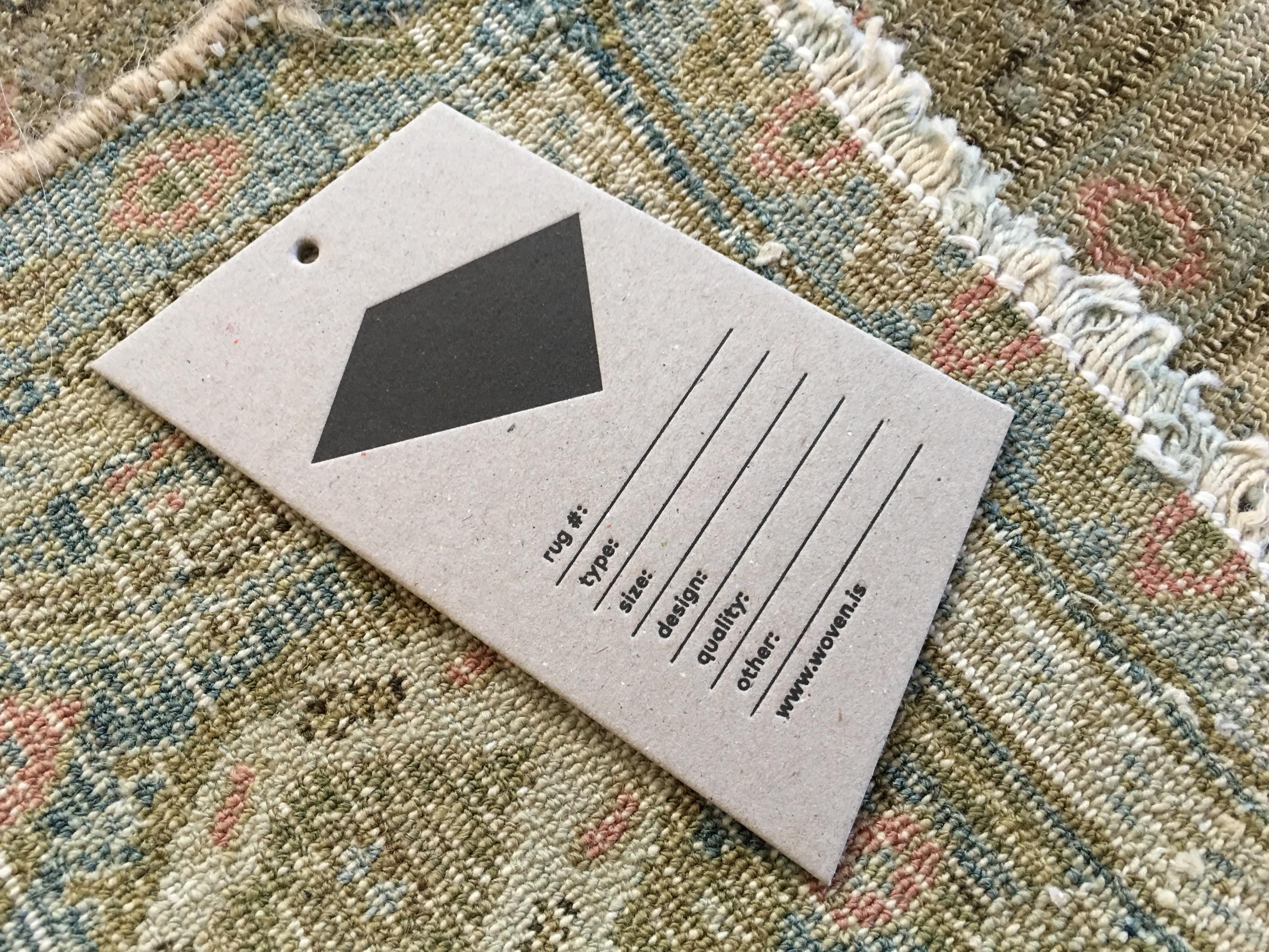
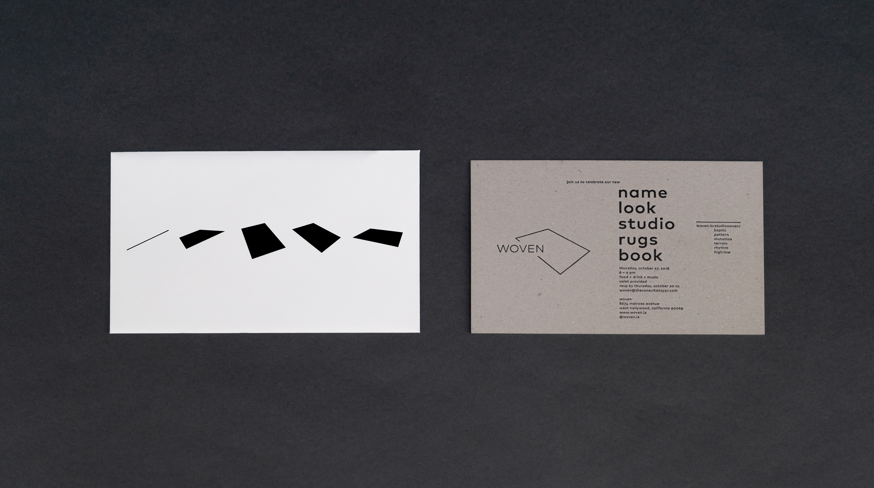
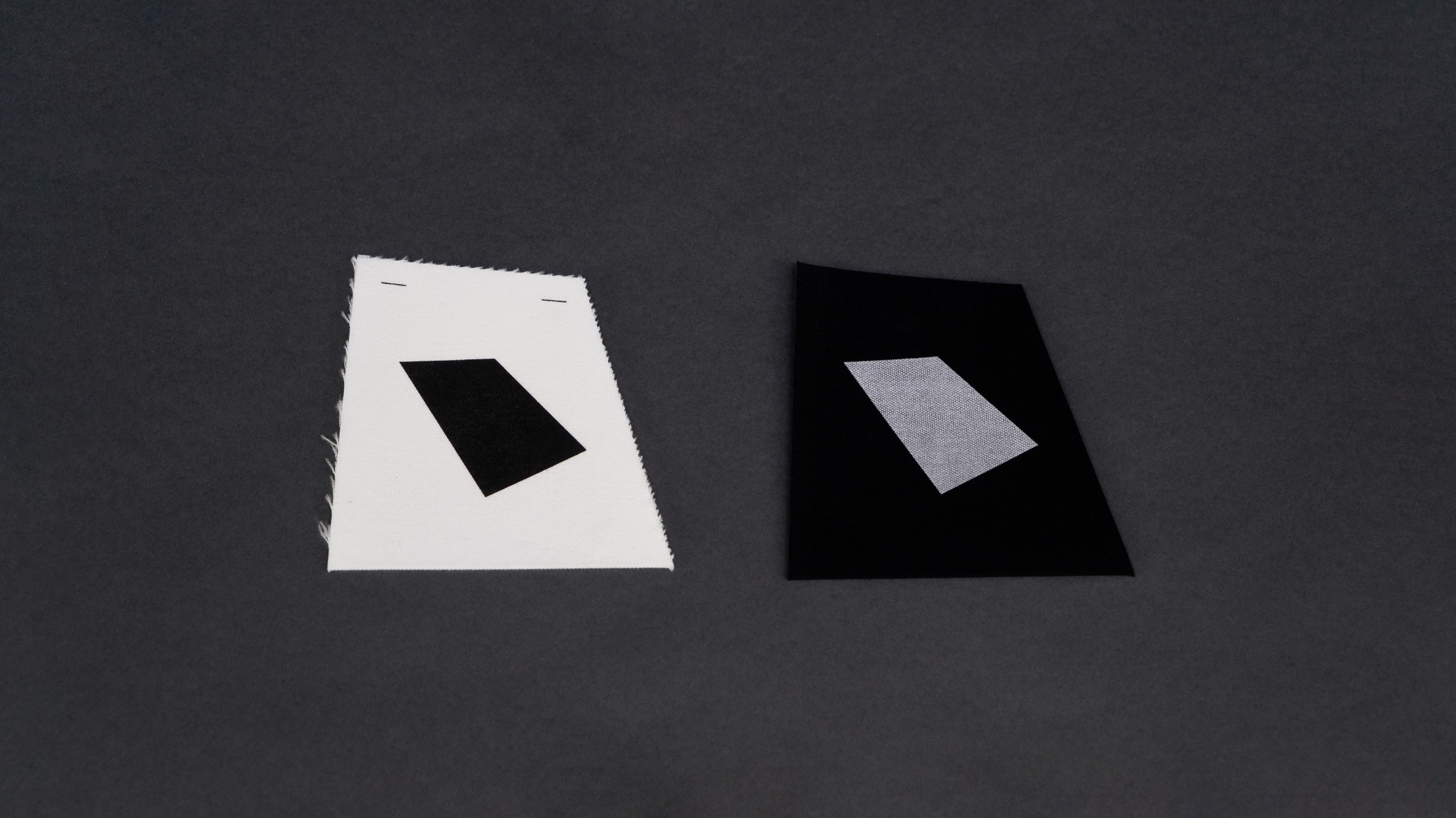
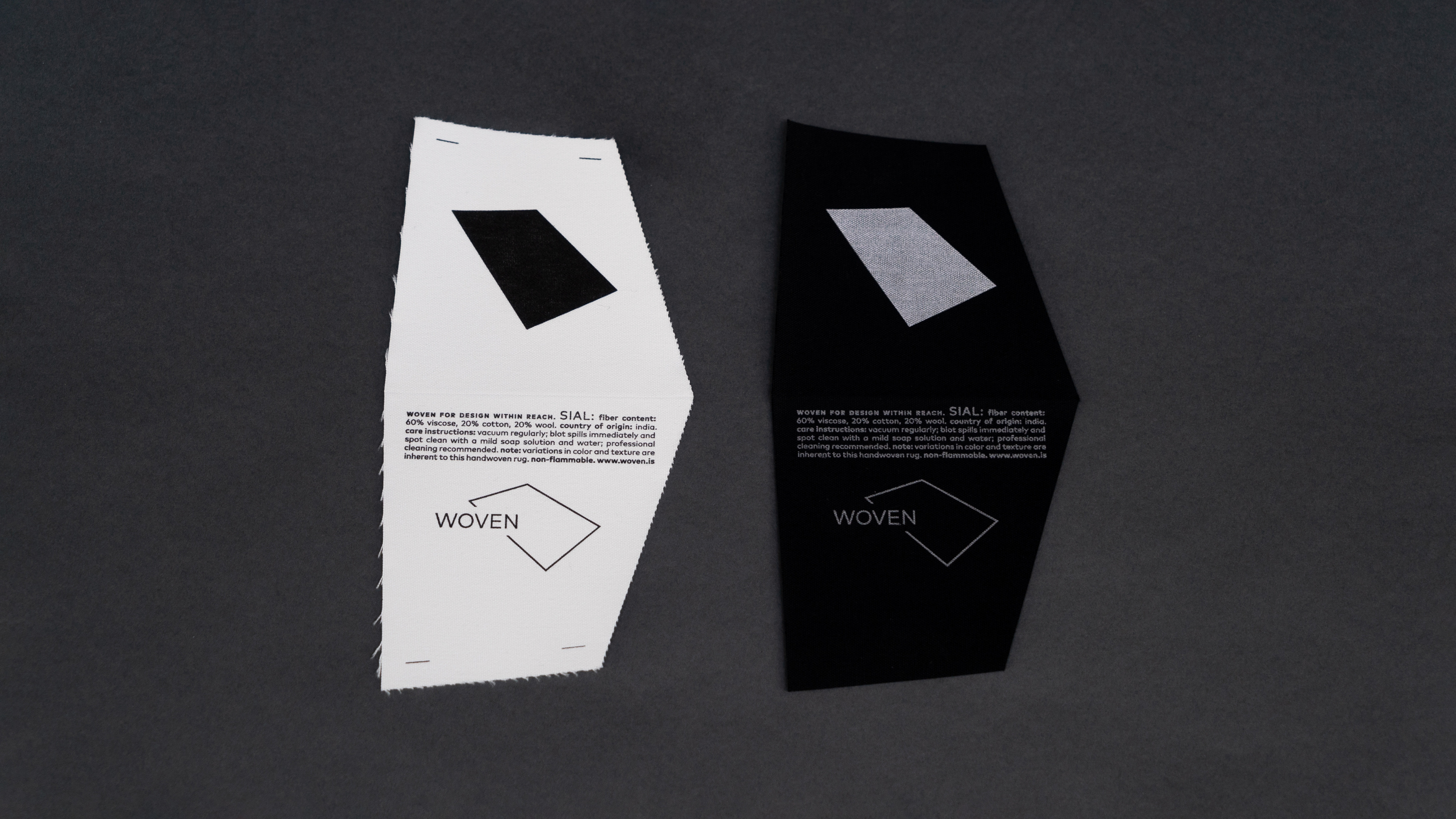
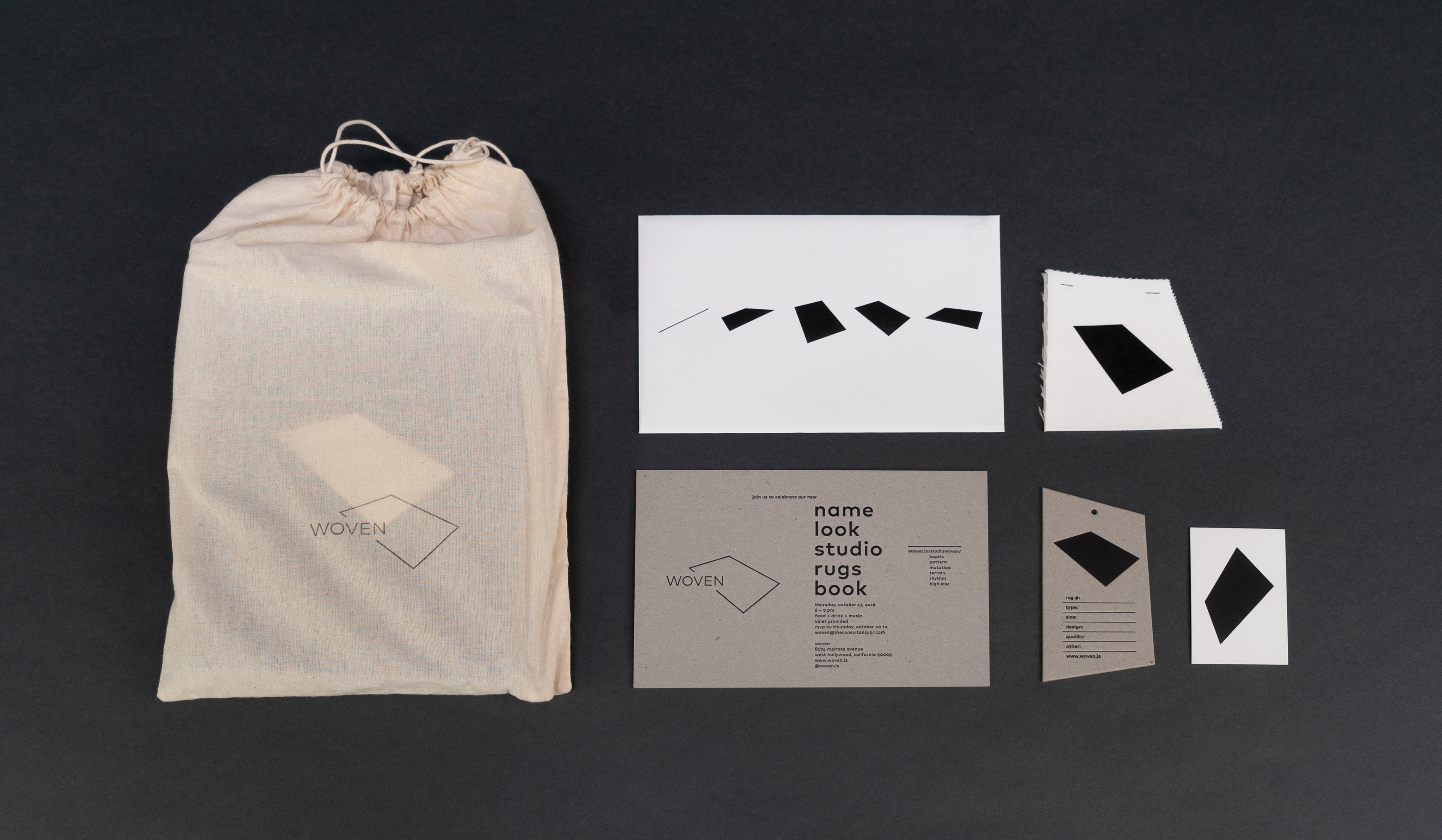
I proposed a visual identity that is ever evolving, with multiple expressions in place and time, with begins with a line, the horizon line, yet it’s also the rug, seen as if you are laying down. Then as you move around it, come closer, perspective changes, and the line becomes a plane, expressing your point of view as you experience a rug. I developed a system of graphic elements based on the typical rug proportion—8x10 feet—to express your experience of the rug in place and time.
I proposed a visual identity that is ever evolving, with multiple expressions in place and time, with begins with a line, the horizon line, yet it’s also the rug, seen as if you are laying down. Then as you move around it, come closer, perspective changes, and the line becomes a plane, expressing your point of view as you experience a rug. I developed a system of graphic elements based on the typical rug proportion—8x10 feet—to express your experience of the rug in place and time.

